alright, here's the process pack for july's MOTM painting. download the attached .zip below, contains 22 pngs and 1 gif!
i find it a bit tricky to pose naga-type monsters because i prefer them to have really long tails, and i want to fit as much of the tail into the picture as possible in a way that makes sense. also, drawing someone who has a tail instead of legs means taking a somewhat different approach to posing to begin with, since they don't have legs that bend the way we're used to when coming up with porn positions. you can't exactly draw a naga on their knees, and even when the pose makes sense, the tail might obscure the view that would have been framed by the legs of a ... legged character. this also applies to drawing merpeople, but with merpeople you're drawing them underwater so you don't have to take gravity into account the same way, and the fact that you can opt for 'floaty' poses increases the possibilities--so it's same but different? all that said, of course i love nagas, and i have so many doodle sheets where i'm trying to come up with good naga poses that both make sense and make for good compositions.
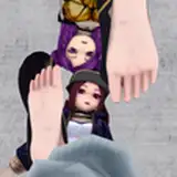
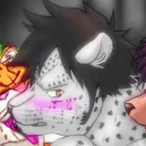
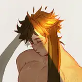
in the case of this picture, i solved the naga posing problem by simply having him laying on his back, partly squirming sideways, arms restrained by a bit of bondage, tail writhing around himself and his lover. perfectly sensible pose, good composition, the tail being all over the picture but not being 'in the way', a good view of the action; ticks all the boxes. the pose kind of popped into my head out of nowhere and i managed to nail it at my first attempt; you can see both the rough first draft (01) and the more refined version of the sketch (02).
the lineart (03) is business as usual; i'm using a rough round brush with a bit of texture and most of the lines are fairly thin. i thickened the lines at some of the 'outlines' to make it easier to tell certain parts apart and enhance the idea of depth; separating the bit of tail in the foreground from his body, his arm from his neck, and also outlining his head and dicks + her hands, to make those areas pop a bit.
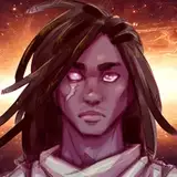
his colour scheme and colour pattern is directly based on that of a quetzal (though not 100% identical, i changed some things around), while also drawing inspiration from mesoamerican art in general, and the colours often used in it (more on this in the concept art + design commentary post that i'll upload soon!). when i started painting i could already picture the colour scheme pretty vividly; i kept the base colours (04-05) pretty muted, adding vibrance little by little, both by painting with more and more vibrant colours and by adding overlay layer effects. if i had used very vibrant base colours, the picture might have easily turned out overwhelmingly bright and saturated, so i figured it best to lay a muted foundation.
i went on to add different hue variations to the base colours, as well as the basic shading, including that of the bigger scales/feathers along his spine and hips; i wanted to really work with that pattern of tapered, over-laying shapes, rather than get too bogged down with tiny details and textures. i added darker green hues on layers set to overlay or multiply, starting to sort of differentiate different part of the picture from each other. and then on to the really fun part: the vibrance of his feathering/scaling (11-12). again, i looked to quetzals for reference, using strokes of pale, bright green/turquoise to add that shiny vibrance and a feather-like texture. i also started painting/adding details to the rest of the picture, including his red underbelly, her hair and skin, and his dicks.

the next step is interesting because it made such a huge difference. just compare 17 to 18 (and 19). i played around with the values of different parts of the picture, making the bit of tail in the foreground darker, and the bits of tail in the background more faded (in a yellowed kind of way). it works suck wonders to push certain parts into the background and pull others into the foreground. as of 19 i kept pushing and pulling; i added a yellow overlay/tint to the parts i wanted to pull closer (his arm and face), to make them stand out; and a faded blue tint to parts that are further away (his neck, his arm and her hair behind his muzzle). i also coloured parts of the lineart, and added even more vibrance to certain parts by basically just painting with green on an overlay layer set to low transparency.
at last i added the background, spent some time adding small details and polishing the whole thing off, cleaning up some lines and just refining various things. last thing i did was up the contrast a bit (really just merged all the layers and went image -> adjustments -> auto contrast) and voilà - it's done!
feel free to comment with any questions or thoughts!
// art + characters © me.