Following up the previous post. I decided to try painting with secondaries which is terrifying.
I think most of us learn red/yellow/blue first so when thrown into green/orange/purple we all have no idea what to do. I watched this one video by the amazing James Gurney. He’s a popular oil painter on youtube and in this particular video he only uses the 3 secondary colors.
This lead to my exploration of lavenders, why I can’t get the right blue, and why on earth are there so many greens.
I also befriended a phenomenal painter named Lauren Tsai!! She came to visit New York and we met through friends of friends. She and I really wanted to explore different colors so we started talking about all these new colors we never attempt because we’re obsessed with our default blues… (ultramarine for me, prussian blue for her). I wanted a blue that felt like sky, like ocean, but the blues I had were very reddish like purple. It made it impossible to mix an authentic lavender between my alizarin crimson + ultramarine. Much to my surprise, the secret was magenta.
Quinacridrone magenta in oil painting is something that you can’t mix, making it a powerful base color. When mixed with different blues, it transforms into varying shades of purple that give you more control than just using purple straight out of a tube. When you add white, you get a vibrancy unlike any other!!! The photo I posted is not mine, it came from this site which I sourced for my understanding.
Next, I knew I needed more variety in my blues. I was hung up on ultramarine and had a really hard time choosing a new blue. My cerulean was too green, and ultramarine was too red. I needed a true true true blue. I was able to find a great guide here on the “geniune” manganese blue of myth… which is discontinued. However the guide is extremely thorough and thoughtful. I quote the artist Melissa Carmon here “I recommend Winsor and Newton’s Phthalo Blue (Greenish) PB 15” and actually purchased this exact color. It is beyond words the best blue I could have imagined but she does also sample a plethora of blues to compare it to.
Lastly, I needed to purchase a green to add to my arsenal of secondary weaponry.... I so badly wanted to paint with green+orange+purple but I had no idea what to choose among viridian, pthalo green, sap green, olive, etc. It was nerve wracking. This guide saved the day because of all the greens, I find it the most neutral and flexible. It’s also an amazing guide on how to get deep greens by mixing green and orange, bright greens by mixing green and yellow, and deep browns by mixing green and red.
Ultimately, I picked up a fun Cadmium Green to try, quinacridone magenta, dioxozine purple, cadmium orange, pthalo green, and a very specific Winsor and Newton pthalo blue PB 15.
For the record, I don’t think you need Gamblin or super expensive oil paints to have a good time. I buy almost all Utrecht brand (school-level) unless there’s a color I really want that they don’t have. In this case, the only “expensive” ones I bought were the tiny tube of Gamblin Cadmium Green and the Winsor and Newton Pthalo Blue.
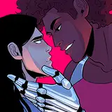
The speed paintings I've made recently were all done on a 9"x12" grey toned canvas pad that has completely changed my life. You can get it here. It is honestly so refreshing to sketch paint instead of plotting out a massive painting. I found this a necessary part of bouncing back from some heavy life changes in the past 2 months because you're basically doing low-stakes paintings. These aren't meant for a gallery and they're literally not even stretched on wood. They're canvas sheets in a notepad. It helps to do fun and simple things like a head or a hand instead of trying to plan out an entire composition.
This color guide honestly helped me a ton and I’ve been working to try and organize all my thoughts & research on it. Its also my first time painting with an orange underlayer (I usually use blue and it ends up really dark). The orange peeps thru the little crevices and brings so much energy to the painting. I've started on a new composition that I'll be making a 3D reference for soon! So I'll have a new BTS for that + the crazy moodboard I have set up for it.