11 years ago I have drawn my own face on the King of Diamonds. Since then, hundreds more cards have followed. Over time, I’ve transformed drawing faces on court cards into my own art form. The traditional court cards provide us with clear guidelines on how to portray them, and I enjoy preserving these classic details in my own designs.
One of my friends is now immortalized on the Queen of Spades, and I think it turned out great. Comparing it to the original card, I wanted to highlight just how much attention was given to every fine detail.
I always start by outlining the face. Instead of actually tracing the outlines, I tend to remove everything else around them. For this, a good portrait photo is crucial, where even the smallest details can be clearly seen. So that the first rough version looks like the picture below:

My problem with the photo was that the outline of the nose wasn't really visible due to the light, which is why the nose still looks very “chunky” in the first picture. Cleanly traced, with all the details you should pay attention to, it looks like this:

I always need a photo that's taken from the right angle and matches the tilt of the head on the playing card. Which should go without saying, but I've already received selfies from people who have brushed their teeth and asked me if it would work... It's truly crazy how the most obvious things are not apparent to some people, but that's exactly how the quality differences in various court card designs arise. But when you look at both faces, you can see that the angle is perfect.
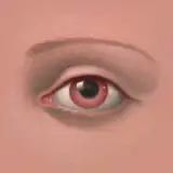
The Eyes
One of the most common "mistakes" on custom courts are tiny eyes. I always resize the eyes to at least 110% before I start drawing a cleaner version. The pupils are probably the most important detail of the eyes - a dot surrounded by another circle. This small yet crucial feature is one of the most significant details overall. The eyelashes are more or less only visualized by a protruding line. But as you can see, I also stick strictly to the guidelines.
I initially connected the crease above the eyelid with the eyelashes. It was one of the final details I adjusted. While it might seem insignificant and doesn’t impact the overall appearance, I knew it was something that just didn’t look quite right.

With the Queen courts, I'm very cautious about the bags under their eyes. There are always huge lines on the original courts but that's making the Queens look old. That's probably the only big detail that I don't try to copy 1 to 1, because it would always have a negative effect on the recognition value. But I drew very subtle lines because I thought it was important for the recognition value and it doesn't make the face look older in this size.
A few days ago, I started drawing the card but decided to take a break because I wasn’t sure how to draw the nose. In the end, I used one of my existing court cards as a reference, and it turned out perfect. It’s amazing how even the smallest adjustments can completely transform the look of a face.

As you can see, in the original drawing, the left half of the nose isn’t connected to the right side. The line on the right extends downwards and simultaneously forms the philtrum.
For the lips, I always draw the entire upper lip and add only a slight elevation at both ends. The lower lip is essentially just a single line representing the bottom lip, which isn't connected to the upper one. I also like to extend this line a bit longer than in the original card, simply because it looks more accurate to me. Except for the Queen of Diamonds, all Queens have an additional chin line under the lip. I added it as well, but the Queen of Spades didn't like it, so I left it out.
 I hope you like the result as much as I do. This Queen isn’t meant to replace the QS in my Black Roses decks, but she will be part of the Gold Foil Monogram Deck.
Thank you so much for your support!
Much love
Daniel
Álvaro Mezcua
2024-09-29 22:22:29 +0000 UTCPaul French
2024-09-29 20:24:18 +0000 UTC