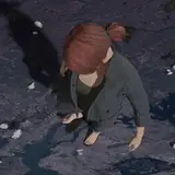
Going through some files and I remembered I was meaning to think a bit on how I handle comics pages. Since I kinda shelved this comic for about more than a year, my thumbing and sketching habits were a bit more rough. This part in the story has a little bit of action and while my thumbs were a bit dated when I picked this up again, I still appreciated the thought past-me put into this page in terms of composition.

What I like about comics is that every page is a composition puzzle where I have speech bubbles, text, characters, and panels to play around with. I buy into the philosophy that it is the duty of the artist to merely guide the reader in how to interpret the sequence of drawings.
In this case, I feel in terms of hierarchy, the reader is inclined to follow where the text goes. Knowing this, I like to position text and speech bubbles in places where i want the reader to gloss over. And from there, I compose the drawings that help guide the reader to the next set of text (Where the character looks, where they look like they‘re moving to, guiding lines, etc.)
Any important action, I like to place in between the text and I feel that works for me in how I approach visual storytelling.