"Whoops" -- Chloe, on feeding you an 80% alcohol shot.
Hello!
Mid-week post. I'm working on the setting for the final part and I'd like your feedback on a few things.
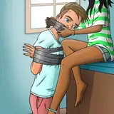
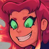
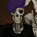
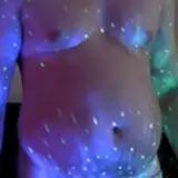
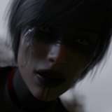
First, and probably most important, is if the saturation is too high on these images. I cranked it up by 40% to give the club a more distinct look, but I'm a bit worried it might be too much.
Another point is the use of color. I tried going for a red/blue to keep to the visual theme of the game, only used more intense reds and blues. Do you think it works?
Lastly, I added those light bands as floor lighting as it was a bit dark, but I'm not sure how well it fits the general vibe of the place.
I appreciate your help. Hope your week is going great!
--SR
Note: these are all test images. They won't be in the game.
Valthas
2023-02-23 06:13:12 +0000 UTCL. Cuzidora
2023-02-22 21:33:05 +0000 UTCjufot
2023-02-22 20:17:13 +0000 UTCBonnie75
2023-02-22 19:50:46 +0000 UTCCallisto
2023-02-22 18:03:18 +0000 UTC