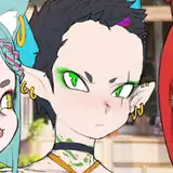
hi everybody. i've been working on idletry, same as ever. in my downtime, sometimes i'll flip through pages and edit them.
the first scene, in particular, i still don't feel great about, but i feel compelled to color that before moving on, so it's gotten a lot of my attention when i do edit.
since it's spur-of-the-moment, i don't usually think to record these edits or changes. you may notice them between sketches and "finalized" (i'll have to think of a better word for this) versions of pages.
one of the things i've been unsure about is pacing for scene 1. there are some things i want to add, and i'm having a hard time feeling like i really know how it'll come off in a book. it is actually pretty difficult for me to read this page-by-page because they're all in individual .sai2 files.
what i did for scene 1 is print it out.
i used my local library's printer. the calibration with the blues is clearly off, but it is a more expensive printer -- much more expensive than i can afford.
i accepted that over the course of working on idletry, i would spend a lot of my own money. the library charges 50 cents per full color page. if i printed EVERY page ONCE, and assumed idletry doesn't extend beyond 800 pages total... that would be $400. but these visits are usually around $2-$3 each. anything will look really expensive if you just drag out the timeline far enough. so, it's still much cheaper to do this than buy a printer, the ink, the paper, etc. and it supports my local library.
they are also, literally, a business expense that affects how i file my taxes, in a way that benefits me. so i can't complain.
that's a tangent, though. the thing about using a printer that isn't mine is that i can't alter the settings or toy with it. this means that when i learned there is no way for the printer at the library to print something on both sides of a piece of paper, i kind of just had to deal with it. but needing to flip two pages just to see the next page would be... not ideal.
so i did the trashiest, cheapest thing anyone would do in my position: i bought a glue stick and glued the pages together back-to-back. also not ideal, but closer to what the finished product would feel like.
which brings us to the binder you see in the pictures here: i bought 2 cheap, really thick D-ring binders as well, to hold the pages together in a "book" way. it won't give me an idea of what the gutter loss is going to look like, but this would be very difficult to approximate, and it wasn't going to ever approach "accurate" due to the thickness and stiffness of two pages glued together.
book one has a red binder and there is a black binder for book two, because i knew that one binder would not be able to fit 800 of these pseudopages, and the story is broken up like that anyway.
along with the binders and gluestick, i bought some paint pen sharpies, or something to that effect (and yeah, i had to buy the hole punch, too). the color ink from the printer itself has some sort of gloss in it, and it's semi-waterproof, but i didn't want to waste my expensive poscas on it to make notes.
the sharpies are thick to write with, so i had to create a small system of symbols for notes instead. this might seem awkward, but it's intended; writing words hurts my hand more than any other creative task. with thick markers that can't write tiny words, i'd be forced to make notes brief, and i'd avoid hurting my hand by pushing it. they don't write perfectly on the water-resistant ink, still, but they are visible.
reading through scene 1, i noticed a recurring theme... smaller gutters beyond a certain threshold bothered me. i pulled up the page files and measured them out pixel-by-pixel and found a pattern: 5 pixels was the minimum tolerable width for me, but i prefer wider than that. i started doing borders in sketches with an 8-pixel brush, using the outline tool to get a 6-pixel end result. sometimes i will go up to 10-pixels with an 8-pixel-wide result. i went with such small borders to try to save space, but it's chump change in the grand scheme, with a huge detriment to readability if it's pushed too far. i've been keeping in mind that the borders can, in fact, be too thin for me.
this seems like such a tiny thing... but it makes it difficult to focus on the art in one panel without the next catching your eye. i don't like it for my own reading experience. and, more than that, borders are on pretty much every page of the comic. changes to the style of the meta structures of the comic, while they are supposed to be invisible to the audience, would be the most laborious to implement. even a large change to a character design would only apply to every panel the character is in.
this is also why i wanted to do a lot of these print tests early. there are going to be mistakes that multiple exponentially with more pages done.
as a side note: you can also see that pages i've finalized with color don't really have many notes about issues, if any at all. that is the exact reason i don't finalize them until i'm happy with the sketch and structure, lol.
i didn't feel that was enough to warrant making a post about it. the other thing about borders and gutters that pushed me to finally wrap it up into a post is that i realized a few days ago that uh. i had not put any extra space on my print zone guidelines for gutter loss. there is a marker for the safe zone, but not for any warning like "hey!!!!! it's going to start curving here and the reader won't see shit from fuck!!!!!! watch out!!!!!"
i altered the guidelines to include an extra 0.2" and i'm not sure if that'll be enough. it's better than nothing, though. i now have to horizontally flip the guideline every page, since the binding of the book holds opposing sides of the pages. i want to keep speech bubbles and faces away from this guideline so that they aren't lose to the middle gutter of the book. i included a couple examples of applying the new guideline to some of the older pages and instantly finding an issue with speech bubbles coming too close. i mostly applied them to about 10 pages back from where i started doing it... i'm not thrilled about going back and doing all of the edits for 105 pages, but not all of them have issues.
i don't know. these are granular, technical complications with making a comic, and perhaps ones that not every comic artist even finds important enough to think about. they're not worse for it, but i very much reread my own comics. a lot. and the experience i get from reading them is important to me.
i thought that it was worth posting now, because the $10 tier gets practically nothing, and because it offers a little more insight into the comic-making process, especially if you want to make your own. i am not experienced with print, so these are my own stumbling blocks.
all that aside, it did feel really good to be able to flip just those few pages of color and see a flash of what the story can be one day: a thick book that you can hold with colorful, eye-catching pages you can leaf through.
Morghann Patterson
2025-01-09 14:37:09 +0000 UTCFetian
2025-01-08 09:16:15 +0000 UTC