So I wanted to talk about my process for this piece Wonder. My idea for the piece was something… magical, a sense of wonder. You look outside your window and there’s just so many plants! It’s a beautiful yet strange feeling. Keep in mind what I wanted!
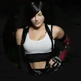
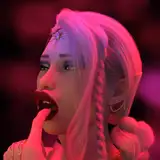
Ref:

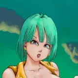
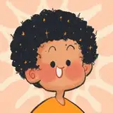
So this was my reference, I went off that and started sketching away
Sketch:

This was my sketch! I loved the idea of filling everywhere with plants!
It was time for my rough colors so I know how the final colors would look like.
I start of with basic colors, I always have to put something down doesn’t matter how it looks at first because I know I’ll change it later!

Then I use a hard light layer to bring in light! Remember that magical feeling I talked about? I wanted the sun to be passing through the plants and hitting her face. Think, it’s morning,sun is shining and you go to open your window and you see all these plants!

I wanted to bring in a new color because my palette was a bit too green. There’s plants so of course there will be flowers and colors! I ran through a few gradient maps and merged them to find a color that would stand out well from the warm light and warm greens and I got this very lovely purple and thought, yep this is it!

Something was missing, it was much too dark for a magical wonder moment, so I thought to raise the values in some places, just so I don’t make it dark, but as I was fiddling with the luminosity/brightness, i remembered the way some artists would have low contrast works were everything was bright, even the dark colors so I wanted to try that out, maybe that’d do soemthing so I turned the contrast down also just to see what it does and I said this was IT!

So I reduced the contrast and lightened everything so that my dark values (like the plants to the front and the room she’s in) was not sooo dark. I loved loved loved the rough colors and I was excited to get this done because it looked so pretty!
I begin my lineart because at the start, I wanted it to be inked, but as I was painstakingly drawing every leaf I started to question whether I really wanted the lineart… I still continued thinking maybe my colors would redeem it!

The inks by itself was lovely! But the more I went, the less I felt like the inks were going to do justice to my colors, so from here, I went to colors forgetting about the rest of the inks!

Right off the bat with coloring the leaves I thought oh no this is actually terrible. I thought to use a leave brush for the plants I didn’t ink thinking oh it’ll be okay. I color picked from my rough colors for the plants!

I skipped to coloring in the character (see all my layers dear god), I was like oh yup the character is what’s going to redeem this.

I was painting her in and I thought wow, maybe lineart was a good idea after all, I loved this!

But then I bring myself back to the entire piece and I just hated it so much.

I tried to crop out some of the rough colors and paste them into the lineart, maybe I could just render them from here but I’m in no mood to do all that rendering so I just leave it for a week without touching it. Everything was stiff and mushed up together, I knew I didn’t want to continue it at that point.

I come back after a week and I decide I want to change the aspect ratio, I wanted it wider so I just doodled in the rest of the missing parts

I take it to procreate to liquify and move around some plants because it felt so flat! I wanted some kind of dimension to it, not super realistic but not super flat either.

After that I left it for some days again, I wasn’t sure what I wanted. I just knew I couldn’t give up on this. It felt like I was on the edge of figuring something out but I didn’t know what yet. So in between those days, I was studying! I studied a lot of painting and it just made me realize something… I need to be more loose with painting. And that was my eureka moment!
Instead of inks, instead of trying to start from scratch… what if I just paint over my rough colors? I loved the rough colors so much that inks just didn’t do what I wanted it to do when I started coloring, so why do the inks then? The rough colors were so good because I was loose with it. I knew I could do whatever I wanted with the colors then so of course I experimenty with it
So, I started painting over the rough colors. I thought, if this was traditional painting, how would I paint it? I’d just go for it! And that’s what I did here. As I started painting over it, this was truly it, this was how I was going to finish this piece.

I flipped the image in procreate and just forgot to switch it back lol but to me it looked better anyway as it was flipped

And then this is the final version! I could have rendered more, I see some mistakes still but I just though to stop here, because I personally was done with it. It’s fine, this won’t be my last illustration. I will make more. And I am very happy with how the final turned out. I added the white bars because I wanted an even wider aspect ratio!

Sometimes, it’s okay for your initial plan to not work out. A lot of things look amazing in our head but once we make it, it’s not what we want. Adapt and change your plans as needed! This piece was a very good learning experience for me and I think was a breakthrough piece as well. My next illustration I know, I’m going to be loose with it!
Lots to think about, lots to study about! 🧐