fanbox
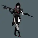
コントラストは低い方が馴染みやすくて良い気がしますが、どうなんでしょうか… I guess low contrast is better in terms of color brending,but I can’t tell which is truly right. PS : I found that it’s wrong for reality to paint with just one color.
Edwin M. Griffiths
ShadowyZman
Brizystorm
未来みるく
QuietValerie
theevilpancake
Oiko
trv hgy
pu-en
Lesaithz
SparkDev
GiselleArtwork
saddoggames
gfxcomet
Shantuiox
Kdy_VRC
Lewdoartist
炬燵-Kotatsu-
epiphany031
terebozu
bestof
florenceiglesias
fusumam
Oreoshaman
kelvinhiu
koh
ぺろきす
蒼流リダ
Fantastical Weapons (Cube World Mod) by LippyLapras
AICuteGirls951
lucidlemonlove
Khanadiety
fluffylunarii
Marbearis
TheBooMoon
rottenheart6
Paleolithik Art
lichen93
Arris_X
oshiso-sio