![[WIP] Quick Update on those Character Sheets](https://img5.xaiju.com/storage/1/jo/fc/d38796-019e8465-e947-74f1-9681-5d474c37e1c0.jpg)
![[WIP] Quick Update on those Character Sheets](https://img5.xaiju.com/storage/4/rt/xx/d38796-019e8465-e959-7874-b7eb-2cacc9d1d28a.jpg)
![[WIP] Quick Update on those Character Sheets](https://img5.xaiju.com/storage/6/ot/db/d38796-019e8465-e960-7afe-8227-80ab3c82cf0a.jpg)

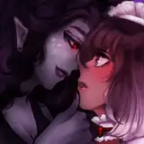
So, I kinda want some input on what's the easiest for y'all to read with these.
I think the first design is the most balanced, but also the most bland. It's factual and straight to the point.
The second one has a little bit of flair, whilst not sacrificing readability. But Vivienne's lower half is cut off from the left. A small sacrifice, but a sacrifice nonetheless.
I actually think the third one is the best, but there's a little bit of scrolling required to get it all. Let me know if you mind the scrolling. I'm still weighing my options on what information I want to showcase on these things, like their favourite fetishes and/or positions. And what parts of their backstory exactly.
If you have any inputs on which design you like the most and what other info you'd like to see, I'm all ears.
SFMPORN
2020-03-06 08:09:24 +0000 UTCMRPang
2020-03-05 22:16:57 +0000 UTCseequiNz
2020-03-05 21:09:59 +0000 UTCqueenofsmut18
2020-03-05 20:50:11 +0000 UTC