Look at these cute buttons and your futuristic room!
Added 2019-09-03 01:49:23 +0000 UTCHello all! Sorry about all the recent email pings. I figure what better way to apologize than to send another one with an apology in it? I should be getting back into a normal amount of posts soon, but I did have some artwork to show you. Thank you for your patience!
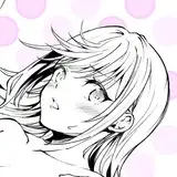
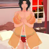
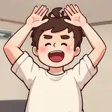
First, here's your new futuristic room. I think it looks so cute:

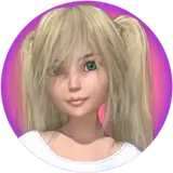
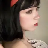
There's lots of little details to notice, but my favorite part is the "PORRN!" poster. In your new farm home, there's a "KORRN!" poster. In my mind, it shows some similarities between you and your father. Pic for reference:

And this morning, AE | Dagger created some UI buttons for me. I also think they're cute, too. For some reason, I like that they're not a perfect circle.

Hope you're all having a wonderful weekend!
Comments
Yeah it's possible that what's happening is the icons are one size, but I'm rendering a different size. I'll look into that. Thanks!
Bawdy Ink Slinger
2019-09-11 19:39:06 +0000 UTCYeah, I just stretched them vertically. They should be circular though, I measured them and scaled them precisely.
Wild Bill
2019-09-08 21:25:06 +0000 UTCDid you "simply" stretch these icons vertically? If so, I can probably do that without waiting for my artist :)
Bawdy Ink Slinger
2019-09-08 18:51:27 +0000 UTCI'm not sure. To me, they look oval, but in the other direction. Like they're more tall than wide. If you're saying that's what looks better, I can ask for that.
Bawdy Ink Slinger
2019-09-08 17:53:56 +0000 UTCYou don't think they look better in the version I shared above?
Wild Bill
2019-09-08 11:44:44 +0000 UTCHm, well I'd be down to fix it, but I don't yet understand what's wrong with it :(
Bawdy Ink Slinger
2019-09-08 01:25:42 +0000 UTCI posted the new round buttons. Let me know what you think!
Bawdy Ink Slinger
2019-09-06 03:20:01 +0000 UTCMmm, if you look closely at the lines they're thinner on the top and bottom. That's a pretty sure sign that the artwork has been smushed. Plus the gear not being round and the book being longer than it is tall, I don't think it's just the ovals. I'm sure the round ones will look much better, they certainly did after I quickly photoshopped them round to see.
Wild Bill
2019-09-05 09:00:17 +0000 UTCFrom what I can tell, that seems to be caused by the oval backgrounds. I'll post the new buttons for you tomorrow. Let me now what you think!
Bawdy Ink Slinger
2019-09-05 05:04:19 +0000 UTCI think it's less the buttons being ovals per se, but that *and* that the icons in them look squashed too. They also look more like squashed circles than ellipses, which might also help, but I think the icons are the biggest thing.
Wild Bill
2019-09-04 04:11:08 +0000 UTCThanks for the feedback. I've asked my artist to change it so they're circular.
Bawdy Ink Slinger
2019-09-04 02:59:32 +0000 UTCI don't know about the squashed buttons, it looks like a rendering glitch to me. I can't look at it and *not* see that.
Wild Bill
2019-09-03 05:52:28 +0000 UTC