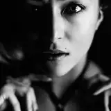
In the last image that I posted, there was something that was kind of driving me crazy about it. I found that while the colours were okay, the balance felt 'muddy'. Its hard to explain without nerding out about 'levels' and 'curves' too much, but the darker parts of the image felt a little blurry. Like they were too mixed in and it gave everything too much of an 'airbrush on the side of a van' feeling. The image also wasn't conveying the light how I wanted it to be. Kind of a morning wandering to afternoon feeling.
I'll leave the other versions up, of course, for those who prefer it to this one. And while I still want to go in and 'fiddle' with a bunch of things on this, I'm at least at a level I can step away and have the more glaring thing that was triggering my OCD settled.
I apologize for a bit of a spam-post of this one.
-T.J.
Tim J.
2020-10-11 04:15:56 +0000 UTCPerfesser Bear
2020-10-11 02:56:24 +0000 UTC