Hey everyone!
Ever created a piece that ended up looking monotone? Or maybe you finished a work, but the reaction from your audience wasn't what you expected? Today's topic aims to help you identify what might be off.
We'll dive into a key element for creating captivating compositions: contrast. You may have heard this term before, or even have a notion of what it means. So let's clarify what contrast means in this context.
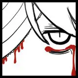
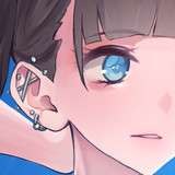
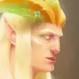
Contrast, simply put, is the difference in visual elements that makes one stand out from the other. In shapes, this can mean the variation between large and small forms, or busy and empty spaces. In colors, it can refer to saturated versus desaturated hues, or a single color that breaks the palette. In terms of values, it's the difference in black and white aspects of the composition, such as lighting and shadows. Addressing contrast well can lead to aesthetically "interesting compositions."
Contrast in Shapes
When your artwork lacks contrast in shapes, the elements in your composition may all vie for attention equally, leading to a lack of focal point. In essence, it dilutes the hierarchy of your composition, making it unclear where the viewer should focus their attention first, next, and last.
Tip: To effectively establish a focal point and a clear visual hierarchy in your artwork, consider incorporating a diverse array of shapes with different geometries such as combining organic curves with angular forms. Additionally, vary the sizes and orientations of these shapes to create multiple levels of interest. By doing so, you guide the viewer's eye from one key area to another in a deliberate manner, adding depth and focus to your composition.
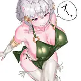
Example: In a character design, consider giving the character a robust, muscular torso juxtaposed with elongated, slender legs. This interplay between contrasting shapes not only adds visual intrigue but also guides the viewer's eye up and down the figure, thereby establishing a focal point and a dynamic visual flow.
30min Exercise: Draw at least six shapes (two squares, two circles, and two triangles). Make one of each shape noticeably smaller than its pair. Next, arrange these shapes into a layout, such as a character composition, composition with characters, or an illustration with different shapes. Keep the larger and smaller shapes apart from each other to create a balanced yet diverse composition.
Contrast in Colors
Without contrast in colors, your artwork may fail to evoke emotional responses or set a specific mood. Colors have psychological impacts; for example, red often signifies passion or danger, while blue can represent calmness. If all the colors in your composition are similar in hue and saturation, it can result in an emotionally flat artwork. In short, you miss the opportunity to guide the viewer's emotional journey through your piece.
Tip: To induce specific emotional responses and set the desired mood for your artwork, employ a calculated palette that includes a range of hues, saturations, and tones. Use complementary colors to highlight areas of interest and analogous colors to create harmony. You can introduce a bold, contrasting color to serve as an emotional pivot or focal point. This strategy can improve your work with the depth of emotional tone, making it more compelling to the viewer.
Example: For concept art of a forest scene, employ various shades of green to represent the foliage but introduce a vibrant, almost startling shade of crimson for a creature that's hidden amidst the trees. This pop of red serves as an emotional and visual pivot, immediately drawing the viewer's attention and adding an element of surprise or danger.
30min Exercise: Paint a basic scene using three to four colors from the same family, like different shades of blue. Then add one distinct color, such as bright yellow, to one specific area. See how this 'outsider' color changes the focus and overall mood of your scene. Apply this rule to a character design composition, composition with characters, or an illustration with different shapes.
Contrast in Values
When there's insufficient contrast in values, the sense of depth and three-dimensionality in your artwork suffers. This can make the entire composition appear as though it exists on a single plane, devoid of any atmospheric perspective. A lack of value contrast can lead to a visually "flat" experience, making it hard for the viewer to perceive the spatial relationships between elements. This undermines the realism or dramatic impact you might be aiming for.
Tip: To restore depth and three-dimensionality to your artwork, make deliberate use of the full spectrum of values from dark to light. Utilize dark values for elements that are meant to be perceived as closer or more important, and lighter values for elements intended to recede into the background. Employ gradient values to give the illusion of volume in individual elements and atmospheric perspective in landscapes or larger scenes. This will enable you to construct a multi layered spatial narrative within a single composition, enhancing its dramatic impact and realism.
Example: In an illustration where depth and space are key, utilize a range of dark to light values strategically. Place darker shadows or elements in the foreground to emphasize their closeness and importance, while using softer, lighter tones in the background elements to create an atmospheric perspective. This intentional value contrast enhances the three-dimensionality of the scene, making it more visually engaging and realistic.
30min Exercise: Pick a simple object or scene and paint it in grayscale. Use at least three different shades: one close to black, another close to white, and one in between. Adjust these shades to emphasize which parts of the scene or object should appear closer or farther away, enhancing the 3D effect. Apply this rule to a character design composition, composition with characters, or an illustration with different shapes.
Conclusion
Contrast is present at every level of my creative process. I don't usually focus specifically on this at the beginning, but I use my intuition to figure out how to balance these elements depending on the concept I'm trying to build. My advice, if you want to tackle this subject, is to pick one of those three steps and focus on it for a while. That way, you can build that intuitive muscle for when you need to combine them in the future. You got this!
.
Welcome to all new patrons. Feel free to drop any questions here in the comments, via DMs here on Patreon, or in our Discord group. I'll be more than happy to answer and see your progress.
If you found this article useful, please drop a like or a comment! I appreciate the feedback and also criticism, I want to improve and give you the very best.
For more information, check out our Patreon FAQ: https://ramonn90.myportfolio.com/faq and Patreon Catalogue: https://ramonn90.myportfolio.com/work
Thanks to your support!