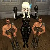
This project is still on the backburner but not forgotten. after sitting with the second version of this poster for some time i realised i still wasn't hitting the desired mark and decided to give the painting another overhaul.
i was eschewing the use of cinematic/photographic effects in painting for a while as i used to use a lot of it in my much earlier digital art and i'm also tired of the same old look in every new blockbuster movie poster. however i realised that if i want this to look like a full-page ad in an early 90's video game magazine then i was gonna have to lean into the high contrast filmic effect. i'm much happier with the look and it also brings some much needed realism to the background as well as framing the figures better.

Right: Original version, Left: second revision. i still enjoy the vibrancy of the blues but in the end it wasn't meant to be! new version still needs work but i'm confident i'm heading in the right direction.
If any new patrons are interested in the work for this secret-ish thing you can see everything in the project tag below :) thanks for reading!