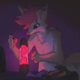
the inks for this commission, now finished! [view here]
i went heavier on the blacks since i was keeping the cell shading very minimal, just using rim lighting to highlight the left character. i could've worked into this even more, particularly with the background, but i didn't for time/energy reasons.
spotting blacks is really one of those things that is heavily down to your own artistic intuition. it isn't completely about accurately depicting sources of shadow, its also an important compositional tool and a good way to build depth and texture. for instance, to emphasise the left character's silhouette i made the inside of the jacket black, and i also added a heavy shadow underneath the arm to bring it forward. i originally drew the jacket looking quite stiff like leather, but i changed it to look more synthetic by adding lots of small creases. these days i'm less of a stickler about line weight but i made sure to add a heavier line around the foreground character's silhouette to really push depth.
another important aspect to me is balance. i tend to go by the 80-20 rule a lot, where i distribute detail on ~20% of the image and leave the rest fairly sparse. this stops me from overworking the image and is particularly important when i spot the blacks. on the foreground character, i concentrated around the detailed creases at the end of the sleeve and around the knee and left the rest mostly untouched, apart from a few large, basic shapes. if i used the same level of detail for the entire character, it becomes harder to look at and more homogenous; it's important to have places where your eye can rest. this goes for the background character too, who has less areas of detailed black to place them further back in the composition. varying the shape and type of brush stroke is also part of balance, and i alternate between neat triangles and rough blocks to add variety.
if you're interesting in building your own technique, i'd recommend studying what other artists do and what you like about it, and then think about why you like it. one of my favs is mike mignola, who's also very concerned about shape/silhouette and composition.

hiroyuki imaishi is also a big favourite. both artists use black and negative space in smart ways to cut down on detail work and make fun, dynamic, and instinctual linework.

a lot of people don't like inking, but that doesn't have to be the case! study your favourite artists and find what is fun and interesting to you :)