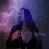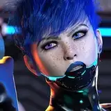
Something fun i did between commission work! this is inspired by the colour palettes from gundam 0083.
i've had a few people ask how i get the "old anime" look in my art, and i think what it really comes down to is the way you use colour. i've found that slapping loads of blur filters over the drawing can certainly make it seem like a VHS screenshot, but it still doesn't feel right. (although i did use a couple filters for this: i copied my lineart layer, inverted it to white, blurred it, and set it to overlay at 50% opacity behind my original layer to give it that crisp look you tend to get in screenshots. i also used a layer of grain to introduce texture)
i think the look is all about the limitations of traditionally hand drawn and painted cels, without anything like digital compositing. colour becomes restricted, since you can only use what paints the studio has in stock. the limited palettes of pre-digital anime appeals to me so much because of this, and the things that colourists did with a just small number of colours really stands out.
i tend to like the look of older anime over modern stuff for this reason - now, the beauty of the art often gets lost in hazes of gaussian blur and gradients. i reckon evangelion is the best example of this. see below the original scenes (left, 1996) and the rebuild version (right, 2007). [source]

check out the rest of the article in the link and you'll see what i mean. the colour work in the original evangelion stands out tremendously.
Below is the board i compiled of screenshots from gundam 0083, aka stardust memory (1991):

You can see that 0083 is generally quite dark. The most significant detail (to me) is that greys aren't entirely grey - they're usually desaturated purples or teals. Spots of red draw your eyes to the characters. Teal and red is one of my favourite colour combinations so i was naturally drawn to this scheme, and i'd been dying to use it for a while now.
Next, something quite the opposite: shots from macross plus (1995)

Macross plus was made when digital effects were starting to appear in anime. it also enjoyed a huge budget - but its smart and bold use of colour remains a standout. Particularly, the flat blue sky pierced by bright missile trails and orange explosions became an iconic look for the series from this point onwards.
so in essence, there isn't one way to get that "old anime" look. the best thing to do is look back on the huge variety of styles and techniques and think about how the look was achieved in the first place - with paint on a celluloid sheet.
Marlo Mogensen
2019-05-24 10:00:45 +0000 UTC