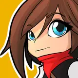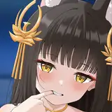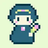
i spend far too much time on adjusting stuff when making icons...
not sure which i like better or if i want to combine parts of both or change the colour of the text or whatever but here is a quick look at two icon ideas i'm deciding between!
the one with the text on the bottom feels kind of like an instant camera photo which i like but i think the general feel of the second one might be better, hmm... let me know if you have any thoughts 👀
edit: added a third option but i'm not loving it 😅
npckc
2021-05-09 00:52:26 +0000 UTCVoyage Goya
2021-05-07 16:55:20 +0000 UTCTeagan Bread
2021-05-05 15:11:15 +0000 UTCoceansong
2021-05-05 08:49:35 +0000 UTCDyna
2021-05-05 08:45:02 +0000 UTC