
Hi everyone,
Sorry this is so late in the month, I'm juggling a lot of things at the moment, and will be until July, so I'm really sorry if things are a little out of synch!
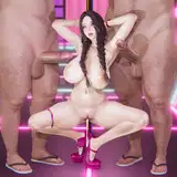
Here is your Step-by-Step for "Bare" for April!
As always, let me know if you have any questions at all, and if you found this interesting!
If you have any suggestion as to what information I should include in future Step-by-Steps that I am not already including, don't hesitate to let me know also!
✦THE MATERIALS✦
Brushes
You are probably used to seeing most of these by now, but here they are again, XD


Paper

Once again, I used a sheet out of my Arches 640gsm pad, which I absolutely adore.
The texture of cold press paper is tricky to scan, but cold press paper is so much better for gouache that I just have to deal with it.
Paints
★ Turner Acryl Gouache

I used some of Acryl gouache for some background detail I knew I would be painting over.
I used the White for the stars, and a mix of the various blues and some Burnt Sienna (to flatten the blue hue a little), for the reeds and some of the sky and water.
★ Regular Gouache
 I'm afraid I don't remember exactly which colours I used for this piece, but my palette was very limited.
I used a lot of white, as always, as well as some Payne's Gray, because of course, and some Purple Lake, by Daler Rowney Designers.
I also mixed some of my white gouache with Moonglow and purple watercolours from my Winsor and Newton set.
★ Sennelier Payne's Gray Watercolour
I'm so glad I bought this massive tube....
★ Daniel Smith Moonglow Watercolour

[The Moonglow tube I have courtesy of the amazing Virginia, who gifted me a bunch of paints I had never tried before, and now absolutely adore! Thank you Virginia!]
★ Daniel Smith and Qor Watercolours

This set of DS watercolours was incredibly generously made and gifted to me by Virginia, and I am so ridiculously touched and grateful for it, because those watercolours are an absolute delight!

I bought myself a small set of Qor Watercolours last year, as I had heard so many good things about it and wanted to try them out. They are delicious to work with, very very pigmented, and I poured a tiny amount of each colour into a small container palette I got in Korea. It isn't air-tight, so they did dry, but I knew that and don't mind.
I also added some Moonglow in the palette, as well as the compulsory blob of White Gouache, I have been enjoying the Linel Titanium White at the moment. It reactivates beautifully and is really super opaque.
★ Misc
Tape
 I use Pro-Tape/Permacel, it is quite sticker and smooth, and gets me the nicest lines of all the tapes I have tried. It does often require that I use a hairdryer to remove it, since it is quite sticky, but it is by far my favourite tape, and the Amazon seller I got it from doesn't sell it anymore, which is tragic.
✦REFERENCES✦
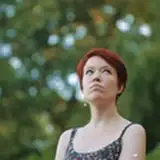
Body and Skin

I used most of these as pose references, but I also inspired myself a lot from the first photograph when it came to the colour scheme and tone of the skin.
Hair

Water

Misc

Those last images are part of my miscellaneous folder for my references.
They are images that I didn't pull from directly, but that were still useful for me to have in the background to keep reminding me of where I was going.
So, for example, I kept that illustration in the top right because I love the look of the trees sticking out against the light background, and it inspired the white reeds on the black water in my final painting.
When I am at the research stage of a painting, I open up a folder in which I save all the images that feel even vaguely relevant to the look, feel and mood I want to give off.
I probably only end up using about 40% of the images I save in that folder, and will directly refer to probably 20% of that 40%.
But saving ALL the image that inspire me for a piece is a good way to refine how I want my painting to look, exclude the things I didn't realise I didn't like, and pin point exactly what I am thinking about.
✦THE PROCESS✦
The Sketches

This was the initial sketch I had done of this idea, some time last year (almost a year ago I believe).

I decided to revisit the piece, and started out by sketching it on the size paper I knew I would end up painting it.
I used my Blue Colerase Prismacolor Pencil, on some Daler Rowner Cartridge paper cut down to size. The border you see is where the tape would go on the final painting paper. I helps me determine exactly where I will be painting, and keep the sketch within those bounds.
I really failed at positioning the sketch on the paper however, plus it just looked weird to me, so I scanned it and edited it slightly in Photoshop.
I made use of the mirroring option, that allows me to flip the image. Seeing the image flipped will allow you to see anything that looks iffy and correct it.
Editing the sketch digitally also allowed me to enlarge anything that felt out of proportion, like the hand (I like big hands, and this one felt too small).

Above is the modified sketch. The white marks are where I moved pieces of the drawing and repositioned them where I wanted them.
I then printed the sketch on normal paper, to the size I wanted it, and transferred the whole thing to my thing to my final painting paper using Carbon Transfer Paper.
I amended the hand directly on my final paper, which wasn't the smartest move, but as I knew I was going to paint in gouache during some of the process, I knew I could get away with some sketchy lines under there. A little. Not too much. It was still a little risky, haha.
Cold Press watercolour paper like this doesn't allow for effective erasing, and Carbon Paper lines aren't made to be erased well either, so you can see where the line of the previous hand design is still there quite visibly. But it worked out in the end!

The Background
1. The Sky

Initially, I wanted the sky to be really bright and light, probably in big part inspired by that illustration in my last slide of references above.
I had also wanted my reeds to be dark initially, again, with the same source of inspiration.
Something I am learning to do however, is to do my best at differentiating between what I think looks cool in images I love, and what would actually work in my final piece.
Because sometimes, if I am being honest with myself, I just want my piece to look like the thing I like, which isn't necessarily the best way to grow, because, instead of analyzing exactly what I like, and then making it my own, I just look to emulate, without really creating anything new.
So in this instance, I loved the high contrast between the light and dark tones of my reference, but that was something I could achieve in my piece without having to emulate the exact tones of the image I liked. Does that make sense?

As I started delving deeper into the painting, I realised the sky didn't work for me, and started experimenting a little. I thought a stormy sky might be cool, but in the end, it gave the piece too much of a dramatic and tragic feel, which wasn't what I was going for. The head in the head being disturbing and a little claustrophobic enough as it is, I wanted something that would give the whole image a sense of space and bigger things.

To be honest, I wanted a starry sky. I hesitated for a while in doing that, because I felt like, after "Wanning", and a few other pieces I have planned to be space-themed soon, I had been giving starry skies to my pieces a little too much, and it felt repetitive.
But after some pondering, I realised it is just something I need to go through, I need to satisfy my desire for big starry night skies, and it's absolutely ok for my pieces for have some recurring themes and visuals.
I think part of me likes the idea that all my characters and creatures might be living in their own, common and shared world, and having recurring details gives them a certain feeling of kinship that I enjoy.
Plus, the whole piece is meant to look somewhat cold, with the wet hair, the cool tones of the character's skin, the bone-white reeds...And stars have that same quality, of exquisite fragility and beauty, but with no heat, and that completely and utterly inaccessible nature of theirs.

The sky did feel a little flat though, so I added dabs of lighter blues and tapped them with my finger to phase them and make them blend into the darker blues already there, in order to achieve a faint "constellation" pattern and texture.
I also made sure to concentrate the stars along a slightly diagonal line that aligns itself with the eyes somewhat, so as to give the piece more rhythm, and more depth.

And there you have it. The sky. :)
2. The Water

The first thing I painted on this piece were the branches sticking out of the water.
Because I knew that they might change, and that I would be painting over them a lot, I used my Acryl gouache to paint them, so that they wouldn't reactivate and sully anything I painted on top of them.
I then did a wash of Payne's gray over the water area, just to block it in in my mind, and establish the main areas of contrast i the piece. I wanted to get a very rough idea of what it would look like if the character was quite light, but the water was dark.
As you can see above also, I wasn't yet certain whether I wanted the character's reflection to be dark or light, and initially opted for light.

Painting the water was the trickiest part of the whole piece.
I have little to no experience of painting water, but I do want to incorporate it more in future pieces, so this was somewhat of an exercise.
The trick with water, is to make sure to paint the darkest areas next to the brightest highlights, but with a lot of variety and randomness.
It is similar to painting fabric, as, obviously, the crest of the wave will catch the light, whereas the dip of the wave will be dark and shaded.
What is particularly tricky, in my opinion, is getting the values in between right, so that the crispness of the highlight stands out. There needs to be quite a lot of in between values and variety in tones in the water, but with that constant "light-dark" relationship.
I used my dagger brushes to create some organic looking pattern, a little light you would get with a brush pen, with those almost calligraphic looking tapered ends and fatter bodies of the lines.


In the above slides, you can see that I started playing with the reflection of my character.
However, I quickly decided that I preferred to play with the transparency of the water instead, as you'll see below.
I was very much inspired by how the black reeds looked at this point, as they inadvertently started looking like they were underwater in places, which really appealed to me. There is a ghostly quality to underwater things, and that matched the mood I was going for in the overall piece.


And so finally, I repainted the reeds white, using my white Acryl Gouache (which comes in the tiniest tube, and I am almost out of it. Sad times.).
I don't know why I wanted those reeds so bad, but I was fixated on the idea.
For some reason, they make think of bones, of living things that died and were bleached by the moon and the stars and became these beautiful, eerie ghosts of things past.
They are a mix between bones and dead coral, objects that could be pieces of jewellery but are also echoes of life.
And this whole piece to me, is somewhat ghostly, like things lack consistence, and are on the cusp of disappearing into nothing. Into the dark void of the universe, or the black depth of the ocean. I love it.
The Character
1. The Body

I decided on cooler colours for the skin tone of the character early on, but in order for it to not look too dead and flat, I incorporated some warmer yellows and ochre as my first layers.
Yellow is a colour I often used as a base colour for skin tones, as most skin tones include it, and it grants an inner light and a richness to highlights that makes skin look more organic. I think.
So I did one light layer of yellow watercolour, and then added darker ochre/light grey layers gradually on top.
I painted most of the skin in watercolour at first, only adding gouache towards the end, to add contrast and richness.

A colour that I had rarely used before but got a lot of use out of in this piece is "Moonglow", but Daniel Smith Watercolours. It's a GORGEOUS blueish purple, and I was sent some by two of you lovely peeps (Thank you SO MUCH Virginia and Lisa!).
I used it extensively in this painting, rarely pure however, as it is extremely concentrated. I often mixed it with a tiny amount of red for warm shadows, or Payne's gray, for cooler tones.
Lately, I have been experimenting with layering watercolours in increments, waiting for each layer to dry thoroughly before applying another layer, to create a visibly layered effect, where each layer feels separate from the ones underneath or above. I don't know if I'm making sense. I'm saying "layer" a lot, haha.
I start by laying down some base colours, usually light colours, which I'll mix on the paper in a wet-on-wet technique (I didn't do that for this piece, but I could have).
I then wait for that to dry, and then start layering the various tones I want to include in my piece ( I might do a post dedicated to this!).
The look I am looking for is a layering of distinct watercolour colours, with fairly defined edges, and minimal blending.
The thicker and higher quality the paper I use is, the better this effect works out, and Arches 600gsm is perfect for this.
I use a broad flat brush, either a dagger brush or a simply rectangular brush, to create easily identifiable planes of colour, with a certain geometric quality to them (the cheek for example).

As I progressed, I added an outline in Moonlight and Red in certain areas of the piece.
I strayed away from outlines for a while in my work, but I am finding myself coming back to them, as I have always enjoyed the clean look it gives pieces.
I made sure to stay away from the highlights points on the skin, and you can see that yellow base layer coming through nicely.
My final step with the painting was going in with some gouache accents to emphasize the shadows and texture. I used an colour that somewhat matched Moonglow in places, and also added light gray accents.

I also went in with a light mix of reddish brown, to add some warmth to the fingers, nose and lips.
I'll be honest, I personally am very happy with the skin in this piece. I loved working with a combination of watercolour and gouache, and I love those cooler tones so much.
2. The Face and Hair

From the first time I drew this concept, I knew I wanted the hair to look wet and matted, almost sea-weed like.
That was probably the most enjoyable thing to paint!
I wanted it to look almost like an invasive plant, wrapping itself around the neck of the character, and extending and wrapping itself around the reeds.
I also knew I wanted it to be pitch black and glistening (since its wet), although that was a little tricky for me,as I am not familiar with drawing hair very much.
Value tip :
I knew I wanted the hair to be the darkest part of the whole painting by far, so I made sure not to use any pure black anywhere in the piece other than for that, and I always made sure to not go too dark with any of my other colours, including the sky and the shadows of the sea.
That is always something I determine early on in the process, and, although I didn't do any for this piece, will plan out in my colour comps. Make sure you know where your lightest value will be and where your darkest value will be also, and then make sure the rest of your piece never goes as dark or as light as those areas.

I used my references quite heavily to work out the highlights of the hair, and made sure to keep the highlights quite detailed instead of smoothing them out, to emphasize the feeling of various clumps of hair sticking together from the water.

It took me a little while to figure out how I wanted to paint the face.
It may sound weird, but I didn't actually want it to be immediate focus of the piece. I wanted the eye to be attracted to the body, and then to the face, as I usually like for my pieces to seem normal at first, and then for people to realise what is wrong quickly thereafter.
I wanted the face to somewhat blend with the background a little, so I chose similar values, although used the colour to make it stand out a little too.
My pieces are not about body horror or physical deformities, and more about visual manifestations of inner turmoil and feelings, so I wanted the face to look somewhat separate from the body, and not just like it had been rotated from it.
To me, the dissociation between the body and the face, and the whole context of the dark waters, the dark sky and the reeds, gives the piece an ethereal feeling of loneliness, but also of introspection, inner discovery, and exploration of an inside world that is as big as the outside world.

I went for blind eyes because I feel like they speak volumes, they often, to me, reflect the idea of looking inside of ourselves instead of out, and they have such depth and expansion in them, that I find them more interesting as a narrative tool than seeing eyes.
I used gouache only to paint the face, not blending, and keeping the strokes of colour, as I like to do with gouache, to add even more contrast between it and the body.
And there you have it.
Bare.
I am much happier with this piece than I thought I would be.
Often times, I end up happier with pieces I just delve into without too much thought, than I do with pieces I spend a lot of time planning.
I remember loving the initial sketch I had done of it, and I'm glad I got round to painting it.
I hope you guys found this post interesting, It is absolutely massive, so, but hopefully vaguely helpful, or at least entertaining!
As always, if you have any questions, do leave them in the comment and I would more than happy to answer them!
Take care everyone,
M