New Spritework Feedback! | Patreon Poll #55
Added 2024-07-15 16:35:05 +0000 UTCHey Patrons! In this poll I’m asking for your feedback on the general direction of new spritework for Shattered Pixel Dungeon!
To quickly recap, I’ve been working with a few different artists for a little bit now to figure out whether Shattered would benefit from enhancements to its pixel art. This has been a frequent subject of Shattered secrets posts lately, and after a bit of back and forth things are starting to look very promising!
In this poll I’d like to gather a bit more feedback from more folks on Patreon, as a first step toward showing the art more widely and possibly adding it to the game! This post includes a whole bunch of the most positively received art from prior Shattered Secrets posts.
(If you have trouble viewing any of these images, or would like to zoom in on them a bit more, you can find an imgur album of them all here: https://imgur.com/a/ulJEaiu)
Firstly, here is an image showing off some improvements to level visuals, with better shading and some extra details. There’s a zoomed in before/after on the left, and a wider shot of potential visuals for a whole level on the right.
 Next is a whole load of improved item sprites! There’s a big variety here, with a bit more emphasis on the game’s weapons. The sprites are set up by rows, with old on top and new on bottom.
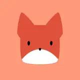
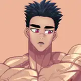
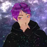
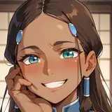
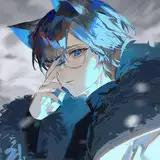
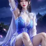
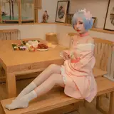
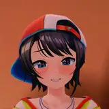
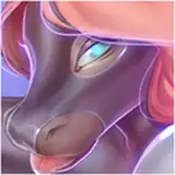
 And lastly we have a bunch of individual images showing off various experimental character art! This includes new enemy shading/details, some animations, an experimental new look for Yog, and potential new visuals for the game’s heroes! (note that there are two different marsupial rats here, by two different artists)


Please note that this is NOT a ‘do I add these to the game right now?’ poll. I’m still mainly interested in gathering feedback about the overall direction shown here, and whether this kind of art is a good idea to use in the game. Obviously some of these may end up in the game as-is, but there will still be plenty of time for feedback and refinement.
The results of this poll will help me determine whether this art style is a good idea to move forward with! Based on the results of the poll I’ll be showing these samples more widely to gather more feedback, and potentially integrating them into the game in the future.
Poll Options
Please vote for just one option this time!
All patrons are encouraged to share their opinion by commenting and voting, but currently only the votes from Golden+ Supporters are counted when determining a poll winner. Votes from Shattered Supporters are worth double!
Comments
I love the new candle sprite!
Spam Account
2024-07-23 17:29:20 +0000 UTCI *think* I like it, but uncertain. It looks more menacing up close for sure.
Matt Johnson
2024-07-18 19:00:03 +0000 UTCAlso keep the mimics derby tongue out of mouth no teeth thing I love it
Epiyuan Cancel
2024-07-16 01:43:28 +0000 UTCI really like the new sprites but I feel the more complicated ones will be difficult to read so maybe simplifying some will be best like the barbarian and succubus
Epiyuan Cancel
2024-07-16 01:40:24 +0000 UTCThe new Yog graphic looks amazing!
Ed Baldwin
2024-07-16 00:13:38 +0000 UTCI would really like the stairs down to be more visible - when I return to a level I often have to spend time looking around the map to find it.
Ed Baldwin
2024-07-16 00:13:08 +0000 UTCWill agree on that. Also Goo with face is something to get used to but the Necromancer looks amazing!
Florian
2024-07-15 20:04:26 +0000 UTCAgree with the above poster. Far too busy in some places. I do like the environment changes however, especially the more climatic fountain and alchemy station.
allowiscous
2024-07-15 19:02:10 +0000 UTCAlmost all of these are good changes. Especially liking the new look the heroes have, the mimic getting a more distinct look from the normal chests + visible teeth, the ghosts & their animations, and the other subtle details/shading seen in the rest of the sprites. The only two gripes I have are: 1. I'm not really feeling it with the evil eye and succubus's new looks. Perhaps too much detail/complexity? 2. The rat's buck-tooth. I absolutely hate it. It may be just me, but I think it makes him look too dorky.
Devious Dangerous Penguin
2024-07-15 18:32:56 +0000 UTCKeeping complexity in check has been a common point of feedback, and is something the artists and I will be keeping in mind for further revisions. It's actually something we already plan to do with some of the samples shown here.
Shattered Pixel
2024-07-15 17:58:51 +0000 UTCMy complaint for all the ones I don't like is that they're too busy.
William Lawson
2024-07-15 17:25:42 +0000 UTC