POLL: Which thumbnail would you click?
Added 2022-11-21 17:00:09 +0000 UTCSpoiler alert for an upcoming video...
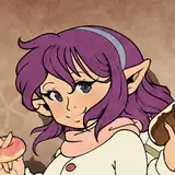
OPTION 1

OPTION 2

OPTION 3

Comments
The arrows and circles makes me wonder what's in that mountain. 🤔
Justin Howard
2024-04-12 19:56:26 +0000 UTC1
Justin Howard
2024-04-12 19:55:50 +0000 UTChttps://drive.google.com/file/d/1DFI7JP3z2u495dKDlk0qOQmAYcBMDIFu/view?usp=drivesdk
Francois Emond
2022-11-26 04:10:46 +0000 UTC1 and 3 but I lean more towards 3. Feel like 3 with a “magnifying glass” zooming in on the arrow’s location would emphasize the scale of the mountain but then the thumbnail might become to crowded
Francois Emond
2022-11-26 03:05:19 +0000 UTCI like how you can see the whole mountain in the 3rd one but in the first one the very grey mountain against the red circles and jacket draws my attention more to the actual bunkers and keeps me looking for longer
Rishi Gens
2022-11-22 08:14:45 +0000 UTC2. Really love the concept of 2 but needs to be a little more refined. Center Johnny, make him slightly biggeradd a glow arround him (preferably hand panted so it seems like hes actually in front of a glowing beam, also add a shadow of johnny next to him but fade out as gets closer to the light. Make the text Switzerland smaller and hidden bunkers bigger (thats the focus), add the red paint stripe behind the logo. As a graphic designer, thats what i would do. i defiantly like it better than the other 2.
Ezra Hollis
2022-11-21 22:13:04 +0000 UTC1. Works cuz: (a) bright colors (b) extreme facial expression (c) simplest, most intriguing text 2. works cuz: has more of a clear story & mystery to it
David Mora
2022-11-21 20:13:08 +0000 UTCLove that first one
Jay Swanson Too
2022-11-21 20:04:08 +0000 UTCOption 1 has the strengest “scoll-stopper” effect with the highest contrast and the eye contact. Well done 👍👌🤙
Julian Brustad
2022-11-21 19:41:11 +0000 UTCI'm not a big fan of any of these. I do like "Switzerland's hidden bunkers" as text over just "hidden bunkers". One arrow is less busy than three, and more evocative than none. But the pictures of Johnny are all unflattering and make him look confused rather than curious.
Peter Sturdee
2022-11-21 18:32:43 +0000 UTCI like 3 better, although 1 is really good too
Vijayeshwar Battula
2022-11-21 18:26:52 +0000 UTCAgreed!
David Mora
2022-11-21 18:17:50 +0000 UTCI like both 1 and 3, slightly favoring 1 because more arrows implies a more interesting story.
Robert Pettengill
2022-11-21 18:10:05 +0000 UTCThe light on your head in number 3 also made no sense to me. Yes, bunkers, dark. But my first thought was "Why does he need a light when to mountain is so bright and open?"
Theo Da Kaffei
2022-11-21 18:08:29 +0000 UTCGenerally number 1, but the arrows make no sense and are confusing. In number 3 it makes at least sense for there to be a bunker where the arrow is pointing. But in number 1 this looks like random spots on the wall right next to you. I like the colors, your facial expression and the swiss flag, though. Number 2 manages to both look silly and hide one of the main elements, the bunker entrance, behind the glaring light beam.
Theo Da Kaffei
2022-11-21 18:05:30 +0000 UTCThe mountain on Option 3 is the Aiguille du Midi. It is located in Chamonix, France, and not Switzerland. I suggest you change that mountain shot as it's not factually accurate.
Georgie Day
2022-11-21 17:45:44 +0000 UTCI like that you seem to be exploring the bunker in Option 3.
Kimberley Duclos
2022-11-21 17:44:30 +0000 UTC2,3 look somewhat unrealistic. 1 has a realistic background and facial expression
Komal Sanjeev
2022-11-21 17:41:53 +0000 UTCPersonally not a fan of red arrows, a combo of the picture from the second option and the layout of the third one would be my choice
Shadow Shinigami
2022-11-21 17:20:58 +0000 UTCCmonnn, you're gonna tell me he DOESN'T look like Spiderman in option 2?
Tiffany Baker
2022-11-21 17:17:58 +0000 UTCThis is the winning answer!
Ara Kevonian
2022-11-21 17:16:19 +0000 UTCAgree
Pablo Ordorica Wiener
2022-11-21 17:16:06 +0000 UTCNot just that, but the arrows pointing at the caves instantly pique my curiosity.
Ara Kevonian
2022-11-21 17:15:32 +0000 UTCOption 1 - white text and it’s red/orange background matches the Switzerland’s Flag, and the orange shirt is a good contrast to the dark mountains
Christopher Pickett
2022-11-21 17:09:43 +0000 UTCSame here
Luis Gomes
2022-11-21 17:06:22 +0000 UTCI think the face from number 3 looks best but i like the background on number one better.
Blake Henry
2022-11-21 17:06:20 +0000 UTCI'd go with option 1. The colors match perfectly with the text, the coat and the flag. The other 2 are quite good as well, but the first for me conveys the information required to the viewer to click on it
Vishwanath Puttagunta
2022-11-21 17:02:55 +0000 UTCThe red is so isolated from the other neutral colors in option 1 and it immediately catches my eye.
Jadeon Abt
2022-11-21 17:02:41 +0000 UTC