YAY she's done!!
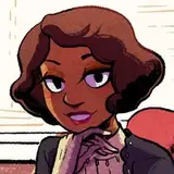
I really enjoyed working with all of the diagonals on this one, Fortuna was just begging to be made into a bunch of harmonious shapes! ✨
Originally I was leaning heavily towards using blue and purple tones for this design, but since I've consistently used teals for Leeds when doing these types of illustrations, I went for something that would similarly say "this is a stand-in for the Familiar grey."
 (this one of the Gladiator is still a personal fave, I think it came out handsome and dynamic and imposing)
sometimes I feel like in another life I would've made a decent logo designer... who wants to let me design their Olympic mascot.......
OH I just remembered, Fortuna was originally going to be named Artemisia! We changed it to Fortuna just because it felt like it fit the character more. Similarly, Winter was originally named Swanhilde (from the ballet Coppelia), but we assumed that no one would recognize the reference and also we could never remember the name Swanhilde lol. (also she was probably created before the ballet was written which would be an anachronism!)
Johnny Wander
2025-05-21 18:49:04 +0000 UTCJohnny Wander
2025-05-21 18:48:49 +0000 UTCskollipsism
2025-05-21 02:25:02 +0000 UTCHannah K
2025-05-21 02:02:03 +0000 UTC