Lician was kind enough to allow me to upload the critique. The general crits I gave for people's galleries are in the original critique post: https://www.patreon.com/posts/3906029
Ok so here we go:
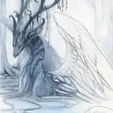
1. The original image. Now, this is a fine digital image. I'm a big advocate of letting people make whatever art they want to make and not placing value judgments on them. But on the other hand, there are always ways to make a piece of art more compelling to look at, either by making it more realistic or stylistic or what have you. There are also certain immutable rules you want to follow regarding form and symmetry, especially, if you don't want something looking 'off'.
2. So I sketched out and reworked some of the problematic areas, of which there were honestly not many. An under-the-jaw shot is very difficult and the artist did very well with it. There were only a few parts that stuck out at me. To show the asymmetries I found I drew the head as it appears in the image from another angle, one horn shorter than the other, the dewlap coming off of the right jaw, and then just an anatomical question-mark regarding how short and recessed the lower jaw is. Which might just be a part of the design, but usually canines don't rest entirely in front of the lower jaw. I also made an orb to show light direction, because it was a little hard to pick out from the original.
3. I made the head symmetrical and addressed the anatomical question marks, as well as added in more shading and highlights for depth. I picked a light direction and stuck with it, rendering the dragon as though it were existing in a 3D space with a single light source.
4. After looking at a greyscale of number 3 I fleshed out some flat areas, like the cheek, and added a backlight in the same color as the red background but a little lighter, in order to show the form better. I also included some details to articulate the form better. I could have gone on pushing and pushing the detail in and out for a completely rendered form but I thought getting it well-started was enough.
5. the original image in greyscale.
6. my re-imagining in greyscale.
The following are the things that were more important to address:
-the asymmetry in the head. The most important part of drawing an animal figure is symmetry. This is what allows us to perceive something as 'alive' and having a face, more than recognizable features like ears and so on. In a way, this is an unbreakable rule, even when faces actually have asymmetry. Symmetry just looks more attractive. So when you do make something asymmetrical, do so wisely, because it's always going to look 'wrong' to a human eye, no matter how realistically it's rendered.
-a full range of tonal value. This makes the object look like a real thing in a real space, and also more visually appealing. Of course, there are ways of stylizing this with line or cell shading, but the end idea is the same when it comes to representational art: to mimic real space in a way that's engaging. I also feel like the artist was trying for realistic rendering rather than a cartoony look, but just hadn't pushed it all the way, so I continued the rendering process.
The following things are changes I made stylistically or anatomically:
-the extreme overbite. In animals that have canines in this kind of configuration, the top and lower teeth always fit together in the same way and the overbite would be considered an undesirable and unadvantageous mutation. I'm not too hung up on that kind of hyper specific design, though, and if an artist just liked the look of the overbite then that's fine.
-the skin details. These I just added in as a matter of course while I was working. The neck looked very pouchlike in the original, and I prefer a tighter skin with an obvious dewlap. This version isn't any 'better' than the original in terms of design. It's just personal preference.
-the specific light direction and strength. I like a hard light because the high contrast between light and shadow can be very visually interesting, like where the neck skin is folded. This isn't necessarily the way it *should* be rendered, though. The artist could pick any light direction and quality, something more diffuse, just as long as they adhered to their own rules.
IN CONCLUSION, a lot of the decisions I made weren't necessarily better, just different. It's a single way to work on the image, not the 'right' way. It's important, when critiquing and getting critique, to know the difference. The best thing a critique can do is give an artist a better idea of what they want out of their own art and how to do it, not how to make art the way someone else wants them to. So take all my, and everyone else's, suggestions with salt.
hibbary
2015-12-18 03:31:46 +0000 UTC