In the run-up to launching the channel, I realized that I needed to do something other than just have a selfie for a profile picture. I decided pretty early on that the closing line of my intro video is actually a great tagline, so I decided that would be right there. Might be a bit garish, I don't know, but I like the sentiment, and I got to do a nice terminal nod.
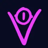
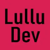
For the logo, I wanted to do something that had meaning, so I fired up Affinity Designer and got to work setting out shapes. Because I'm just going by my name for now, I figured my initials, "EY" would be a good place to start.
What I ended up with is an icon that is hopefully at once uniquely recognizable and legible. I wanted to incorporate the concepts of togetherness, progress, and belonging through the split arrow motif and the way it wraps around the "E" and acts as the middle horizontal stroke. The split in the arrow represents you; That each portion is aligned represents the desire to learn together. The gradual shadow underneath the arrow diverging from the "real" horizontal stroke represents the potential each of you has.
Or, y'know, maybe it just looked nice. Depends on your POV.
The colour scheme took some more time to figure out. I wanted something that felt both techy and welcoming, which is a tall order when tech is often seen as something cold and unfeeling. By using midtones for the majority of the icon and a "warmer" shade of blue, the hope was that I could use the sharper highlights to help drive home the tech aspect of the channel without being overbearing or too abstract.
The darker diagonal lines are meant to visually represent both a shadow and a resize handle; I've got an idea for a transition that involves sizing a window out from the logo that should hopefully work with that. The angle's not quite right for that, but it works best visually by maintaining the angle with the Y.
I did a bunch of different variations on the theme once I had everything decided upon, trying different lighting, shadows, and colours, but ultimately ended up sticking with something fairly simple.
I'll be the first to admit I'm not a professional graphic designer, so I appreciate that it's pretty amateurish. All the same, I think I like it well enough to use it.
MittenFacedLass
2025-02-01 18:17:48 +0000 UTCPieter Monnier
2025-01-30 18:42:41 +0000 UTC