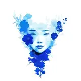
So...I ended up finishing the other two and the mini-series is done! You can read my walkthrough of Cerulean here!
If $10 patrons or higher are interested in timelapse videos of all three, please let me know in the comments and I will upload them.
I did play with different versions of the layouts, but after showing them to my boyfriend he preferred the original one after all.
I don't know if I will continue the series and complete the alphabet. Part of me would like to, because I think this could be a really cool artbook idea; the other part of me doesn't think I have the pull to sell an original lookbook very well. I'm glad I got ABC down as a "proof of concept" at least, and I like this composition style enough that I might play around with it more.
Regarding the color of absinthe: I know many people consider absinthe to be more emerald green, but personally I've always associated it with a yellower green and I designed this illustration with that shade in mind. Apparently absinthe becomes more yellow-green as it gets exposed to light and ages, so I think both hues are correct anyways? What color do you usually associate absinthe with? 🤔