Pantone 2021 (art process)
Added 2021-11-16 20:00:05 +0000 UTCThis was originally intended for $5+ patrons, but I'm publishing this for all patrons instead because this is the only art I've been able to work on as of late 😅
I'll be writing about the process behind my design for Pantone Color of the Year 2021. As the artwork is still in progress, this post will be regularly updated so keep your eyes peeled!

I've not enjoyed most of the recent Pantone Colors of the Year, but I really didn't enjoy this year's choice. The past Colors of the Year have all been on the duller side but you really can't get duller than a color named Ultimate Gray. I also think picking two colors feels gimmicky, especially when the first and last time they did it was pretty recent (Rose Quartz and Serenity in 2016).
But, part of the reason I don't design until the end of the year is that it's nice to have the full year to mull over it and come to terms with it. The concept I decided to focus on was the vision of a bright Illuminating Yellow shining through the monotony of Ultimate Gray - I'm guessing the optimism despite everything going on in the world is what Pantone wanted to represent with this choice.
I had this idea of a gray suit with some frilly yellow tulle sticking out, and trying to juxtapose this boring business-like suit with something more grand and fantastical.

These are the first thumbnails I came up with. I ran them by my friends and 2 ended up being the favorite. I actually expected 3 to win, but I was rooting for 2 since it captures my original idea the best, I think. I normally don't do asymmetrical designs so it was a nice change of pace!

Figuring out the pose for the design, but also a fitting hairstyle. I went with the right pose because a runway walk helps the "fashion" of this design to come across.

Fleshing out the sketch, including the specific shape of the frills. I saw this asymmetrical suit neckline by a designer named Melique Street and I really wanted to do something like it.

Added the other frills on a separate layer in case I want to make them a little translucent when inking.

Figuring out the right colors before I ink.

Lineart done and inked. I started to color, but then I zoomed out and decided that the current lineart was too thin.

Thankfully Clip Studio Paint lets you change the lineart thickness if you use vector layers, so it was an easy fix. I also added more color to the lines.

First pass at coloring and shading. I've been trying to go for a more flat coloring style for a while, ie no shadows, but it doesn't seem like my flatter coloring performs well on Instagram. I know I shouldn't care what the internet thinks lol, but fuck it I decided to try more detailed shading again because why not!

Added my standard background for the Pantone looks. I usually add a white border around the design, but reworking 2019's Living Coral made me realize that it doesn't work with every look. With a busy design like Living Coral, the white just makes everything look busier. So I decided to try something different...

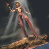
A shadow really makes the presentation look a little more fashionable, huh? Especially since the design is the same color as the background, I think it helps the design pop more. I went back and edited Living Coral to add the shadow too, and it works well enough that I think I'll replace the white border with this officially.
I also adjusted the colors slightly to help make the look pop more. I think she's done, but I'm debating adding some pencil line textures to make the drawing feel more complete. I might try it.

Here's the final version with etching in selective places - I think it adds a nice touch!
Comments
That looks so lovely 😍
SS-chan
2021-12-03 01:34:13 +0000 UTCEchoing Monica love seeing the process so much. Also this series is forever iconic
Enaree
2021-11-16 20:29:29 +0000 UTC