What is this?
A study? A commission type? Mmmhh... 60% column A, 40% column B. The idea hit me as something that I could use as smaller work that could help me practice numerous things: Brush economy, edge control, shape information and expression, in a controlled environment. Don't worry if you don't know what those are. All terms in italics will be explained in what I think are simple terms at the end, along with little explanations along the way in service of the narrative, but let me know if you don't get it. I did go to art school and of course that makes me a little pretentious and give overlong explanations~
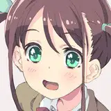
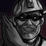
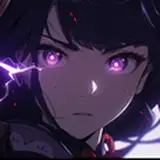
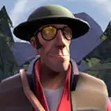
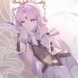
Other than that, they're headshots of people's characters! Something that's small and simple, which definitely I think holds a place in my repertoire of offered commissions which tend to include a more cognitive approach to artwork and requires a lot more of the big brain thinky about composition, story elements, directional forces, shapes, color theory, and then including what your character means to you on top of that, and then brush economy, edge control, etc. That's perfectly fine if your desire is to make artwork that's the best it can be, but with these I wanted to learn as well. And as Kenshin Himura's master Hiko Seijuro once quoted from Confucious, "The man who chases two rabbits, catches neither."
INSPIRATIONS
Brush Economy
There's other things that inspired me as well! Doing expressions is fun and something I needed to practice, if the chronological order of these headshots doesn't give that away. Another was the desire to improve my brush economy, since I tend to fuss with my brushstrokes a lot rather than slowing down and thinking of the right brushstroke to make and how limiting my brushstroke count would not only give me deeper insight on the right brushstroke, but the more I practice, the faster I would get! Slow down to speed up. First be right, then be fast. That kind of thing. In terms of speed, these headshots take me around 2.5 hours so... y'know, I'm only going to get faster! After watching the following video, I got the inspiration to start on this idea: https://www.youtube.com/watch?v=pLiANyLGh68
Edge Control
As I was practicing though, I recognized a distinction between my work and the work of those I have in my waypoint folder. That thing I decided, was a consideration for edge variety: hard edges, soft edges, and lost edges. In painting, not everything needs to be exactly portrayed like they have to be in lineart.
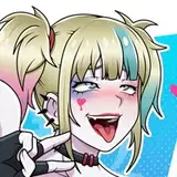
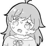
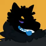
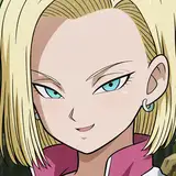
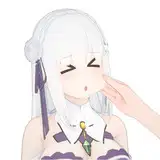
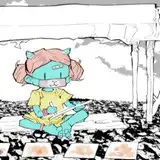
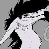
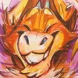
Edges can have a softness to them to reduce contrast, even to the point of losing the edge, and thus the distinguishing contrast that separates two objects, like the left shoulder of Caaaarrrrll the kobold and the background. That's not something you can do with lineart. So if you see HE, LE, and SE, that's me planning out where I would put each of them.
Now with the inclusion of edge variety, comes the risk of OVERUSING edge variety to the point that the intent of what you're drawing is lost. The unimportant things can be kept vague but if the point of your painting is the expression, then it won't do to make the eyes, or flair of the nostrils blurry. Making edges a variable is only as useful as it is in serving the point of your picture. If you aren't read for that, then that's fine. Edges are a complicated subject and these are ONLY the basics that I'm learning from a practice that only exposes me to one aspect of them.
If you'd like to learn more though, here some great resources that have assisted me in learning beyond ARRRT SCHOOOOOOOLLLLL. If you get that reference, hello Twitch Streamers! And thank you for the biggest support you could give me!
Muddy Colors: https://www.muddycolors.com/2015/04/10-things-about-edges-2/
Edges in Painting by moderndayjames: https://www.youtube.com/watch?v=w3zVGXSw_d8
Using edges to guide focus with Marco Bucci: https://www.youtube.com/watch?v=nnhj5efzN_w
How varying edges help strengthen your compositions with Ian Roberts: https://www.youtube.com/watch?v=VV8XEwb8-BE
Shape Information
But as you can see it wasn't just edge control I was a thirsty little flower for. I also wanted an understanding of shape information. Shapes to me have always been one of those vague things like color and composition that can express an emotion but it's such a convoluted mess of a combination of factors that come together to form the final statement and you won't really know what exactly you're saying until you have it down... "UNTIL TODAY", thought I.
Shapes, like everything in painting, come together to form your final statement and the shapes can either be conducive to your statement or clash with it, and both can be useful in the right circumstance!
For this first attempt I was focused exclusively on shape appeal. This incorporates design aspects like shape flow, combining shapes, simplicity, and incorporating big medium and small shapes! Including these factors will assist with making a more interesting shape!
For more learning, enjoy this video: https://www.youtube.com/watch?v=P6yJO9gKSAI
Now this next part is entirely hypothetical on my part as I have yet to find a video on it and thus have my hypothesis justified by others describing the same thing. I do have a tendency to overthink things so take it with as many grains of salt as are inversely proportional to how much you trust my opinion.
Doing expressions simplifies what I need the final statement to say to the viewer so I know what I need the final product to be... in words: Happy, sad, dejected, goofy, etc. Now I just needed to get down a representation of the final product, before I started eating into my brush stroke count to get a sneak peak at what my final statement would be as supported through shape language.
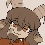
You can see me doing this in Hakawne's piece specifically, where I outline in the sketch, not only shadow shapes, but also light shapes. Being a first attempt, I didn't consider the shapes effect on the final product. I was only considering shape appeal: big sweeping kinds of shapes that exaggerate the expression. To clarify, this isn't nothing, but I'm thinking those shapes should also be balanced with the tone of the expression and this attempt wasn't, leading to what I alluded to earlier: my shapes clashing with the statement.
All of this leads into vague sentiments about what shapes mean what feelings, which I can explain on a base level:
Circles: organic, inviting, open, empathetic, friendly
Squares: sturdy, dependable, loyal, stubborn
Triangles: sharp, dangerous, adversarial, antagonistic, slick
With these almost elemental aspects of shape language, try mixing and matching them into different forms! For more information on that I recommend Brookes Eggleston and the Character Design Forge: https://www.youtube.com/@CharacterDesignForge
Expression
Lastly, we have expression. As I said, I feel I've been lacking in my ability with expression lately. With so much else to focus on, it's important to go back to things you used to focus on. An ignored skill is not just a stagnating skill, but an inversely progressing one, though that might just be me with an ADHD brain. Unless I get it down to muscle memory, it's generally lost until I pick it back up again.
For depth of expression, I can't recommend enough that you look at the work of 2D Disney animations and even moreso, animator's work in general. My personal favorites have been Jim Hawkins from Treasure Planet, Klaus, even Steven Universe for it's simplicity.
Simplicity, I think is a good operative word. Lots of animators will have a mirror on their desk so they can make faces at themselves and thus have a quick reference for details necessary in an expression. NECESSARY! You aren't going to copy all of the details of a face. That's how you get "dog with lips" syndrome in furry art. It's on you to look at your face in the mirror, recognize what details are essential to make the expression work, and what details are secondary and only add to the confusion of what the expression is trying to communicate.
As you'll hear me say a lot if you ever have the... experience of meeting me, there is nothing simple about simplification, so if you don't get it right away, don't worry. Simplifying is complicated! My recommendation, learn more than you need to, then work on simplifying things DOWN to the level you need them. In the realm of expression, this involves drawing a lot of human faces from reference! I KNOW! HUMANS! GROSS! But they're useful... sometimes...
And that's really it. All I've learned so far, (which taking account of... is a lot more than I thought) and all of my thoughts in their entirety on these headshots. I'll probably have more to say as time goes on and I do more of these, but I'll be sure to let you guys, gals, and non biney pals know if I hit on any more of those.
HOW DO THIS?
So best to describe it in steps I think? The five steps you've seen are really just themes that I focus on until I get to the assigned brushstroke count. Only, whenever I do the base colors I'm also laying out the basic value structure as well as defined in the sketch, so don't think of them as strict outlines, but rather a theme to focus your VERY limited number of brushstrokes.
Step 1- Sketch (image included)
So the image starts with a sketch. This is designed to get shape information and notes down in front of me so I know a little of what I'll be doing with my paint. I plan out where all the varieties of edges will be knowing that typically you want your hardest edges where you want the viewer to focus on. On top of that I also plan out the shadow shapes and light shapes, keeping in mind how those shapes sell the illusion of a 3d headshot, and how those shapes help lead the eye around the canvas. USE REFERENCE!
Step 2- Base Colors (image included)
By this point, typically around 20-30 brushstrokes, I want all of my base colors I'll be working with down including the yellow underpainting, which I'll let peak through here and there. Before I start, I get my colors selected, adjust them for the gamut I'd like to work in, and make a darker value version of each of those colors. Sometimes I'll make a lighter value of the color too.
Step 3- Values (image included)
While I'll already have basic values down, due to dedicating 1 dark value and 1 light value of every color to a single stroke in the 2nd step, this phase is dedicated to selling the illusion of 3d. Deepening shadows on planes of the face, facing away from the light source, reds on the border between light and dark shapes (when I remember) to imply subsurface scattering, and almost most importantly, creating light shapes.
Step 4- Occlusion (image included)
So you'll notice in step 3 that something appears to be missing in the texture of the face. Namely, everything kind of looks samey value wise. There's a variety in the values that seems to separate what it is now from what other paintings seem to have. A flatness, borne of the method we're using here. In my experience, this can be chalked up to a lack of occlusion shadows that darken up the areas of the figure that light REALLY can't get to. In this example, darkening the inside of the orbitals of the eye, the hairline, and beneath the jaw. The general placement is determined by the thought "If I need to put a line here to define and edge, it probably needs an occlusion shadow."
Step 5- Finishing up (image included)
With my remaining 30-40 brush strokes I take care of those last little bits I need to focus on that didn't get enough attention the first time I put them down, or just errors in placement, or I just don't like how it looks (very important consideration). In this step, I'll lose edges, add more light/shadow, include colors I want in there, and just general exit plan stuff that isn't covered by my formula'd approach up to this point. A formula is nice for consistency, but a lot of expression can be achieved in those last 30-40 brush strokes! In this case I needed to change up the lighting to have more of a kicker lighting, then as if the characters are being lit from the front, so... yeah formulas are only as good as you are at planning! Leave some room for chaos!
When all that's done, you're ready to post, my friend!
Terminology
Brush economy- Getting the most result out of the least amount of brush strokes. Relies on implied detail rather than specified and obsessed over detail.
Edge Control- The utilization of edges of objects or elements in your painting to communicate to a viewer what is worthy of focus and what isn't
Shape Information- All of the information that can be communicated through shape alone
Composition- The arrangement of elements in a painting. Anything from props in a background to character placement, to how big that character is as compared to everything else. Elements of composition: Balance, Contrast, Focus, Motion, Pattern, Proportion, Rhythm and Unity
Story elements- Elements in your art that contribute to the story you want to communicate to your audience
Directional forces- Visual forces in a painting that guide the eyes this way and that. Typically lead to a focal point
color theory
Waypoint folder- An iteration of my own design based on the concept of a living folder. Both are directions in which you want your art to go based on art you've seen before, but a waypoint folder is more of a short term version designed specifically to influence one or a series of future paintings that follow a similar theme
Living Folder- A folder designed to give your art an overall direction based on artwork made by other people that inspires you. A living folder should only ever have a maximum of 20 pieces of art in it. If you want to add one past that, you have to take one away, which creates a greater consideration for what kind of art you like more while maintaining very quick searchability.
Shape flow- the directional forces of a shape that help lead the eye in one direction or another, the overall expression of which forms a consistent and cohesive pattern.
Simplicity- Hard to do actually. Taking the factors that make up a thing and removing all of the unnecessary aspects without diminishing what the thing is.
Subsurface scattering- light go underneath skin and reflects back out red
Values- fancy art school talk for shading
Alright, that's all it from me! This took a while to write! Hopefully it's not too much to read. I know I can be lengthy and I intend to put things in more bite sized chunks rather than trying to explain everything up front. Either way thank you for reading and I hope you enjoy trying this for yourself!