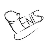
On a scale from 1 to 10 I give this image a very solid 'meh.' I finished it because I'm stubborn and I really do like the concept. I'm sure the image looks fine, I just think it's 'meh' because it falls so far short of what I was trying to do. I used this as an opportunity to experiment with textured brushes for the line-art, in hopes that it would improve my anti-aliasing (fancy graphics term for 'smoothing'). Anti-aliasing is something that I'm hyper aware of in art, and I'm very, very, very, very bad at it, so I've been killing myself trying to find ways to improve it. Unfortunately I've learned so many bad habits that following the tutorial exactly was damn near impossible.
Other 'sins' that this image commits are very unbalanced saturation levels, and high 'k values' (another fancy graphics term for too much black). Really good artists can paint a realistic image without ever dipping below 50 on the k value. I don't know how they do it, even when I'm watching them do it.
There are also anatomy problems, but I stopped caring about those years ago. I'm not trying to draw good. I'm just trying to draw well.
Dantels
2018-01-31 02:30:36 +0000 UTCDaphnis07
2018-01-30 22:48:21 +0000 UTCAce
2018-01-30 05:47:12 +0000 UTCGeeko170
2018-01-30 04:23:32 +0000 UTCMaster Dragon
2018-01-30 03:29:35 +0000 UTCDresdenQ
2018-01-30 01:48:11 +0000 UTCArdenW
2018-01-30 01:45:17 +0000 UTC