I'm gonna try talking a bit about page composition/design choices in these posts, maybe some of you are interested. (I'm no expert in comic visual narrative, I'm figuring it out as I go)
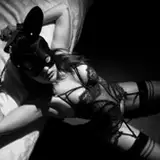
I like to use kind of "theatrical lighting" some times but maybe I've overdone it a bit on the first panel haha. If you think so, you can let me know. The goal, as you might have guessed, is to convey her shock.
The autoflush closeup panel is in the center since it's the answear to "what happened in the previous page" and it's the center of her attention at that moment. I also gave it a cold background instead of the mostly warm backgrounds of the other panels so it pops more (even though the blues in her phone kinda ruin this :/ ), and made it literally pop more by going over the other panels, even over her head in the bottom panel, which is already popping out.
Voidnaught
2023-10-14 15:16:55 +0000 UTC