Hello everyone!
Just wanted to drop some quick tips to hopefully help fellow artists.
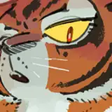
The one issue I see the most is Values. Values are you dark and lights. When the values in a piece are too close together it reduces the contrast. As artist we use contrast to define shape and to guide the eye into area we want them to focus.
There are many ways to check the values, but the easy and dirty way is to create a hue/saturation adjustment layer and drop the saturation to 0. Check the example below. Obviously for traditional artist its a bit harder but not impossible, if you have a cell phone camera all you need to do is take a black and white picture.
I attached an example of values affect the same piece.
Hopefully this helps.
Cheers!