XaiJu
suefan3d
suefan3d

patreon


Re-learning lighting because I apparently have to.

Hi everyone.

I have to sadly report that I am still failing to make the lighting of the set look good. In fact, I have problems making any kind of scene look good. I genuienly believe I somehow lost the knowledge required for good lighting, because everything comes out as bad.

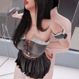
The render above was one I made yesterday purely to re-learn lighting, and I can at least say it doesnt look terrible, but it could still be better.

I wonder if any other artists have problems like this, or if I'm just that dumb. My money is on me being dumb.
EDIT: I also forgot how to English. 

Re-learning lighting because I apparently have to.

Comments

LOL, I didn't click on the image to see the full image so I didn't see that it was actually an outdoor image and that was a duct that was reflecting the light, not a window. So, embarrassing! I was looking at it zoomed in.

WhutSorcery

Hi, I'd like to first say, thank you for the kind words. The scene is using a round corner of a building as a backdrop, with a post-rain settings, i think. To be honest, i just loaded it up and didn't touch the settings at all - I probably should've turn down the glossiness. Original plan was to use a lit-up advert, but that messed with the light even more, which made me swtich to this building near the end of trying to make this render.

Suefan3DX

Hi, it can be more difficult but in this case its offset by how shiny the suits are, and that the scene is using blue light from the side, which makes it 'pop' out more, if that makes sense. And thank you for your kind words :)

Suefan3DX

Uhh, are you joking right now? This scene looks awesome! It is totally doing these bodies justice and bringing the shapes to light with the shadowing and reflection areas. I am no graphical expert but I hope to get into video editing professionally in the future and doing 3-D modeling. The glass looks excellently lit with the blue light coming through the back. The wall though is giving the wrong level of reflectivity so it looks like glass instead of simply a textured wall with spackling. The wall that her hand is resting on does look curved as well? The light coming off of the glasses should show up a bit stronger on the face on the cheeks and nose. But for artistic look, I personally think it looks better if there isn't the light reflection on the face. This scene design looks like its going to be amazing! Body designs look perfect!

WhutSorcery

Looks good to me. That said, if the scene is strictly for helping you improve your lighting skills, isn't it more difficult if your subjects are grey and black? ๐Ÿค” On a completely unrelated note, size differences between characters is always appreciated. ๐Ÿ˜‰

Kraig


More Creators