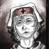
Planning an illustration as a tribute to the LA wildfires and I was hoping you guys could help me pick out which thumb looks best to convey that somber, apocalyptic feel.
TheAoHna
2025-01-16 09:29:21 +0000 UTCAnon44
2025-01-16 04:47:07 +0000 UTCGoodnightRobo
2025-01-16 03:48:59 +0000 UTCJulie
2025-01-16 03:19:03 +0000 UTCChris Ovens
2025-01-16 02:33:26 +0000 UTCRex Stultorum
2025-01-16 02:21:02 +0000 UTCim_9volt
2025-01-16 02:19:27 +0000 UTC