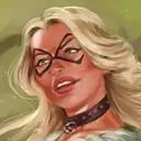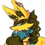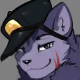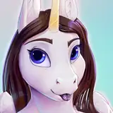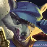
This one has been beating my butt for quiet a while. The biggest challenge in this was because this is such a one-toned character (mostly white) that it made my choices in lighting and colouring a little tricky.
I lost my sketch/process layers in the process of making this as the file was getting too big to handle without sai crashing on me. But we can still talk about the process!
Sketch:
Roughly drew out the face and shoulders as well as loosely motioned where the badge and buttons would be.
Flat colour:
Planned out with very plain colours. I used off white/eggshell, grey's, and desaturated purple and blues and yellows in the face. For the outfit we focus on very dark oranges and purple to loosely suggest where light/shadow is.
Finished:
After rendering the fur and painting one button (I copy pasted one of my painted buttons because holy wow that took so much time and was the biggest headache). We layered up some overlaying shadow colours using some blue purple and yellow to further accent a 3d space before taking it into photoshop cs6 and editing our curves, adding blur, and vibrance and exposure.
Overall this was fun to really test myself as far as lighting and shading and focus and I would probably only take one of these on at a time because omg >///<
What do you think? Is this something I should continue to do and improve in or should I go back to more defined fur shapes?
Kindest regards,
Momo