今月あまり更新できてなかったのでまとめて2つにしました!
長めの期間の依頼が多めになってきたので更新数が減ってますがこういうときは過去作のものを出していければと思ってます~。
The caseさんとDonさんのリクエスト作品二つです!
パターンで背景にすることだったり、グラデーションのみで奥空間を感じるシンプルな背景であったり、キャラ絵には良いまとめ方と思う二つですので参考になれば幸いです!
--
I haven't been able to update much this month, so I've decided to do two at once!
I've been getting a lot of requests for longer periods of time, so the number of updates has been decreasing, but at times like this, I'd like to release some of my past works~.
The case and Don's two requested works!
I hope you find them useful, because I think they're a good way to put together a character picture, whether it's a background with patterns, or a simple background with only gradation to give a sense of depth and space!
2021-11-17 09:00:00 +0000 UTC
View Post
直近のものと過去作品のまとめです!
今月前半の更新がなかったので申し訳なかったです~。
今のところは月に高解像度PNGとPSDそれぞれ2回ずつの更新を目標にしていこうかなと思っているところですね。
可能であればプラスしてそのほかのことを更新出来たら、と思います!
--
Here's a summary of my most recent and past works!
I apologize for the lack of updates in the first half of this month~.
I'm currently thinking of aiming for two updates per month, one for each of high resolution PNGs and PSDs.
I'm hoping to be able to update some other things in addition if possible!
2021-11-17 09:00:00 +0000 UTC
View Post
ハッピーハロウィン!かつ「食欲の秋」ということでしょうか。
今回はご飯を食べてるイラストですね~。
ZaxさんとSylphiaさんのリクエストありがとうございました!
食べ物の描写ってあまりしたことがなかったので美味しく見えていたら嬉しいですね。
--
Happy Halloween! Isn't it also the "appetite of Autumn." ? (Japanese says like that because of harvest season.)
So this time it's an illustration of eating time!
Thank you to Zax and Sylphia for their requests!
I haven't done many illustrations of food before, so I'm glad if it looks tasty.
2021-10-31 03:00:00 +0000 UTC
View Post
高解像度PNGと同じくSylphiaさんのリクエスト。
ラーメンをすすって大食い感のある感じになってます笑
作画コストを考えるとこういったピントを合わせた表現も試してみるのも有効的ですね。
雰囲気だけでも伝えられるのでOCリクエストにはとても重宝します。
ですがこの場合、前面のレイヤーほどガウスを強くして被写界深度を疑似的に用いるわけですが、こういう使い方は強くぼかさないと粗が目立つのでそこはカメラ位置などを考えないといけませんね。
力を入れない部分といいますか、その辺もご覧になってみてください。
--
Requested by Sylphia as well as the high resolution PNG.
She is slurping down ramen noodles, giving the impression of gluttony :D
Considering the cost of drawing, it's effective to try out this kind of expression with focus.
I thought it would be great for OC requests because I can tell the atmosphere.
However, in this case, the more Gaussian the front layer is, the more it is used to simulate depth of field, but in this kind of usage, if you don't blur strongly, the roughness will stand out, so you have to consider the camera position.
Please take a look at the part where you don't put too much effort.
2021-10-31 03:00:00 +0000 UTC
View Post
English translation is at the bottom.
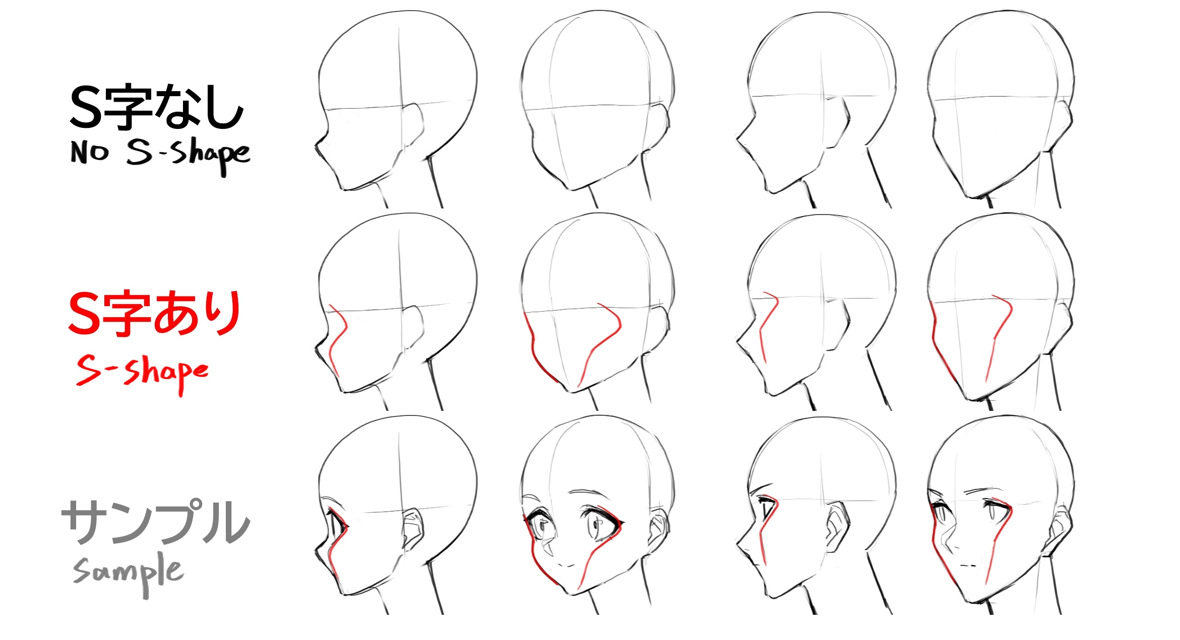
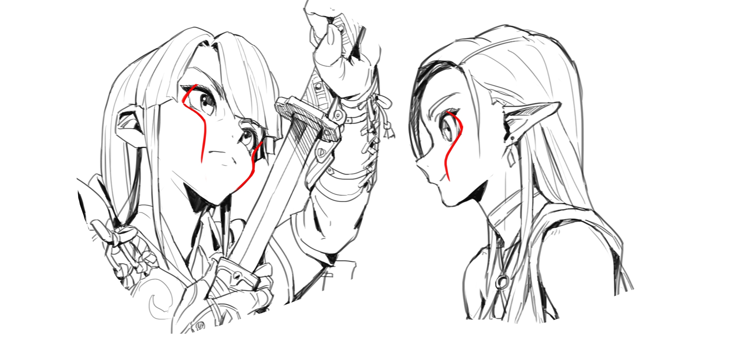
顔の描写でバランスを図るために十字のアタリを使うのは非常に一般的ですが、横顔が非常に苦手、目の位置や鼻の位置が分からない、ということはあることと思います。昔を思い出してもそこそこ苦労したのを覚えています。
そこでイラストよりは3Dや立体造形でよく聞く顔のS字について紹介したいと思います。
今回のは目の窪みのラインと頬を合わせたS字で、より目の位置、頬の位置がハッキリして鼻、口も位置取りしやすくなるものです。
(この角度では逆S字・・・)
S字なしに比べて目の位置、頬の位置がイメージしやすくなっているかと思います。
おおよそ頬の稜線(最も高い位置)を意識する感じですね。
追加でいうと、鼻筋もここで補助線を付けとくとより把握しやすいですね!
よりリアルな造形などでは頬と口、顎のラインでS字とする場合もありますが、個人的にはイラストなどのデフォルメに合わせるには大きな目と頬をより把握しやすくし、口はかなり小さかったり流動的に動くものとしてアタリを取らない形が良いかなと思っています。
あらゆるキャラクターに適応できるもので、より顔の立体把握に役立つと思いますので是非試して見てほしい知恵であります。
いろんな角度でも使えます。初心者さんは好きな作家さんがどんなS字をしているかなど参考にしてみるのもいいかもしれません。
S字はいろんなところで聞くテクニックだったりします。ポーズなどでは以前紹介したコントラポストでも語られることですが、今回は顔の造形についてのご紹介でした!(ギリシャ美術とコントラポストについて面白い記事をみつけたのでリンクしときました)
今回は以上です。ありがとうございました!
下手に見せない描き方シリーズ
--
How to draw a face without making it look bad (4): S-shape of the face
It is very common to use a crosshair as an auxiliary line to achieve balance in depicting a face, but I'm sure there are times when you have a very hard time with a profile, or can't find the position of the eyes or nose. I remember how difficult it was for me in the past.
So, rather than illustrations, I'd like to introduce the S-shape of the face, which is often heard in 3D and sculpting.
In this case, the line of the hollow of the eyes and the cheeks are combined to form an S-shape, which makes the position of the eyes and cheeks clearer and makes it easier to position the nose and mouth.
(At this angle, it is an inverted S-shape...)
The position of the eyes and cheeks is easier to visualize than without the S-shape.
It is easier to visualize the position of the eyes and cheeks than without the S-shape.
To add to that, I'd also add an auxiliary line here for the bridge of the nose to make it easier to grasp!
For more realistic modeling, the cheeks, mouth, and jaw line may form an S-shape, but personally, I think it's better to make the large eyes and cheeks easier to grasp for deforming the figure in illustrations, and to keep the mouth small or fluid without auxiliary lines.
This can be applied to all kinds of characters, and I think it will help you get a better grasp of the face in three dimensions, so please give it a try.
It can also be used from various angles. If you're a beginner, you might want to look at your favorite artists and see how they do the S-stroke.
The S-curve is a technique you will hear about in many places. In terms of poses and the like, it's something that's talked about in the contraposto I introduced earlier, but this time I was talking about facial modeling!
That's all for this time. Thank you very much!
"How to draw without looking bad" series
2021-10-21 03:00:00 +0000 UTC
View Post
PSD7回目はTasty Treatさんのリクエストいらすとです!
ポートレイトとしては非常にシンプルで今回もわかりやすいものだと思います。
クライアント要望でちょっとエクストラで付け足しているレイヤーがあります( ´艸`)
--
The seventh PSD is a requested illustration from Tasty Treat!
It's a very simple portrait, and I think it's easy to understand.
There are a extra layer added at the client's request ( ´艸`)
2021-10-16 03:00:00 +0000 UTC
View Post
すっかり秋の気候になってきました。更新遅くなってしまって申し訳ないです。
夏は終わっただろ!って言われるのも覚悟のうえで投稿する今回は水着や水面表現頑張ったやつであります。
去年からの時系列になってますが、リクエストでかけられる時間やそれによるレイヤー構造と作風変化がみられるのも面白いですね。
そのうちコミッション始めたての時のPSDも公開していこうかなとも思いますね。
いろいろと今とも違って面白いかもしれません。
--
The weather has completely turned to autumn. I apologize for the late update.
I'm prepared to be told that "summer is over!", but this time I'm posting a work in which I tried my best to express swimsuit and water surface.
It's interesting to see how much time could spent on requests and how that changes the layer structure and style of the work.
I'm thinking of releasing the PSDs from when I first started the commission soon.
It might be interesting to see how different things are now.
2021-10-16 01:00:00 +0000 UTC
View Post
今回はThe Mute CynicさんのリクエストOCさんたちのイラストです!
どのOCたちもとても魅力的で、日本のキャラクター性ともまたちょっと違い面白いなと思って描いていました。
個人的には情報量が過多になりつつある日本のゲームキャラクターとはまた違った良さが海外コミッションにはあるなと感じることがあります。
--
These are requested OCs by The Mute Cynic!
All of the OCs are very attractive, and I thought it would be interesting to draw them in a way that is different from Japanese characters.
Personally, I feel that overseas commissions have a different quality than Japanese game characters, which are becoming overloaded with too much information.
2021-09-30 01:00:00 +0000 UTC
View Post
未統合PSD今回は少し前に描いたThe Mute CynicさんのKulthoomとIscavellaです。
二人のキャラクターを前後に配置して書いているだけではありますのでレイヤーもまだわかりやすい配置かな、と思います。
二人の間に少し霧っぽいレイヤーを置いたりなどの効果の部分は他とちょっと違うかもしれません。
--
Unintegrated PSD This time it's Kulthoom and Iscavella by The Mute Cynic, who I drew a while ago.
It's just a drawing of the two characters in front of and behind each other, so I think the layers are still easy to understand.
The effects are a little different from the others, such as the foggy layer between the two characters.
2021-09-30 01:00:00 +0000 UTC
View Post
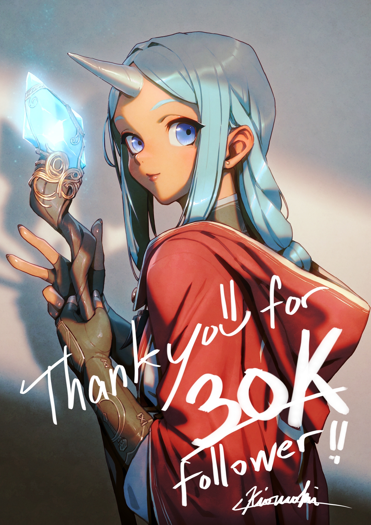
少し遅くなりましたがこの前のサイバークノイチさんのイラスト投稿後にありがたいことにTwitterフォロワー3万人を迎えました!🥳🎉
感謝のOCフリージアのイラストです。
2020年の年始の時点では2000人程だったように記憶してますが、アイルランド留学や旅行の帰国後からの海外コミッションを始めて沢山の海外の方にもイラストを見てもらえるようになり、コロナ禍でもありがたいことに絵を描いて生活できてる程度には落ち着いています。
あまり企業案件にはアピールしていなかったのですが、近日少しずつそういったことも増えるかも知れません。
2020年時点では3万人なんて考えてなかったので本当に驚きです。
FANBOXもありがたい事に100人フォロワー向かえました!
趣味ではじめたメイキング動画作成やTipsを少しずつでも見てもらえてるのは割と嬉しいものだなと改めて思います😃
youtube post: 4cw3j-xdBrU
メイキング動画も5つ目になりました。
何よりここの更新は全て支援者様のおかげ!
今後も負担にならない程度にこちらも更新して、これからも沢山描いていきたいと思いますのでどうぞよろしくお願いします!
PS:写真素材は先ずアップするとしたらどこの国からが良いですかね?まとめるにも数が数なので絞りたい…。
枚数が豊富なところは以下あたりです。
スイス
モロッコ
エジプト
トルコ
イタリア
ギリシャ
--
I know it's a little late, but I'm grateful to say that I've reached 30,000 Twitter followers since I posted my illustration for CyberKunoichi the other day! 🥳🎉
This is an illustration of a grateful OC Freesia.
I remember that I had about 2,000 followers at the beginning of the year 2020, but since I started overseas commissions after returning from studying and traveling in Ireland, my illustrations have been seen by many people overseas, and I've settled down to the point where I can make a living drawing pictures, thankfully even with the Corona disaster.
I haven't really appealed to corporate projects, but I may be doing more of that in the near future.
I'm really surprised because I didn't think there would be 30,000 people in 2020.
Thankfully, FANBOX has also reached 100 followers!
It's nice to know that people are watching my making videos and tips that I started as a hobby, even if it's just little by little😃.
youtube post: 4cw3j-xdBrU
This is the fifth video I've made.
I'd like to thank all my supporters for making this possible!
I'll continue to update this page as much as I can without it becoming a burden, and I'd like to continue drawing a lot more in the future, so please help me out!
PS: What country should I upload the photos materials from first? I'd like to narrow it down because there are too many to list....
I'd like to narrow it down.
Switzerland
Morocco
Egypt
Turkey
Italy
Greece
(YouTube)
(YouTube)
2021-09-23 08:40:09 +0000 UTC
View Post
高解像度PNG5つ目はぴちぴちSFスーツ編!
なんでかはわかりませんがリクエストが最近そういうのに偏っていたのですが個人的にも描いてて楽しかったですね~。
今後もうちょっとSF 作品の衣装にも目を向けときたいと思いましたね。
リクエストありがとうございました!
--
This is the fifth high-resolution PNG I've done, and it's the one with the shiny sci-fi suit!
I don't know why, but I've been getting a lot of requests for that kind of thing lately, and I personally enjoyed drawing it!
I'd like to pay more attention to SF costumes in the future.
Thank you for requests!
2021-09-17 14:34:26 +0000 UTC
View Post
Gweiさんのリクエスト作品。
メイキング動画もアップしました!
https://youtu.be/4cw3j-xdBrU
とてもスムーズに仕上がったのでデータもすっきりした方だと思います。
灯篭流しのシーンでシンプルに水面表現しているのも参考になればと思います。
--
A work requested by Gwei.
I've also uploaded the making video!
https://youtu.be/4cw3j-xdBrU
It was finished very smoothly, and I think the data is clean.
I hope the simple expression of the water surface in the lantern floating scene will be helpful.
2021-09-07 14:59:51 +0000 UTC
View Post
_kilburnさんとGweiさんのOCリクエストイラストです。
ガンアクションとお盆の灯篭流しの絵になります。
メイキング動画も作りましたのでそちらもぜひご覧ください!
https://www.youtube.com/watch?v=ynCOMKrSdgM
--
This is an OC request by _kilburn and Gwei.
It's an illustration of a gun action and a Bon Festival lantern floating.
I've also made a making-of video, so please check that out too!
https://www.youtube.com/watch?v=ynCOMKrSdgM
2021-08-28 09:00:00 +0000 UTC
View Post
とてもかっこよく決まった_KilburnさんのOCリクエストのPSDデータです。
クライアントさんがインディースゲームでは有名なThe Binding of Isaacのプログラマ兼デザイナーさんでびっくりでした。
https://antibirth.com/
緑髪のかっこいい娘でとても好みですね~、ありがとうございました!
---
Here's a very cool PSD of an OC request by _Kilburn.
I was surprised that the client is a programmer and designer of The Binding of Isaac, a famous indie game.
https://antibirth.com/
She's a cool girl with green hair, which I like very much--thank you!
2021-08-20 16:02:18 +0000 UTC
View Post
English translation is at the bottom.
3回目は3にちなんで「3の法則」にしてみようかと思います!
3の法則の言葉自体はいろんな業界でありうる言葉ですが、これはもちろん絵についてです。
もしかしたら「3のジンクス」程度にとどめた方が良かったかもしれません(汗)
絵を描いていて、慣れないうちは色々とどこまで手をつけたものか、いくつ描いたら充分か、など悩む事も多いと思います。
悩むこと自体は大事なんですが、手を動かしたい時にはあまり躊躇したくないものです。
そういう時は割と法則的な事を取り入れて悩まないようにしてみるのも手かなと思っています。
有名なのは黄金比や白銀比がありますが、今回は比率よりは分かりやすい数の話になります。
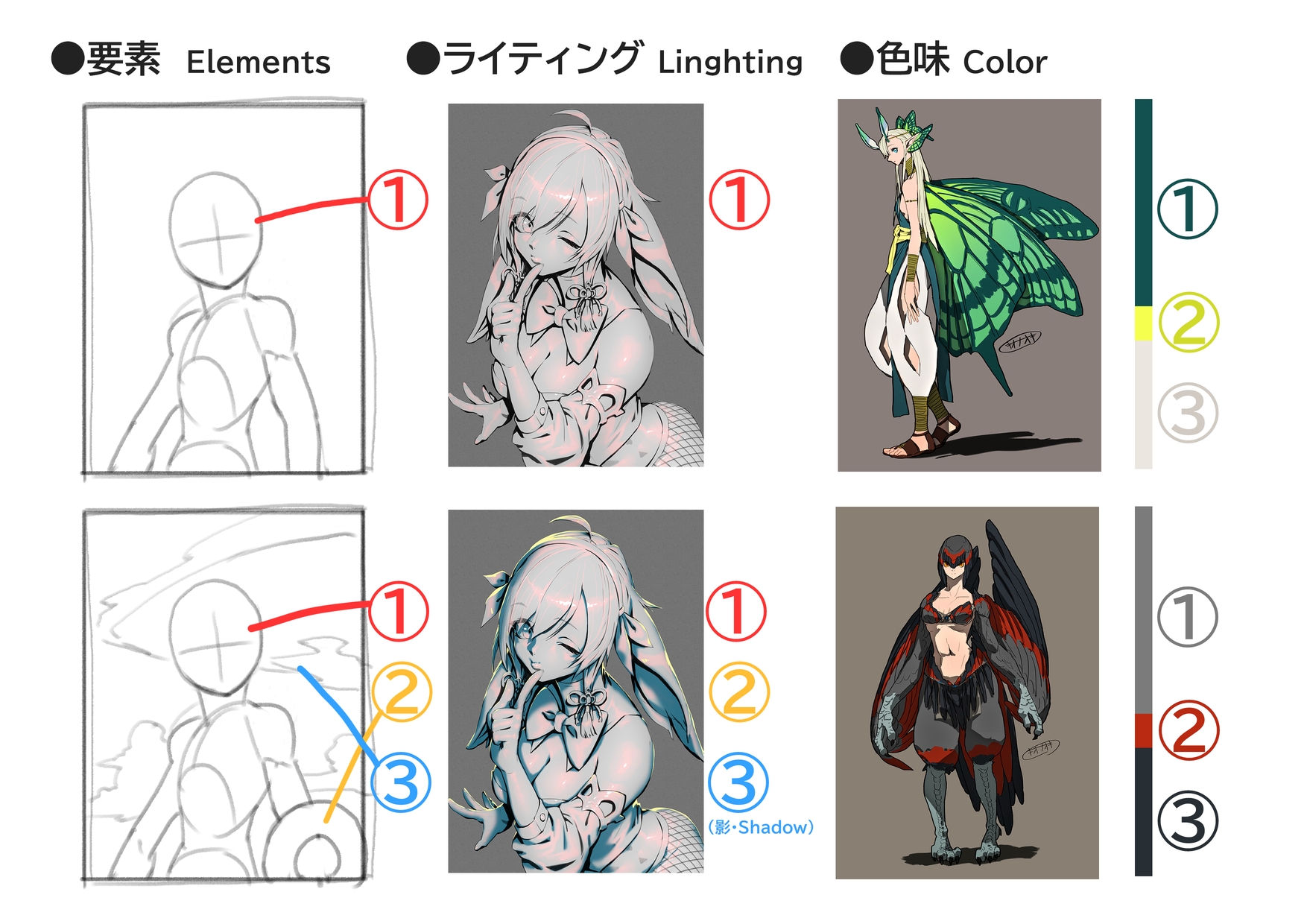
結論からいうと、絵で何か要素が足りない、物足りないと感じた時に要素や色味、光源の数や注目点などを3つは考えましょうというものです。
三竦み、三つ巴、三位一体など、3という数字がとても重宝し効果的なのは絵の世界でも同じで、「三点分割」、「三点ライティング」、「メイン、サブ、アクセントの三色」などや「3つの要素で視線を循環」があります。
例えば1つ、顔は大きな要素です。2つ、身に着けている特徴的なもの(アクセサリーや持っているものなど)、3つ、場所を示すようなもの(空、草木や花、水面やインテリアなど)。
要素が2つでは視線の往復するだけになりますが、3つある事で最低限の循環をさせることなどができます。(特徴的なものであれば何でもよく、例えばキャラのみであればもう一つ特徴的な要素、属性などを盛ってみるなど)
大事なのは3つなければいけないわけではなく、迷ったり慣れないうちは法則に従ってみることもより効果的で学びもあるでしょうということです。
構図を使えば手一つでも(なんでも)要素にできますが、今回はわかりやすい簡単な方法として3つ考える方法を挙げてみました。
おそらく他にも3の法則が活かせる部分はあるかと思います。
その他の詳細はリンク先で例があるのでいろいろ気になった方は見てみてもいいんじゃないでしょうか。
今回は以上です!
「下手に見せない描き方」シリーズ
--
For the third installment, I'm going to try the "Law of 3" in honor of 3!
The word "Law of 3" itself is a word that can be used in many industries, but this is of course about painting.
Perhaps it would have been better to keep it to a "jinx of three" (sweat)
When you're painting and you're not used to it, you're probably wondering how far you should go, how many drawings are enough, and so on.
It's important to worry, but when you want to move your hand, you don't want to hesitate too much.
In such a case, you can try to avoid worrying by adopting a rather law-like approach.
The golden ratio and the silver ratio are famous examples, but this time we will be talking about numbers, which are easier to understand than ratios.
In conclusion, the idea is to think of at least three elements, colors, number of light sources, or points of interest when you feel that something is missing or lacking in a picture.
The same is true in the world of painting, where the number three is very useful and effective, such as in "three-point division," "three-point lighting," "three colors for main, sub, and accent," and "three elements to circulate the eye".
For example, one, the face is a big element; two, something characteristic that you are wearing (accessories, something you are carrying, etc.); and three, something that indicates a place (sky, plants and flowers, water surface, interior, etc.).
If there are only two elements, it is just a back and forth gaze, but if there are three, it can create a minimum of circulation. (It can be anything that is unique, for example, if you only have a character, you can add another unique element or attribute.
The important thing to remember is that you don't have to have all three, but if you are unsure or unfamiliar with them, following the rules will be more effective and you will learn from them.
If you use composition, you can use just one hand (or anything) as an element, but in this case, I've chosen to use the method of thinking of three as a simple and easy way to understand.
Perhaps there are other areas where the Law of 3 can be utilized.
For other details, there are examples at the link, so you can take a look if you're curious about various things! (Sorry it's Japanese)
"How to draw without looking bad" series
2021-08-10 03:00:00 +0000 UTC
View Post
8月2日がバニーの日だったということでそれにちなんで集めてみました!
人によってはパンツの日だったみたいですが・・・。日本語は言葉遊びしやすいですね。
逆バニーリクエストはそれはそれで冒険であったとは思っています・・・(笑)
---
August 2nd was Bunny Day, so I decided to collect them for that!
It seems that for some people it was Panty Day... It's easy and fun to play with words in Japanese.
I think the reverse bunny request was an adventure... (laughs)
2021-08-04 10:05:08 +0000 UTC
View Post
English translate is at the bottom.
さて、ガチ勢よりはエンジョイ勢寄りなシリーズ2回目は構成美にも関わる部分ですが、それよりは表面的でわかりやすい形状に関する注意点で、連続とシンメトリーに関するものです。
絵を描いていると脳は無意識的にバランスを取ってしまうもので、割と「自然な配置」やバランスは意識しないと出来なかったりします。
模様やデザイン的な部分とは別に、イラストの修正ポイントとしてわかりやすいかなと思うので見てみてください。
連続
そもそも美術においても連続性は模様や構成美においては美しくみせるもので、間違いなどではないのですが、イラストにおいて初心者に見られる無意識の連続性は下手に見られてしまうものも多いです。
髪の毛や服のしわ、草や木、雲の配置など、人工的な部分とは分けて考えないと違和感に繋がります。
同じ大きさ、太さ、リズムを避けて緩急をつける意識をすることで回避します。
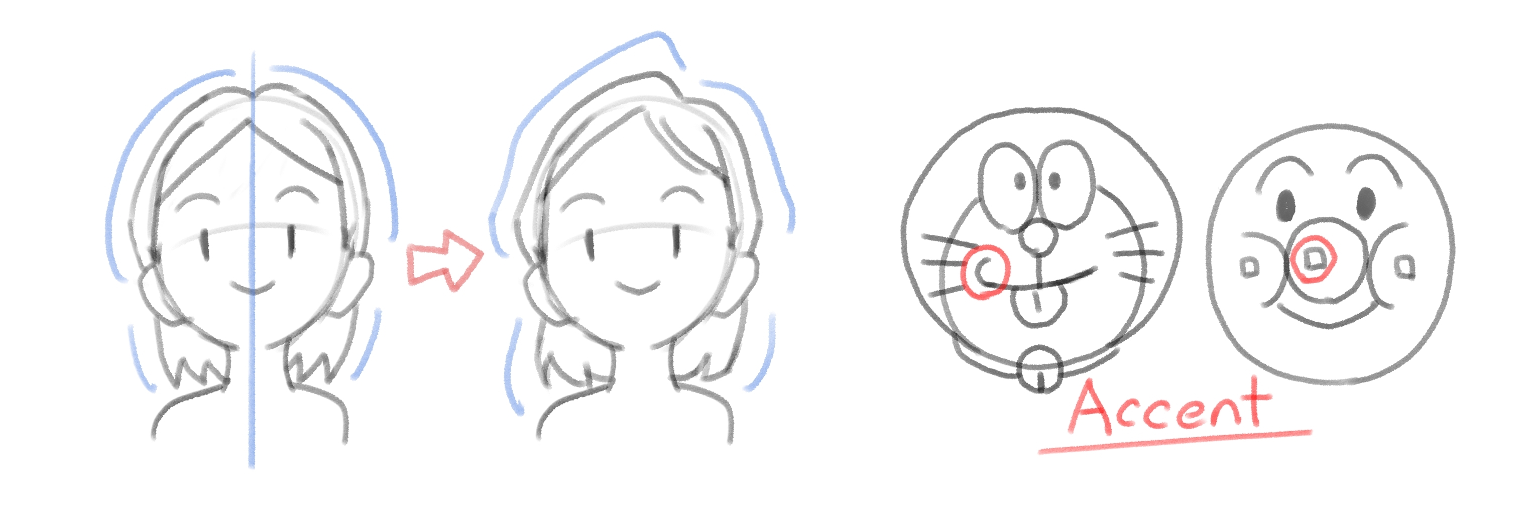
シンメトリー
シンメトリーも同様に構成美に繋がりますが、形状などでは同じく注意が必要です。
真ん中分けなどの髪型の場合はシルエットで回避したり、ほんの少しの違いを出すだけでも良いです。
意図的にシンメトリーなものであっても一部分にそれを崩すポイントをつけてアクセントとするのも大変効果的です。
何度か言うことになると思いますが、こと構成美においては意図していれば美しいものにできるのですが、無意識に不必要な部分に適応していないかは注意が必要ですよ、ということです!
表面的な形状の話にとどめましたがもう少し構成美について知りたい方は以下を見てみてください。
構成美について
https://jrhighart.blogspot.com/2019/03/blog-post_10.html?m=1
ポーズにもリズムやフォームの似た考え方はありますがそちらはコントラポストで調べてみるといいですね!
以上でした!
「下手に見せない描き方」シリーズ
---
In the second installment of this series, which is more fun than hardcore, I'd like to talk about the beauty of composition, but more superficially, about symmetry and repetition.
When you are drawing, your brain unconsciously balances things out, and it is not always possible to achieve "natural placement" or balance without conscious effort.
In addition to patterns and design, I think it's easy to understand how to correct illustrations, so please take a look.
Repetition
In art, repetition is a beautiful feature of patterns and composition, and it is not a mistake.
Wrinkles in hair and clothes, the placement of grass, trees, and clouds, etc., must be considered separately from the artificial parts of the image, or they will lead to a sense of discomfort.
Avoid this by avoiding the same size, thickness, and rhythm, and by being aware of the need for looseness.
Symmetry
Symmetry also leads to compositional beauty, but you need to be careful about the shape as well.
If your hair is parted in the middle, for example, you can avoid it with the silhouette or just make a small difference.
Even if the hair is intentionally symmetrical, it can be very effective to accentuate it with a point that breaks it up in one area.
I'm sure I'll be saying this several times, but when it comes to compositional beauty, you can make something beautiful if you intend to, but you have to be careful not to unintentionally adapt unnecessary parts!
If you would like to know more about compositional beauty, please see the following.
About compositional beauty (sorry it's Japanese page)
https://jrhighart.blogspot.com/2019/03/blog-post_10.html?m=1
(Translate)
1) Symmetry
Symmetry refers to line and point symmetry, which came up in elementary and junior high school mathematics in the area of shapes. In art, we use the effect produced by symmetrical left and right, or rotating 180 degrees.
2)Rhythm
In art, this is expressed by depicting the continuous change of colors and shapes, or by adding movement and change by devising a part of the repetition in (3).
3) Repetition
Place basic shapes on the screen and arrange them in an ingenious way so that they change throughout the screen.
4) Gradation
This is one of the most commonly used color surface techniques, in which colors and shapes are changed according to a certain standard. It is especially used for gradual changes in color.
5) Contrast, opposition
This is an expression that aims to create an effect where opposite shapes and colors are combined to complement each other.
6) Proportion
Expresses size and shape by combining ratios of length and width and size.
7) Emphasis (accent)
The effect of changing the color or shape of a monotonous composition in one area to draw attention to it and make it look tighter as a whole.
8) Balance
Combine shapes and colors to create a state of balance, even though the left and right sides are different. If the left and right sides are exactly the same, it will be symmetrical as in ①.
There is also a similar idea of rhythm and form in poses, but you can look that up on Contraposto!
"How to draw without looking bad" series
2021-07-31 08:54:19 +0000 UTC
View Post
Sabrith EbonclawさんのOC二人のイラスト!
メイキング動画も作りましたので合わせてPSDを見てもらうとより工程はわかりやすいかもしれません!
https://youtu.be/knnI0DtgldA
スムーズに描けた作品なのでレイヤー構造もわかりやすい方だと思います。
--
Illustration of the two OCs by Sabrith Ebonclaw!
I also made a making-of video, so you may find the process easier to understand if you watch the PSD as well!
https://youtu.be/knnI0DtgldA
I think the layer structure is easy to understand because it was drawn smoothly.
2021-07-25 15:58:06 +0000 UTC
View Post
English translation is at the bottom
こちらでは初のブログ形式になります!
ずっと何か絵に関することをブログにしていきたいなと思っていた部分がありましたが、FANBOXでようやくやっていこうと思い立ちました。
どういうことをやっていこうかというと、「下手に見せない描き方」というもので、絵の上達に役立つ知識的な部分に注力しようかなと。(考え方、の方が良かったかな?)
枚数描いて、しっかり観察して、ということよりは知識でカバーできる部分は沢山あると感じていますのでお役立ちしてもらえたらと思います。
絵を描いてるのを楽しんでいる方向けに全体公開の分はあまり難しくない議題にしたいと思っています!
基本的には絵にダメなことはないと考えていますし、私自身完璧にはできないのですが、意図せずに見栄えの悪い選択をしないためにもシェアしていけたらと思います。
ーーー
では、さっそく1回目は接線の考え方について。
まず接線って何ぞや、というのもあると思いますが要は描いた線と線との位置づけ、接点のことで、それに注意しようということです。
デッサン力などとは別に絵作りにかかわる部分です。
構図的な考え方に通じますが、具体的な回避例になります。
以前からなかなか日本語の説明記事がないのをやきもきしていたのでよく見る接線についての英語の記事を紹介しつつ大雑把に説明します。(イラスト付きなので意味は伝わりやすいと思います)
The Art of visual Thinking
http://artofvisualthinking.blogspot.com/2012/10/those-pesky-tangents.html
題目だけ翻訳すると、
1:直線上の線
帽子と屋根がつながって見えています。
2:平行な線
背景の線が人物のシルエットを沿うように平行になっています。
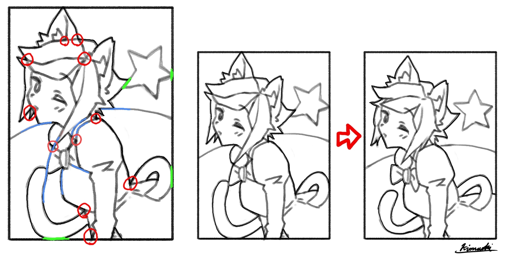
3:集中する線
人物の線と背景の線がいくつかの点に集まっています。
4:輪郭が重なる線
1枚目は輪郭同士、2枚目は枠がぴったりくっついてしまっています。
5:延長線上
傘の延長線上にグラスの輪郭があり不自然ではありますが視線誘導的。
重要なのは「意図せずに」なってしまっていることで、特に5番目とかは意図したものであれば問題ないと考えます。
ただ、このすべては不自然で違和感のあるものにしてしまうのでご注意ということです。(5番は使い方次第ではで視線誘導にもなります!)
大雑把ですが一転に集中する線(赤)や延長線上にある線(青)、シルエットが重なる線(緑)などの「不自然」な箇所が該当し意識して修正や回避している点です。(右の絵が修正後になります)
例が分かりづらい・・・(汗)
人によっては簡単に見えるかもしれませんが、パズルのように複雑化し侮れない部分だったりします。
ただ、「あっ」と気づいたら回避、修正ポイントとして分かりやすいと思って紹介してみました。
個人的には2番「平行な線」は結構注意しないと髪の毛や尻尾など無意識に前面にあるシルエットに沿ってしまうことがあるので注意しています。
これは多くのアートに通じるもので、写真でより多い9つのポイントを紹介している英語記事もあるので載せておきます。
Avoiding Tangents
https://emptyeasel.com/2008/11/18/avoiding-tangents-9-visual-blunders-every-artist-should-watch-out-for/
-
どんな感じでしょうか、多くあるパーツの描き方のようなこともあるかもですが、どちらかといえばこのような感じで頭の隅に入れておくと上達につながりそうな情報を出していけたらと思いますのでこれからもよろしくお願いします。
「下手に見せない描き方」シリーズ
以下英文
----
This will be my first blog format over here!
I've been wanting to blog about something related to painting for a long time, and I've finally decided to do it on Fanbox.
I've been wanting to write a blog about something related to painting for a long time, but I finally decided to do it on Fanbox. What I'm going to do is to focus on knowledge that will help me improve my painting, called "How to draw without looking bad. (Or maybe "how to think" would have been better?)
I feel that there are a lot of things that can be covered by knowledge rather than just drawing a lot of pictures and observing carefully, so I hope this will be useful.
For those who enjoy drawing, I'd like to make the agenda for the general public not too difficult!
Basically, I don't think there's anything wrong with painting, and I can't do it perfectly myself, but I hope I can share it with you so you don't make unintentionally unflattering choices.
---
Let's start with the first article on the concept of tangent lines.
First of all, you may be wondering what a tangent line is, but the point is that it is the point of contact between the drawn line and the line, and you should pay attention to it.
This is a specific example of how to avoid it.
I've been frustrated with the lack of Japanese explanations for some time now, so I'm going to introduce an English article on tangents that I've seen often, and give a general explanation. I'll try to give you a rough idea of what I mean.
The Art of visual Thinking
http://artofvisualthinking.blogspot.com/2012/10/those-pesky-tangents.html
Just to translate the title...
1: Lines on a straight line
The hat and the roof appear to be connected.
2: Parallel lines
The lines in the background are parallel to the silhouette of the figure.
3: Concentrated lines
The lines of the person and the lines of the background come together at some point.
4: Overlapping contour lines
In the first picture, the outlines overlap each other, and in the second picture, the frames fit together perfectly.
5: On the extension line
The outline of the glass is an extension of the umbrella, which is unnatural, but it is also eye-catching.
The important thing is that it is "unintentional," and I don't see a problem with it as long as it was intended. Especially the fifth one,
However, all of this can make things look unnatural and uncomfortable, so be careful. (Number 5 can also be used to guide the eye, depending on how you use it!
This is a rough description, but "unnatural" lines such as lines concentrated in one direction (red), lines on extended lines (blue), and lines where silhouettes overlap (green) fall under this category, and I consciously correct or avoid them. (The picture on the right is after the correction.)
This example might be hard to understand... (sweat)
(The picture on the right is after the correction.) The example is hard to understand... (sweat) It may look simple to some people, but it can be complicated like a puzzle, and it is a part that should not be underestimated.
However, I thought it would be easy to understand as a point to avoid or correct if you notice it.
Personally, I pay attention to the second point, "parallel lines," because if I'm not careful, I may unconsciously follow the silhouette in front of me, such as the hair or the tail.
This goes for a lot of art, and there is an article in English that shows 9 points with more photos.
Avoiding Tangents
https://emptyeasel.com/2008/11/18/avoiding-tangents-9-visual-blunders-every-artist-should-watch-out-for/
-
I'm not sure what it's like, maybe it's like how to draw a lot of parts, but I hope I can give you some information like this that you can keep in a corner of your mind to help you improve.
"How to draw without looking bad" series
2021-07-19 03:00:00 +0000 UTC
View Post
今回の高解像度PNGはちょっと雰囲気の違った仕上げ方をした二枚になりました!
要望というかその方の趣向もちょっと考慮して変えてる部分もありますが、重厚感のある仕上げ方とピンナップのように仕上げる方法とみてもらえればと思います!
--
This time, the two high-resolution PNGs are finished in slightly different ways!
Some of the changes are based on the request or the person's taste, but I hope you can see it as a way to give a weighty finish and a pin-up look!
2021-07-13 15:11:09 +0000 UTC
View Post
高解像度2つ目は未統合PSDをアップしたONSTAちゃんとメイキング動画をアップしたヴィオラさんです。
https://www.fanbox.cc/manage/posts/2449534
https://www.fanbox.cc/manage/posts/2455953
いろんな意味で対照的な絵ではありますが楽しんで見て絵もらえればと思います~。
--
The second high resolution one is of ONSTA, which uploaded an unmerged PSD, and Viola, which uploaded a making-of video.
https://www.fanbox.cc/manage/posts/2449534
https://www.fanbox.cc/manage/posts/2455953
I hope you enjoy the pictures, even though they are contrasting in many ways!
2021-07-07 10:27:48 +0000 UTC
View Post
メイキング動画早速ふたつ目です。
今回は長めに流して内容はYoutubeの字幕機能でつけるようにしてみました。
いらない方はそのまま見れますし、コメントありがよければぜひ見てください!
かなり修正したり少し大変でしたが、ラフイメージを大事にすることを今一度学んだ回でした。
まただいぶセクシーなのでyoutubeでは限定公開です~
--
Here's the second making video.
This time, I tried to make it bit longer and use Youtube's subtitle to show the contents.
If you don't need them, you can watch through it, or if you prefer comments subtitle, please check it!メイキング動画早速ふたつ目です。
今回は長めに流して内容はYoutubeの字幕機能でつけるようにしてみました。
いらない方はそのまま見れますし、コメントありがよければぜひ見てください!
かなり修正したり少し大変でしたが、ラフイメージを大事にすることを今一度学んだ回でした。
まただいぶセクシーなのでyoutubeでは限定公開です~
--
Here's the second making video.
This time, I tried to make it bit longer and use Youtube's subtitle to show the contents.
If you don't need them, you can watch through it, or if you prefer comments subtitle, please check it!
youtube post: mAxTGfkLbYs
2021-07-07 09:53:04 +0000 UTC
View Post
https://skeb.jp/@kionaoki2501/works/69
Skeb頂いたVtuberONSTAちゃんのイラストです!
レイヤーも整っていたので公開しやすく上手く描けた1枚だと思っています~。
空グラデーションや露光量調整など、簡単に星空を表現するにもわかりやすい形になっているかと思います~
--
ONSTA-chan, Vtuber who gave me lovely Skeb request !
Thanks so much!
I think it's easy to understand how to make a simple starry sky, so please check it!
Layer name is Japanese sorry~
2021-07-05 15:08:02 +0000 UTC
View Post
直近のSkeb4作品の原寸サイズPNGデータになります。
A4サイズ(2480x3508px)
あまり近くで見ないでほしいくらいの気持ちではありますが背に腹は代えられませんね!
https://skeb.jp/@kionaoki2501
2021-06-30 13:18:40 +0000 UTC
View Post
はじめての動画編集で公開するのも恥ずかしいし様子を見たいということで、とりあえずFANBOXで限定公開してみることにしました!
メイキング動画のノウハウなどまだ何もないのであれこれを試しためしでやっていくつもりです。
メイキングの大まかな流れを動画で見てもらって詳細はまた上げていけたらいいなと考えてます。
見せたいポイントだけわかるくらいのスピードにしてコメントを入れてみたんですが、垂れ流し動画が欲しいなどの意見があればそちらも考えようかと思います!
元作品
https://skeb.jp/@kionaoki2501/works/73はじめての動画編集で公開するのも恥ずかしいし様子を見たいということで、とりあえずFANBOXで限定公開してみることにしました!
メイキング動画のノウハウなどまだ何もないのであれこれを試しためしでやっていくつもりです。
メイキングの大まかな流れを動画で見てもらって詳細はまた上げていけたらいいなと考えてます。
見せたいポイントだけわかるくらいのスピードにしてコメントを入れてみたんですが、垂れ流し動画が欲しいなどの意見があればそちらも考えようかと思います!
元作品
https://skeb.jp/@kionaoki2501/works/73
youtube post: UDSt4sn9dvQ
2021-06-30 07:41:31 +0000 UTC
View Post
SkebでリクエストいただいたSalverionさんのオリジナルキャラクター、リンメイちゃんです。リクエストありがとうございました!
データ容量上200dpiになりました。最近のフローはレイヤー構造も分かりやすくなっているのでほぼそのまま上げることが出来ました!
300MBでは未統合PSDは絶対足りない・・・。
初めてなので不安なのはパターンなども自動でデータ内包されているのだろうか・・・。問題ありましたら一報ください。
衣装がセクシーなのでSkebはNSFW判定になりました笑
https://skeb.jp/@kionaoki2501/works/73
2021-06-30 03:00:00 +0000 UTC
View Post


