you may have already received an email from patreon about this, but I thought I'd just let you know if you didn't see it yet. moving forward, if you start a new pledge and pay in the iOS app, you'll be charged a 30% apple store fee. new pledges apply to both new patrons and patrons who have cancelled their pledge and are joining again. to avoid paying the fee, all you have to do is either:
pledge from desktop
pledge from android
capiche? sweet. basically, don't pay using the iOS app and you're all good to go. 👍
I have more fun bts process stuff to show you this month since I used some traditional tools this time around. for those who are also nerds about process, this one's for you. 🫰 since I did the sticker sketch traditionally, I didn't record it, so the video for the sticker only features the flatting + coloring portion of the process.
songs used:
francesa - hozier
motionless ft. tiffi - city girl
gathering references
this part's a lot of fun! for those who enjoy making pinterest boards or tumblr blogs, you'll understand. it's the equivalent of gathering and oggling a bunch of pretty pictures, a personal favorite past time of mine. I take this time to consider the overall theme I want to focus on as well as the mood and feeling I want to communicate. this includes things like setting/environment, color palettes, character design, and symbols/objects. I use pureref to put all my images into one place so I can easily see everything together.
thumbnails
to get the brainstorming process in motion, I'll sometimes write down a list of words to think of a theme(s) I could explore. generally, my process has a lot to do with giving myself parameters to work within, because I have a tendency to get swept away in possibilities. limiting the bounds helps me focus and come up with ideas that are relevant. I also like using a marker (I used a pentel sign pen for these thumbnails; I also like using tombows) to sketch, because it places additional limitations on how many details I can cram in (tools with finer tips like pencils and ballpoint pens are too precise).
once I have a thumbnail that I like and want to flesh out further, I'll take notes to remind myself of key points that I want to include in the finished pieces. I started doing this, because there's no legible way for me to draw all those details into a small, messy thumbnail (these pages are A7 so there's not a lot of space to work with; I go into further detail about why I prefer this size for thumbnails in this vlog). so I try to help future Vicki stay organized by taking some notes and reminding her of what's going on. xD
these are only a handful of the thumbnails I did that are directly related to the final pieces. there are 17 other pages I filled with thumbnails that I didn't include in this post. it's all about getting closer and closer to what I see in my mind/what feels right. it's not about finding the 'perfect' idea, but rather one that I feel excited about working on more. I'm very purposeful in this early stage, because I want to make sure I really like the idea before moving forward and spending a lot of time on things like rendering.
value breakdown/color passes
these are the value and color tests I did. this stage is really important for me, because it helps me quickly visualize the overall balance of values and decide where to direct the piece's focus. especially for highly detailed pieces like this one where it's easy to get lost in/overwhelmed by all the different parts, I find ways to help redirect myself to what's important. for example, I thought the version with white hair looked really cool, but I didn't end up going with it, because I wanted the focus to be on the glowing sword and felt that the hair being white would compete with where I really wanted to draw attention to.
🌟
the rest of the process is spent painting and rendering, which you can watch in the speedpaint. there's nothing specific about this part, since the bulk of the load-bearing decisions were done in these earlier stages.
I hope it was interesting or useful to see more of my process this time around! I know not everyone is into this kinda stuff, but for those that like it, enjoy~ ^.^
November tends to put me in a reflective state. as the leaves lose their trees and become bare, so too do I strip back the collection of experiences that have accumulated throughout the year to consider what I’ve learned and how I hope to change. this month’s pieces are a love letter to that process and the quiet transformations we go through all the time beneath the surface.
above: I really wanted to create a piece set in a forest and liked the idea of movement through trees. life is full of many challenges that may scar us along the way and to keep our hope alive is a skill that asks us time again to choose openness. tending to that inner light is challenging, but is also what allows us to face changes with renewed ability and perspective.
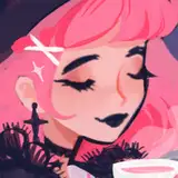
and this month's sticker! I tried out a different process this time and did the sketch traditionally in pencil, scanned it in, and colored it digitally. I really love the textures that come through from the pencil sketch, there’s an immediate feeling of roughness and energy that emanates from pencil. I'm excited to try out more mixed media techniques moving forward, I think something really special happens in the interplay of different art supplies.
☆ ☆ ☆
˗ˏˋ ★ ˎˊ˗
This month's postcard and sticker are available for galaxy, eclipse, and interstellar patrons!
☆ galaxy - postcard ONLY ($10)
☆ eclipse - sticker ONLY ($10)
☆ interstellar - postcard AND sticker ($15)
Interested in a print and sticker of your own? Make sure to pledge anytime during November! These postcard prints and stickers are limited edition and will not be reprinted. Prints are 4"x6" and stickers are ~3.5". TBD: stickers may come with additional finishing details (eg: holo, glitter, etc.). So if you're interested definitely hop on it! <3 International patrons are welcome!
I recently started playing pokemon tcg and have been reminded of all the cute pokemon that exist and the great urge I have to draw them all as cool n cute ladies in fun outfits. so I did exactly that. yes, I have a notes app list of all my fav pokemon. yes, I want very much to draw them as gijinkas. I also did a breakdown of energy type and most of my favorites fell into psychic or fairy energy, which....well, yes, exactly. and I felt that.
the litwick evolutions have been some of my longstanding favorites and I thought it'd be perfect to draw them for halloween. :D I have so much fun designing outfits based on a theme, it's like getting to play dressup with an infinite wardrobe! (<-my childhood dream) I hope you have a lovely halloween wherever you are! eat a sweet treat, watch a spooky movie, play an autumnal game (stardew gang rise up), whatever! I'm currently sat here typing this while wearing a giant witch hat. cheers! 🧡🖤
was really in the mood to draw some cute spooky outfits and looked no further than draculaura for sketch inspiration. the way a gothy pink/black combo never misses!! genuinely surprised I haven't drawn more of the monster high characters before. clawdeen esp, I love how fluffy and rocker chic her style is. I'm v excited for halloween, even wore a witch hat out to go grocery shopping earlier haha. it's a fun way to get into the festive mood + old women love seeing that sort of thing (received not one but two compliments about my witch fit) and there's truly no better feeling than that ⭑.ᐟ
yharnam is such a scary place, there's nothing better than returning home and being greeted by the sweet doll to escape the nightmare for a bit~ TwT<3 (tho whether you can ever really escape is another question...)
did some Sasuke and Naruto doodles a couple posts ago and thought it only fitting to draw Sakura as well! I had a lot of fun sketching a character from my teenage years and getting to revisit her after so much time has passed. I was a big fan of the series back in 2007-2009, but haven't kept up with it much since. even so, the series formed several of my core creative experiences and beginning experimentation with different art forms like fanfic (I wrote my first fanfic about characters from Naruto), cosplay (I was one of those kids who wore a Naruto headband to school LOL), and making OCs. I'll always have a soft spot for the series, because it inspired me to try a bunch of new things and express my creativity in a fun way. :D
thank you so much for your patience this round! all mail tiers shipped today October 21. I really hope y'all enjoy these rewards and thank you again for your support! I've already used a couple of stickers from the sticker sheet to deco, which has been a lota fun~ the extra bit of sparkle delights me every time I see it. :D
to see when your mail will arrive or if you have other questions, please visit my monthly mail FAQ.
because I simply can't resist and it is October after all isn't it? I'm so happy it's October. have you been doing anything to celebrate the spooky season? I've been lighting a lot more candles and have adorned my home with very cute n tiny pumpkins.
see how tiny they are? they are very good and I love them.
been pushing for more traditional elements in my digital art lately. since I'm working with traditional mediums more often, I've started noticing that the digital workspace can feel overly smooth and a little bit foreign. to balance things out, I've been using paper textures and gouache/textured brushes to add a rougher feel.
I've always been super inspired by 60s hair and makeup (so many beautiful shapes in the flowing styles + I adore the look of exaggerated lashes, so fun and cartoony!) so I found references and painted a page of colorful busts. the other page is filled with what seems to come to me naturally whenever I put on music and draw (city girl fans already know). blue/purple/pink color palettes are the best all my homies love blues, purples, and pinks 🩵💙🩷💜
one of my top priorities when sketching is to feel comfortable experimenting, making mistakes, and playing around. affordable art supplies are my favorite way to get into the groove since pigmentation or longevity aren't my concerns. there's a playfulness that gets injected into the process when using cheap supplies, because I don't feel precious or fearful about running out and needing a pricey replacement. you also tend to get a wider set of colors, which allows you to do more experimentation and learn new things about the medium or what palettes you enjoy. I love layering different supplies to see what sorts of effects come out in the interplay and create beautiful textures and colors that give art life on the page. it's a process I find both exciting and therapeutic in its inherent unpredictability. it's humbling to be taught something new each time and be reminded that there's always more to discover!
some of my favorite cheap supplies 🎨💸
-crayola color pencils (an absolute classic)
-pentel oil pastels (the value on these is crazy!!)
-himi gouache (so easy to use)
-artist loft sketchbook (so many pages, solid paper quality, not spiral bound)
-pentel sign pen
-bic ballpoint pen (I've gone through so many of these it's not even funny)
September mail is fresh from the printers and looking amazing! I think the colors turned out beautifully on both pieces and went with a fun glitter finish for details on the sticker sheet. I think it really makes the stickers twinkle and serves as a fitting complement for Nebula's (just came up with her name..!) love for stars. I've been having a lot of fun exploring different finishes and formats for the patreon stickers so far, thank you for the opportunity to play around! :3c
I'll get started on prepping and packing envelopes and aim to get all tiers sent out by the end of next week! I'll also post an update here once everything ships out. as always, if you have any questions about your mail, check out the FAQ. ✨
I know Sakura has an immense wardrobe/catalogue of cute outfits, so I just went with the classic one with lots of pink and plenty of fluffy white frills. :3 other cute Sakura fits I really like:
working more with traditional materials has inspired me to bring more of those elements into my digital work. I've been playing around with paper textures and layering colors like I would when painting with gouache. I really enjoy how playful it makes the digital painting process feel and it's exciting to see my process evolve in real time as I learn new things from different mediums.
kinda got carried away playing with jpgs like dolls so I've got quite the variety of options for your screens this month! have fun trying them out to see which one suits your mood or fancy. ^_^
lol watching the replay I forgot just how many sketches I had gone through for the sticker. a lot of them felt too reminiscent of drawings I've already done and I didn't want to rehash the same pose for the umpteenth time when what I really wanted was to try something different. the sketch I ended up going with felt in line with my stylistic tendencies, but with fun new departures like energy and movement conveyed through pencil textures.
I knew early on that I wanted the postcard to mainly feature a cool-toned palette. I think it conveys the creepy/haunted feeling I wanted to get across really nicely. really glad my partner came in partway through and suggested I remove the puff sleeves to stay true to the line of action of the original sketch. I knew something felt 'off' and sometimes you need another pair of eyes to help you see what you keep overlooking (resisting the urge to turn this into a pithy life lesson).
as usual, I listened to music while working on these pieces and visited my middle school playlist for the appropriate vibes. some of the songs that inspired me:
the peak of summer has broken and the arrival of fall has ushered in cloudy skies, chilly breezes, and deepening evenings. the change in weather has inspired me to make darker art that is befitting for the transition of seasons and the eerie and otherworldly feelings that are brought about during the shifting days.
above: I felt compelled to paint something spooky and moody and liked the idea of a character whose hair can transform into a flock of ravens. I thought it was a fun idea to make the hair have a personality of its own. I also like making characters who are in communion with the moon and used mostly cool tones throughout the piece so the shocks of red could really stand out amidst the swaths of darkness.
and this month's sticker! I continued with a similar idea for the character and opted for a black and white palette to spotlight the brush textures and strokes. I love the look of old storybook ink and pencil drawings for their personality and energy that appear to come off the page. Leaning into that style helped me bring a character to life who feels mysterious and mystical, both piercing and aloof.
☆ ☆ ☆
This month's postcard and sticker are available for galaxy, eclipse, and interstellar patrons!
☆ galaxy - postcard ONLY ($10)
☆ eclipse - sticker ONLY ($10)
☆ interstellar - postcard AND sticker ($15)
Interested in a print and sticker of your own? Make sure to pledge anytime during October! These postcard prints and stickers are limited edition and will not be reprinted. Prints are 4"x6" and stickers are ~3.5". TBD: stickers may come with additional finishing details (eg: holo, glitter, etc.). So if you're interested definitely hop on it! <3 International patrons are welcome!
new challenge unlocked: scanning big art aka playing 4d chess
been on a big/traditional artwork kick ever since I picked up large paper by chance at the art store. bought my first set of soft pastels over the weekend to play around with and love how hazy and dreamy they look when smeared out. used them as a base for this piece to lay down some rough color over a color pencil sketch then did the rest in oil pastels. was in a mood to paint something blue (when am I not), put on gab smolders's silent hill 3 playthrough as background noise, and got to it. it's really interesting how your feelings can change toward an art supply. I remember first testing out oil pastels a year ago and wanting so badly to like them, but feeling hindered by my unfamiliarity with the medium. I decided to just lean into the messiness and no joke they're now one of my favorite traditional mediums to use (gouache is hard to beat). it's so satisfying to blend colors together and the resulting texture is delicious (who amongst us hasn't thought about eating art?). having so much fun with traditional mixed media lately, I like how it makes me feel embodied in the process! ^_^
came across some big paper at the art store and bought it, because I thought it'd be fun to do some big traditional paintings in my ongoing quest to make looser art. and boy was I not disappointed! I really love traditional mediums, because despite my strongest desires to be clean and color within the lines, they resist my efforts and always perform in an unpredictable manner (paint brushes have a mind of their own i s2g). digital art allows so much capability for control that sometimes it's nice to limit my options and work with set tools. it's also been interesting working on a larger canvas as I'm usually shrimped over a tablet that is roughly the size of a foot. I've had to learn how to scale the drawing differently as I no longer have zoom or transform tools to use. I like the change-up, because it challenges me to work with a different thought process and come up with new ways to problem solve. the more I experiment with different mediums, the more I realize that there's something new to learn with each set of tools. it keeps things interesting! ^_^
continued experimentation with messier digital art that mimics a traditional process. also generally encouraging myself not to feel so precious about what I make and embracing big change-ups while working on art. letting go of a long-held rigidity that I've noticed at times calcifying my process. it all comes and goes, like the ocean's tides, here one moment gone the next and back again.
pretty sure I'll be drawing these two until I pass from this mortal coil (last 3 drawings are from 2013; if you remember these pieces you get a senior discount). I haven't rewatched the anime since (it broke me into a million pieces and I haven't recovered ^_^), but I'll always love the characters and love drawing them. I think it's cool how the series uses the concept of magical girls to explore emotionally turbulent parts of life like grief, regret, and death. the juxtaposition of genres creates an interesting and memorable combination. the more I talk about it the more I'm convincing myself to rewatch lol...
(・∀・)ノ🗂️ if you'd like to leave a request, head on over to the chat and drop a line in the suggestion box~🪐
August mail has come in from the printers and both postcards and stickers turned out beautifully! I'm a bit behind schedule since there was a formatting issue that needed to be worked out with the sticker, but it was well worth it since the final design looks so lovely. thanks so much for your support last month, I'm excited to get these out to y'all!
I'll be packing mail over the next couple days and aim to get all August mail sent out by the end of this week. I'll also post an update once everything's been shipped out. as always, if you have any questions about your mail, check out the FAQ. 💧
the aforementioned neocolors I ordered arrived a couple days ago and I excitedly sat down to play around with and test them out! I soon fell in love with the versatility of the medium and swiftly made several paintings. using neocolors feels like a marriage of all my favorite aspects of traditional mediums (texture of oil pastels, rewetting of gouache, blendability of alcohol markers, ease of color mixing) and they felt entirely intuitive to use. I made sure to get colors I know I love using to better ease the transition into a new medium, which worked out well. it's always exciting finding a medium that you click with, because it can take a lot of trial and error. I love how certain traditional mediums look, but using them feels cumbersome and at odds with my process (cough watercolors). on the flip side, you can easily tell when you like an art supply that feels compatible with your process and artistic habits. I fought against those inclinations for a long time, but I'm learning that leaning into them can really bring out the feeling and personal voice of your art.
so yeah, I'm having a lot of fun using these new supplies and especially love how they've helped me embrace mess and unpredictability in art. I'm excited to keep testing them out and making more paintings. ^^ here's to trying a new or unfamiliar art supply this weekend if you're looking to change things up!
this new overwatch hero's design is soo cute and right up my alley with the celestial motifs (<-she is a known star and moon enjoyer). I especially love the lil crescent moon detail on her bangs. I haven't actually played her yet since I don't play ow much these days, but it's always fun seeing the new designs and skins they come out with. :3c
(・∀・)ノ🗂️ if you'd like to leave a request, head on over to the chat and drop a line in the suggestion box~🪐
first request of the month, thank you! ^.^ had to draw these iconic queens to honor their impact. even though I've never watched the entirety of legend of korra, I remember when the finale aired and the internet went wild at the reveal (never forget "we poppin the BIGGEST bottles when makorra happens tomorrow" LOLL). lives were changed quite frankly. anyways, I'm happy for these two, long live korrasami.
(・∀・)ノ🗂️ if you'd like to leave a request, head on over to the chat and drop a line in the suggestion box~
lately, I've been in the pursuit of messier art or more accurately art that feels more energetically expressive. I mentioned in my last sketch post that making digital art sometimes feeds a perfectionistic mindset, in which I get encumbered by the possibility of continually improving something, sometimes to its detriment. it's something I try to stay aware of, because it's a habit that's really easy to slip into. to try and balance out that tendency, I've been encouraging myself to stay loose while drawing and painting, using techniques that steer me away from fixation on details. I like to use brushes that have a degree of unpredictability, mess around with color jitter settings, and paintover rough sketches so I don't get feel hemmed in by arbitrary lineart. it's made painting a lot more fun and less precious when I know I can just paint over something that doesn't feel right, which is how I paint when working traditionally. I love exploring new techniques and learning the quirks of each medium. even though I've been making digital art for so long, I always feel like there's something new for me to learn about it, which is really cool! forever grateful for the existence of art in this world~ 💖
got a new set of wallpapers for ya today, 2 for phone, 2 for desktop, 4 total! I hope you enjoy decorating your screens with some fresh art and immerse yourself in the soothing starry skies~
got a coupla fresh speedpaints for ya! since I did all my ideating/sketching digitally this time, you can see how many versions I went through before deciding on which ones to flesh out. I love seeing this kind of process stuff and how someone got somewhere. it's amusing that it's a little different every time, a nice reminder that life is full of little surprises. ^.^ one of my favorite parts of the process was painting a bunch of stars against a dark night sky. something so soothing about the repetition and bringing the sky to life with small glowing spots, each speck a part of a larger celestial tapestry.
I recently read a passage somewhere that described a character as "plucking stars from the sky". those words evoked an image in my mind that has stuck with me and I decided to draw this month's rewards inspired by that idea. celestial themes are an evergreen source of inspiration for me and like clockwork I feel compelled to make art filled with stars and deep blue skies.
above: I really liked the idea of a character sitting peacefully cradling a pile of fallen stars. I wanted to create a space that felt soft, lit with calmly glowing fragments of sky. I'm very drawn to serene dreamlike environments and it's something I often try to give form to in my art.
and this month's sticker sheet! I love sticker sheets so much and really wanted to make another one for patrons. ^.^ this sheet features a cute celestial OC who loves music and travels through space with her kitty companion to collect stars for her nebulous locks of hair.
☆ ☆ ☆
This month's postcard and sticker sheet are available for galaxy, eclipse, and interstellar patrons!
☆ galaxy - postcard ONLY ($10)
☆ eclipse - sticker sheet ONLY ($10)
☆ interstellar - postcard AND sticker sheet ($15)
Interested in a print and sticker of your own? Make sure to pledge anytime during September! These postcard prints and stickers are limited edition and will not be reprinted. Prints are 4"x6" and sticker sheets are 4"x5". TBD: stickers may come with additional finishing details (eg: holo, glitter, etc.). So if you're interested definitely hop on it! <3 International patrons are welcome!
I have this tendency when making digital art to get overwrought in details. since I'm mainly a digital artist, I've developed a lot of habits over the years that allow me to use digital features to my advantage (layers and layer effects are p sweet), but have also led me to be overly controlling about the process at times. that tightness has often resulted in pieces that lack energy and emotion, a certain je ne sais quoi you can't always explain, but can certainly feel. something I both love and hate about traditional mediums is their unpredictability. that quality can produce a lot of 'happy accidents' that you couldn't have planned, but give the piece a lot of beautiful visual interest.
I tried a traditional approach to these paintings, making sure to do an underpainting/wash, build layers of paint, and pick colors by eye. I also made sure to use gouache brushes or brushes with a traditional feel and tried to lean into the unpredictability of the medium. it's a different mindset compared to my usual approach and tools (lineart, flats, paintover and clean, sharp brushes) and I'm really chuffed to see that the result both looks and feels different! it definitely feels looser than my usual digital art and I'm really excited that I can get such a different look digitally. there was a period of struggle when switching over my mindset and once I leaned into the quirks of the medium I felt more comfortable making something out of the mess and trusting the process.
I also ordered a set of neocolors ii (oil pastels) that I'm really excited to play around with once they come in the mail! I remember using them in high school and really enjoying it. I want to keep practicing loosening up and will share my experiments here once I do! ^.^


 these are the value and color tests I did. this stage is really important for me, because it helps me quickly visualize the overall balance of values and decide where to direct the piece's focus. especially for highly detailed pieces like this one where it's easy to get lost in/overwhelmed by all the different parts, I find ways to help redirect myself to what's important. for example, I thought the version with white hair looked really cool, but I didn't end up going with it, because I wanted the focus to be on the glowing sword and felt that the hair being white would compete with where I really wanted to draw attention to.


 see how tiny they are? they are very good and I love them.


