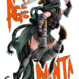
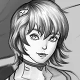
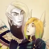
When time sent the original image it was already flattened so i couldn't slide the title logo behind her like I wanted to. Dropping it center just looked meh and so top right corner it went. I did debate dropping it all the way to the bottom and letting it sit there...
Patreon logo wasn't playing nice so i just left it for now. Still time to touch it up though.
RAGS
2017-11-06 13:34:21 +0000 UTC
How about putting the title way bigger and centered, on the top, but bleeding behind the character, between her and the background?
Also, the Patreon logo seems stretched vertically.
Not sure if important, but it bothers my graphic designer nerve. ;)
Tracy Scops
2017-11-06 13:30:24 +0000 UTC
Almost....I would personally flip the logo and credits - keep the traditional placement. The lettering/color contrasts would work better IMO. Honestly though, seeing that reference pic you posted the other day - I'd be careful using a background pulled from anything that isn't non-copyright. Might be easier/less trouble to just pay a little more for a modified mock-up.