In this series, Veronica will summarise the most interesting pages from old chapters and explain some of the process that went into making the final thing! This time, it’s Model Girlfriend!! And it’s a big one!
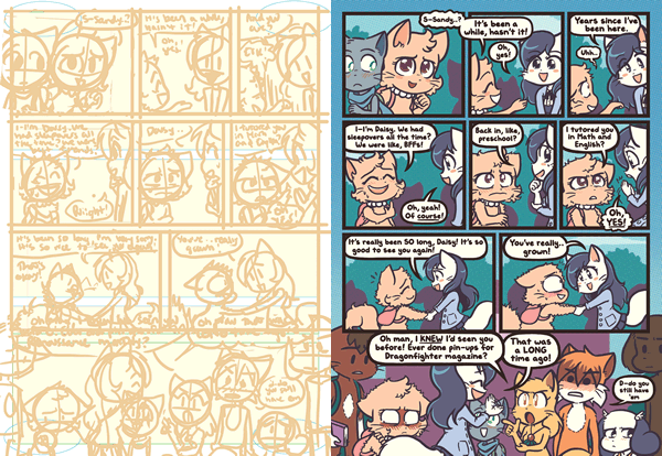
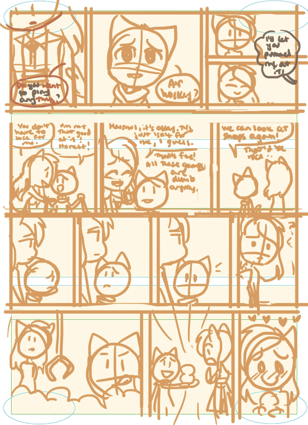
Page 9: Sorta sad about losing the spunky-looking Sandy in the first initial sketch, she looks so bright-eyed and cute, but she should be looking all animu-beautiful instead :(
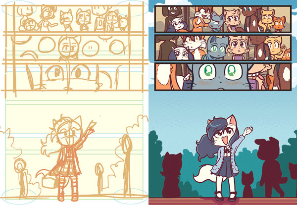
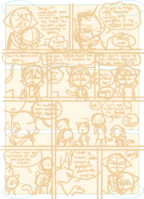
Page 11: Goodness was that final panel difficult. Sandy took over enough of the foreground that Mike would have to be obscured, but I didn’t want him to be TOO obscured because we need to see that he’s happy in love, but I needed other characters to be visible, primarily Daisy and Rachel. David and Abbey provide a bonus, but I was drawing them sorta expecting much of them to get cut off for the web version (though they’ll probably show up fine on the book!)
Poor Amaya just disappearing into the background, lowest priority. Cropped like this, you can’t even see her.
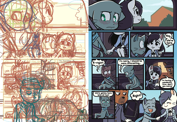
Page 13: I like how I copypasted the second sketch of the first panel into the rest of the panels, I wanted to place the characters so they wouldn’t be floating everywhere or moving to the side too much, so it was a pretty efficient guideline. The second layer is me actually making the characters DO things, which was helpful for times when characters would overlap the other, like when Rachel overlaps Amaya as Rachel walks away.
Page 14: The interesting thing about the initial sketches is that they’re done with the mindset that I’m plotting the scene, so they always look.. much less dynamic than the final page. It’s never how I truly want the page to look, it’s more just having the “essence” there :-[ Sometimes the initial sketch looks similar to the second sketch and then the final page, but other times, like in pages like this, I decide to move things around.
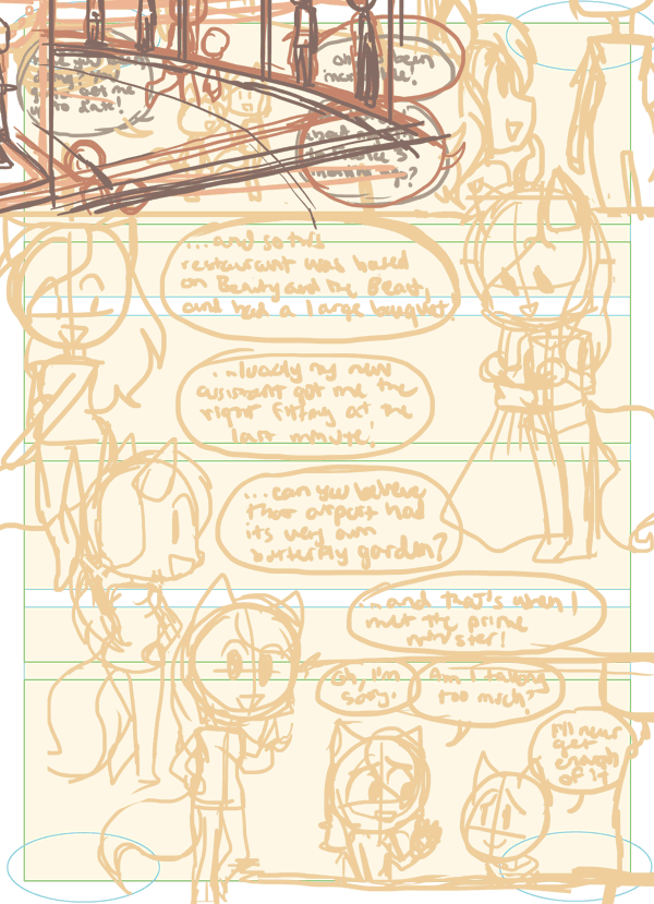
I didn’t want Paulo to look isolated in the 3rd to 5th panels, so I added Sue when doing the second sketch, (And as a result I even made Sue appear in the final panel) and also I wanted to make Paulo look more interesting, like showing a hesitance due to the events of Guest of Honour and Golden Hour. The initial sketches didn’t show that, it just expressed someone hesitant who then gets mad, but I like how I made Paulo look more pained in the fourth panel.
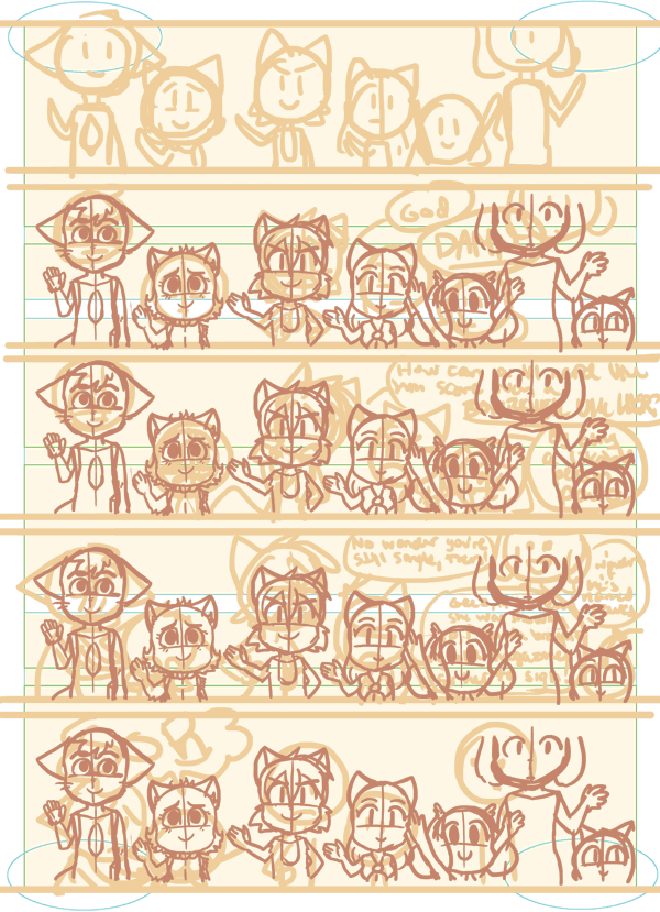
AND I also wanted to make sure the heights weren’t too inconsistent, you have to fight a lot with so many characters on a page, like having David not look too ridiculous around very short characters.
Page 16: Get a lot of all the sketch spaghetti on this page.
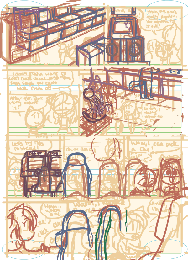
I think this page had so many layers that Souppy ended up combining them, which is a shame because it woulda been really interesting to see exactly why I struggled so much. There were so many characters overlapping complicated backgrounds and props, and that’s made more difficult when it’s also overlapping panels. The car was difficult because I had to draw a character in another layer interacting with the door.. and having Sandy overlapping the door and Mike.. coming out of the car, but the door is overlapping Mike!! But I want Mike to look like he’s interacting with the car and coming out of it!! Just a lot of elements, and I always want to draw what’s behind characters, so that was a challenging juggle. You can see Sandy and Mike changed position as I finalised the look of the car.
And I also ended up making Mike just out of the car rather than in the process of getting out of it, because otherwise he woulda been totally obscured.
Page 17: I like how I plotted Sandy’s poses first without the clothes she would be wearing, but when I drew the second sketch I changed some of her poses while putting on the clothes anyway :-[
I struggled a bit with the poses because I wanted it to look.. balanced. So basically Sandy not looking the same way too many times. I really loved the pose on the farthest left, but I felt it made the pose with her holding the clothes to be repetitive, they’re facing the same angle!! But I knew if I flipped Sandy’s angle, there’s be the issue of details being lost when working with the other poses, BUT I THINK I DID FINE IN THE END.
Page 19: I love looking at sketches where you can toggle the characters appearing over the background. One moment the DDR machine is just standing there and then, a person!! I love that.
As a bonus, here’s the arcade floor pattern made just for this sequence of pages. It’s not much, but it works for what we used it for!
Page 25: You can see that I initially drew Mike mentioning the air hockey, but then begrudgingly wanting to SHOW!!! NOT COMPLETELY TELL!!! So I had to draw the air hockey table in the second panel and die trying.
BCB is so often full of characters talking and is essentially conversation-heavy, but you can still make things look interesting and not make it look like talking heads!! I sometimes become complacent and do talking heads, but I try to check myself when I can :( Even if it means i have to draw an air hockey table lol
I wasn’t planning to make the stuffed animals overlap the final few panels, but I thought that would look interesting!
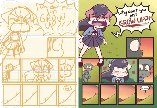
Page 33: Man I always feel sad when Sandy loses some cartoonishness in the final product. I love her initial sketch of her screaming, but it makes her look too silly! Sandy always has to maintain this fancy prettiness so I always have to be detailed with her face, the only times I don’t do that is when she’s looking oblivious, but otherwise she doesn’t.. emoticon-emote as much as other characters do. Not that I use the emoticon-emoting crutch too often.
That’s it for now. There’s actually a big post on the end of Model Girlfriend coming up, so stay tuned!
![Martin Gunnarsson [ Deerstranger ]](https://xaiju.com/istorage/44146.jpg)