XaiJu
CrimePaysButBotanyDoesnt

patreon


Designing a Logo for a friend, which one?

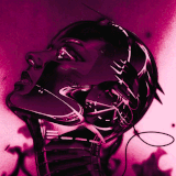
The stippling really went over board, flattening the whole image. I've gotta tighten these up tomorrow but here's some previews. Which one do you prefer?

Designing a Logo for a friend, which one? Designing a Logo for a friend, which one? Designing a Logo for a friend, which one? Designing a Logo for a friend, which one?

Comments

Top left

Cam

Top left, nice detail but not as muddy as the one below. I'd convert it to vector, clean and polish it up a bit. Then chose a font style.

Eric Walton

Or bottom left

Mitchell

Bottom right

Mitchell

I like the top right. It has the her name, or the name of her business. I would make the cap letters a couple of points smaller(maybe 4), and match the sizes of the rest of the letters. I would lighten the ground shadow a little towards the center, not a lot, though. The stippling looks fine! I love working in water media. Water color was/is my thing, but I got into working with ink when I had a dumb fucking cube farm job, and in between calls I'd doodle with my ballpoint pen. It's amazing what you can do with even ballpoint pen. Anyway, it gave me the bravery to try ink and I really like it! In my drawing class, the prof. had us do still lifes(lives?), where the stuff that was closer to you had a thicker line, and the things further away had a normal line. Have you tried this method? What did you think? You mentioned that the stippling made your drawing look flat. I think it looks fine. What direction is the light coming from in these drawings? Not being mean, just stuff to think about. You've really gotten good at drawering, ya prick.

April Hughes

Bottom right

Ryan Helfrick

Hard choice…love the Madame Cacti…as someone who had a tech writing and design business, it’s good to have an odd number of items in the drawing. Beautiful work. You’re hired!

Sharon Kaczorowski

Depends on the use case; for a banner logo I'd use top left but cut back the ground shadow the way you did with the bottom left. For something like screen printing or a physical sign, I'd pick bottom right but with heavier lines.

TOLSH

bottom right for balance & clarity

George Sagi

Top left

Bryan Peterson

I like the top left!

Uncle Curse

Looks like top left for the 🥇

Zeebes

While bottom left is a great drawing with the shading, that doesn't translate well to some applications- like screen-printed tees, so I would say right side ones are better. Maybe reconsider font sizes though. I think the adam and the acti should match.

Cynthia Adamson

Either of the top row. "Madam Cacti" is great, but I would make the letters the same size.

Eric Wagner

Madam Cacti, but the “acti” should be same size font as “adam”.

Jarel

Bottom right reads best.

Black Dragon Press

I like the first picture✌️

Ana Rita

Depends what's being done with it. If Madam Cacti has a website, she'll need something super simple for her favicon, for instance, but you could possibly simplify a single one of those flowers for that purpose, or anywhere else something needs to be tiny. For a header graphic type thing, I like #1, but I also dropped out of art school, so iunno

Candice

Start from scratch, make drawing of fancy lady w barrel cactus head

Hildegard von Bigass

Top left.

Jeremy Tuler

Mostly because of the sharpness of the drawings. Not sure if it's problematic to omitt the cactus in the bottom right.

Lindsay Malone

Top left or bottom right.

Lindsay Malone

Top left. Bottom L for shrinking down. Beautiful drawings!

Linus Lancaster

love em all, but to me the bottom right comes off as a clearer image to process

Adan Gallo

Number 1 (pulled the trigger and finally signed up on the Patreon deals!)

Jacob

The third one feels the most balanced as a thumbnail, which feels relevant for a logo.

Noah

Top left, ya. Spiffy

Rebecca Hunter

I like the top two. Text seems a little big compared to drawing but still real nice!

Dominique Frost

Top is #3 (bottom left), the shading looks good and adds some visual variety, esp. when seen at a smaller size. If there will be text, runner-up is #4 (bottom right)- could balance well beside it if the flowers are pointing away from the text.

Sean Radcliffe

Top left. Then bot.left.

Joe D'Arienzo

I like the level of contrast in the top left the most, but I also agree with Kevin's point about scaling.

Kira Taylor

Top left image

Eric

if this is going to be printed, especially at smaller sizes (like business cards) I would say the 4th image is the way to go as it will scale down without losing as much detail

Kevin Krebs

Top left/first image.

Stephanie Morse

Bottom left/3rd image for me

Tyler Taylor

I also like the first one (top left) the best

Arianne Avery

Bottom left rocks my socks

Landon

Bottom left, I like the hoarier version.

Malaki

I like this simplicity of number four, maybe some pebbles in the background. But if not number four, number one.

Spooner

3rd image

Kyle Flaherty

Splitting hairs- they’re all good, but I think I like the first one the most

Corbin Rowland

Top left/first image

Autumn Teeter


More Creators