

This took a while to draw because I spent two days laying it out, then I decided it was crap and started over from scratch. Sorry for the wait, but it really was irredeemable garbage.
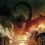
There's some unusual stuff going on here and I'm wondering how you're going to feel about it. First, you've got multiple levels overlaid on top of each other. There's the winding path with arrow slits above, then the tunnels on the other side of those arrow slits below.
Mainly, this keeps the map a bit more compact. I try not to bloat the size of my maps too much because it's always more of a hassle for people using them. If you're printing it, there's more to print and if you're using VTT, the file size is bigger. And I don't think this is giving anything away. The PCs can see the arrow slits and, I mean, what else would be on the other side?
The second unusual thing is the perspective shift. To me, this feels like the part that might be controversial. You've got a slightly angled view of things right up to the door. Then, once you enter the mountainside, it's a fully overhead view.
This does a few things for this map. It makes the path seem more upward, it shows the arrow slits and it gives a nice view of the chasm. But, once we're inside, it's not doing anything for us anymore, so it changes to top-down. I'm curious what you all think about it. Let me know if you like it and definitely let me know if you hate it. We don't have to do this again.
By the way, this is handled a few different ways in the patrons' edition versions. In the 1-inch grid print version, the tunnels are a separate overlay, which seemed more practical for print. And in the VTT version, there's something similar (the tunnels are a token/tile, basically). There's also a VTT version like the image above. This map was a gamble, so I thought I'd hedge my bets.
There are a few more things. LIST MODE, ON MY MARK. ENGAGE.
Milby's Maps
2020-11-10 13:02:19 +0000 UTCBen Horbert
2020-11-09 13:20:32 +0000 UTC


