XaiJu
JRMathews
JRMathews

patreon


Just got the color version of JMM3's cover back! Which color palette do you like best?

I can also make a few more color adjustments one way or the other if people have feedback to give.
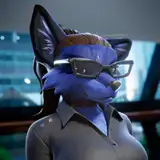
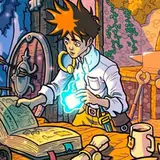
Image 1: Warm

Image 2: Mid-Blue

Image 3: Blue

Let me know what you all think!

Just got the color version of JMM3's cover back! Which color palette do you like best? Just got the color version of JMM3's cover back! Which color palette do you like best? Just got the color version of JMM3's cover back! Which color palette do you like best?

Comments

Although all of them are attractive, I lean toward the warm palette because (to me) it reflects Jake’s feelings of home, sanctuary, and creativity. The gold window background really stands out.

ArDee

Warm for me as well. I also just became Artifact level subscribers so how do I get to read JMM3?

Luqman

Warm! Mid-Blue is great as well, but I think Warm edges it out. Gives a cozier feel

Jeff Sloan


More Creators