• Download the full process image from attachment.
• The full illustration is available as an HD 2+ reward. See this post to know how to receive the reward.
• Attachment version is smaller than HD 2+ version. (1000 px in width vs 1600 px)
• 從附件下載完整的過程圖片
• 高清完成圖為限時HD 2+獎勵,詳情請參考此篇文章。
• 附件圖片比HD 2+獎勵版本稍微小一些。(總寬: 1000px vs 1600px )
Paintstrom studio / Cintiq pro 24"
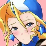
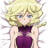
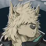
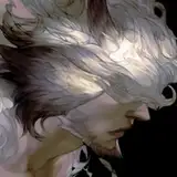
It's not hard to know who he is if you've known my OTP. *wink*
基本只要知道叭子的OTP都會知道我想要畫誰

# Rough idea and the initial sketch 初步構想與草稿
Starting by drawing random poses. I used to prefer bigger and more transparent brushes for rough sketches; recently I found it is actually harder for me to finish. So on this one, I'm practicing using smaller brushes with no transparency (but slightly textured).
反正一開始就是隨性自由亂畫。直到感覺對了就是對了(好籠統) 得到喜歡的構想之後再具體畫出更確切的構圖。過去我習慣用較大且不透明度低的筆刷打稿,後來發現反而會讓我很難完稿,具體原因我也不是很瞭。最近都在練習用比較小且不透明、帶一點材質的筆刷打稿。

# Adjusting pose and clean the messy lines 調整構圖和清理雜線
The pose of the initial sketch seems too relaxing and emotionless. I like to use body languages to provide some depth of his personality, and I want to make him looks a bit insecure.
I'm using neutral lines to do the sketch so I won't be distracted to refine those lines and miss the whole composition. If the composition is bad, it's not worth to be refined.
初步草稿的姿勢感覺不對。姿態過於放鬆且缺乏情感。我個人喜歡用身體語言來詮釋角色,而這張我想讓他看起來稍微欠缺安全感,利用緊張與距離感製造一點畫面張力。 在這步驟的草稿,我盡量用比較中性的線條...嗯...還是該說比較無聊的線條?總之就是只專注在把整體結構畫好,盡量避免把集中力放在「想把線條畫得更完整更漂亮」,而用一些粗細彈性低的筆刷比較容易達成這個目標。 也就是說,在這步驟我只專心思考結構,而不是去思考線條夠不夠漂亮。結構不好看的草稿對我來說也沒有繼續完成的價值。

# Inking(not really), adding wings 上墨線(老實說也不算上墨線),添加翅膀
I 'adjust' the final sketch from light green to black. And then, well, just brainlessly refining every line. So basically my final sketch and 'inking' is on the same layer. And oh well I made a mistake on my final sketch, that the wings are not defined enough and his anatomy is a bit off. So the right part is me correcting his body and create a new layer to remake a sketch for the wings.
單純就是把清理好的藍色草稿直接「調整」成黑色,然後慢慢把線條修好。也就是草稿和墨線稿其實是同一個圖層。修線條步驟很無腦,反正就是慢慢修到看起來爽為止。 但在草稿階段我犯了一個錯,那就是翅膀交待得太隨便,所以加開新圖層,重畫了一次翅膀的草稿 。

# Finalization 完稿
Not much to say about these steps. Finishing the wings is the hardest part and I guess it's because I'm not familiar enough with drawing wings. And uh, I suck at shading.😩 So I tend to only rely on linework and just make it clear and appealing enough to be a finished art.
無腦地繼續完稿。雖說無腦但還是很耗精神力,可能是因為太無聊。如果畫漫畫只需要畫草稿該多好。我非常不會塗黑和上灰階,每次放太多灰色或黑色塊上去都覺得和線條的美感很衝康。所以塗黑就點到為止而已,如果是畫漫畫的情況就頂多再上個網點。收工!