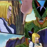
I don't often do this, but maybe I should do it more often seeing as I have a lot to say on comic layouts. I was actually very pleased with how I laid out this page because of how well it read even though it doesn't really look at all remarkable in the end. It takes some critical thinking to make a page read well, with the correct beats.
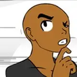
There are two things happening here: the dialogue exchange (as seen above) and the movement of the characters via the visual trajectory, as seen below:

Comic book pages are weird in that they're cinematic like storyboards for film but they also have to be stacked upon each other to create flow and order, in a way that is presented with good composition that aids in moving the eyes in a specific trajectory.
The thing doing the brunt of the work in a lot of my page layouts is the speech bubble placement, to string along the eyes from one panel to the next in the proper order. I pay a lot of attention to where and how they're placed so the reader doesn't get confused.
But once you're done reading, you can take in the overall character behaviour between panels because I managed to group the two panels with Rel and the two panels with Nal.
Anyway I thought this might be insightful. I might do a little series on principles of comic page layouts in general, if anyone is interested.
Also, as for my health... I'm still not doing any better and I don't find out until next week as to what has been happening, leaving me kind of stumped and useless for the time being. As a result there probably won't be a new CT page this week ><. I will continue to keep everyone updated. Thank you kindly for your patience and support. ♥
Chkao
2019-04-21 15:30:00 +0000 UTCJoodlez
2019-04-20 08:40:26 +0000 UTCMaur Razimtheth
2019-04-19 00:51:43 +0000 UTC