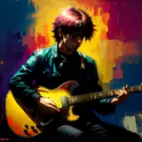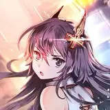
今回はカブトムシの方限定のメイキングになります。 第一回目なので手探りなのですが徐々にメイキングの方向性などを決めていけたらと思っています。 「春日陰」色決め、着色 から構図を変更した点について何故こうなったか大きく影響しているのが一つ、【視線誘導】です。 知っている方知らない方もいると思うので説明しますと イラストや写真など目で無意識に見る際にどこを最初に見て最終的にどこに目線がたどり着くか、視線を意図的に誘導させることを"視線誘導"といいます。 僕は視線誘導を取り入れる事が結構好きでイラストによく使っています。 これを覚えとくとまとまりのある絵になるのでおすすめです。 やり方としてはまずイラストの中でどこを一番見せたいかを決めます。 決まったらそこを中心に様々な線をそこに向けて描くと自然と視線誘導の出来上がりです。 今回のイラストでは主体キャラが全体の6割りを占めていてキャラは誘導する必要がないので次に見せたい「御守り」を注目させます。 1枚目では全体的に線が色んな方向に流れてしまっていて、視線が左右に分散している状態になっています。 ●緑の円と青の線 あまり良くない箇所。 ●白い線 このままでも良い箇所。 上部の緑の円は空白があり気になる部分。 帽子は建物や刀侍君の視線誘導を遮っているため御守りより帽子に注目がいってしまい帽子を指さしているような誤解を生む可能性。 一番の原因になっているのが春成君で左足と顔(髪)が左下に大きく向かっている部分、足のポージングは決定なのでここをどうにか右下に誘導させたい...と考えます。 そこで春成君に大きく重なるよう後ろに右下から左上に伸びる桜の木を置きました。(黄色の線) こうすることによって空白部分も埋まって目線が右下に流れるようになり「御守り」に目が行くようになりました。 帽子を動かすには風が必要だと思ったので髪と共に左側に風を吹かせ大きく移動させました。髪も刀侍君の方に揺らがせて視線を誘導させます。 こういった感じで良く見えるように状況を変える事はよくにあります。 後ろの建物も左肩より大きく出すことで視線を右下に持っていき同時に柱は遮ってしまうので無くしました。 これで前のものより修正したものの方が注目させたい部分がわかりやすくスッキリ見えるようになったと思います。 他にも細かな部分にも入っていてるのですがキリがないので一番大事な部分を紹介させて頂きました。 直接的に描くとわざとらしくなるので、あくまでも注目させたい方向として描くと自然な視線誘導になると思います。 見せたい所がよくわからない構図になった時は是非試してみてください! 次回は完成の原寸JPGデータを配布します(・ω・) -------------------------------------------------------------------------------------- 「Spring shade」~visual guidance~ This time it will be a making for "beetle" limited. It's my first thought, but I'm thinking if I can gradually decide the direction of making. "Spring shade" color decision, coloring One of the reasons why this happened with respect to changing the composition from [visual guidance] is one. As I think that some people do not know how to know When viewing unconsciously with eyes, such as illustrations and photographs, it is called "visual guidance" to see where the eyes first arrive and finally where the line of sight will arrive and deliberately direct the line of sight. I like drawing guidance very well and I often use it for illustration. If you do remember this, it is recommended as it will be a painful picture. As a way of doing, first decide where you want to show the most in the illustration. When it is decided, drawing various lines centering around there and drawing it there is the result of nature and gaze guidance finish. In this illustration, the subject character occupies 60% of the whole and the character does not need to guide, so let's pay attention to "charm" that I want to show next. In the first sheet, the lines are flowing in various directions as a whole, and the gaze is dispersed to the left and right. ● Green circle and blue line ------ Not so good. ● White line ------ A good place to stay as it is. The green circle at the top is a blank part and anxious part. The hat blocks the "visual guidance" of buildings and Touji. Possibility to make such a misunderstanding that the attention to the hat is pointing from the charm and points to the hat. The most frequent cause is Harunari's left foot and face (hair) headed great toward the lower left, I think that posing of a foot is somehow determined and I want to induce this here to the lower right .... So I placed a cherry tree extending from the lower right to the upper left behind so that it would overlap heavily on Harunari. (Yellow line) By doing this, the blank part is filled and the line of sight is made to flow down to the lower right, so that eyes will come to "charm". I thought that wind was necessary to move the hat, so I blown the wind to the left with my hair and moved it greatly. Hair will also shake towards Touji to guide the gaze. Frequently changing the situation to look good like this. I also lost the building behind because I put the line of sight to the lower right by making it bigger than the left shoulder and at the same time like the pillar will be blocked. I think that the part which modified more than the previous one seems to be refreshing and easy to understand the part which I want to watch. I have also included other details, but this time I introduced the most important part. I think that it will become a natural "visual guidance" if it draws as a direction which I want to pay attention to the last because it becomes painfully depicted directly. Please try it when you become a composition that you do not know well what you want to show! Next time we will distribute the actual size of completed JPG data:) ※I am using google translation.