[Random note]I'll make a note of what I feel I need to pay special attention to in the painting of figure hair.
Added 2022-06-27 02:49:54 +0000 UTCI would like to leave a memorandum on a couple of subjects that have been requested for two articles.
The first subject is something that I feel I would like to pay special attention to when painting hair.
Hair color is a very important element in figurines, and I think it is the second most important part of a figure after the face. And it is also a part that I am not quite good at. So when I paint the hair, I always have a hard time and end up re-painting it many times...
Anyway, I think that you can get a better idea of how to make hair parts that fit in with the kit as you work on it over and over again.
This time, I would like to share with you some of the points that I personally pay attention to.
I have posted about 6 photos of PVC finished hair (front and back) + photos of the kit I am secretly painting right now as a reference.
■ Four points to be aware of in hair painting
The general points to keep in mind when painting hair are as follows
1. Prepare an ideal material for the color scheme.
2. Prepare and distribute colors with an awareness of the three-color composition of base color, highlights, and shadows.
3. Confirm color tones with both the naked eye and photographs.
4. Check for trends in hair coloring.
Let's take a look at each of these.
1. Prepare an ideal material for the color scheme.
First of all, it is basic to prepare materials for painting. You can use official materials, or print out fan art of your ideal color scheme on a printer at a convenience store or the like that can print out colors to a certain degree for easy confirmation.
In some cases, it is easy to think that a PC monitor that produces a certain amount of color will be fine, but it is difficult to compare the colors on a monitor and with the naked eye when you are not used to it, so printing is recommended.
The best reference would be a デコマス photograph or a finished PVC figure. I think you can learn a lot if you take a good look at any figure and observe how the hair color scheme is composed.
I think it is OK to adjust the hair color to your own taste, but recently I have been trying to make it as close to the official color as possible. This is harder than I thought it would be, and it's good practice for color mixing.
2. Prepare and distribute colors with an awareness of the three-color composition of base color, highlights, and shadows.
In my case, when I paint hair, I first tone the base color. The base color is made by mixing white surfacer with ready-made colors or pure colors. (so-called "color surfacer ").
Depending on the situation, it is recommended to make two types of base color, one with a lighter saturation and the other with a higher saturation, so that it is easy to reapply when the color is different from the image. It is also useful when you want to create natural highlights.
First, apply a solid coat of this base color, then apply shadow color, and add highlight color as needed. The reason I say "as needed" is because applying the highlight color may make the opposite look uncomfortable.
Basically, two colors, the base color and shadow, can be used, but if you look closely at the finished PVC product, you will see that about four colors are used. Of course, it is a case-by-case basis, and it is possible to create a beautiful gradation using only two colors, the base color and shadow.
In the case of hair colors with high lightness (brightness of color) or low saturation (vividness of color), there are quite a few cases where highlight colors are not needed. If the base color is light, applying highlights won't make much sense... So, I personally think that with such light hair colors, there is no need to apply white highlights.
If you emphasize the edges by alternately applying the base color and shadow color, you can naturally create a gradation between the base color part and the shadow, so I sometimes think it is better and more natural than forcing a highlight color.
So, for reference, let's take a look at the finished PVC product I have.
・AMAKUNI-コウハイちゃん


☆ Colors that may be used
- Base color・・・Yellow with low saturation and close to white
- Shadow・・・Clear brown, clear black
- Highlight・・・・A very light reddish white
About 4 colors are used for hair, and it is gorgeous. By the way, most of the shadows in yellow-based hair colors are clear brown.
The highlights are not so subtle, but white highlights are used with the color adjusted so that they do not stand out too much. It is easy to think that white should be used directly for highlights, but it has been adjusted so that it blends in with the overall color scheme.
It appears that the color is adjusted with clear red to clear brown on a base of white-leaning yellow with light saturation, which makes me feel that they are doing something quite sophisticated even though it is a mass-produced product.
・ネイティブ-クロネ


☆ Colors that may be used
- Base color・・・Yellow
- Shadow・・・Clear brown
- Highlight ・・・ base color as it is
It looks like a two-color composition of base color and shadow color. Since the shadow is used to create a solid gradation at the parting of the hair ends, the paint is beautiful enough without highlights. This makes me feel that it is not absolutely necessary to add highlights.
Similar yellowish color is used for Shokuhou Misaki by Alter, like Kurone. However, It was highlight on the hair. Orange (or light clear brown) was added to the shadow at the ends of the hair.

・グッドスマイル-リン


☆ Colors that may be used
- Base color・・・Green
- Shadow・・・Clear green, clear black
- Highlight ・・・ Base color as it is
It is rare to see a character with green hair, so this alone is enough material, but it looks like the base color is green and clear green and clear black are used for the shadow color. Since the saturation of the green color is high, the gradation is expressed by applying different shades of green according to the unevenness of the color.
Since a long ponytail like this would be monotonous if painted solidly, the shadows and highlights were intentionally created by alternating light and dark shadows. Long ponytails tend to be stretched out, so this kind of painting method is quite effective.
・アルター-ララ


☆ Colors that may be used
- Base color・・・・Pink
- Shadows・・・・the base color as it is
- Highlight・・・・Pale pinkish white
This Lara is painted using a rather basic technique, so the highlights, shadows, and base color are very easy to see. The highlights are placed in an angel ring-like fashion to express the glossiness of the hair.
The top of the head is well colored. In the photo, it looks like the highlights are painted pink, but in the actual product, a large area is white. The ends of the hair are also highlight-colored, so it looks like no shadow color is applied. Incidentally, Alter's Momo is also in the same pink family, but is slightly orange (ivory) in color, and the highlights are ivory-white to match.


・グッドスマイル-加藤恵


☆ Colors that may be used
- Base color・・・Reddish brown
- Shadows: Black, navy
- Highlights: Not confirmed
Kato's color scheme is a bit unusual: reddish brown as the base color, black on the top of the head, and navy on the ends of the short bob. The highlights are omitted in the mass-produced version, but in デコマス, brown highlights are added.
・マックスファクトリー-結城美柑


☆ Colors that may be used
- Base color・・・Brown
- Shadow・・・Black
- Highlight・・・Light brown
The base color is a brownish color that looks a little green, and the highlights are bright brown and easy to see. This type of highlighting with thin lines is basic, so it is quite safe and easy to create a good atmosphere.
・ネイティブ-西園寺撫子


☆ Colors that may be used
- Base color・・・Light ivory color
- Shadow・・・Brown, clear black
- Highlight・・・・Base color
It can be seen that this Saionji is painted with brown or black in detail on a lighter base color (molding color). The highlight is a type of paint that leaves the color of the base color instead of applying it on top, so it is a difficult type of paint to apply as much as Kohai-chan.


☆ Colors that may be used
- Base color・・・・Light yellowish brown
- Shadow・・・Black
- Highlight・・・・Base color
Are there many types of figures around natives that are painted with a top coat of clear black, etc. on a lighter base color? It is amazing how many man-hours it takes to paint the figure. While creating highlights like angel rings, the shadow is blown hard on the concave part of the back of the hair.
---------------------------------
...When you look at the PVC finished product like this, you can see where and how you should put the highlights and shadows. Also, since there are certain colors that should be used as shadow colors depending on the hair color system, it would be less likely to fail if you follow them.
3. Confirm color tones with both the naked eye and photographs.
Once the color is applied to some extent, check the color not only with the naked eye but also with a photograph. At this time, it is recommended to take a picture with a white background paper, because the correct color will not be reflected if there is a background color.
It is recommended to prepare a gray card and correct the camera's white balance, but you can also take a picture with the subject and correct it using software. Depending on the lighting, the white background may turn gray, but if the color is almost the same as the original, it should be fine.
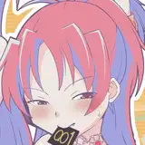
This is a kit that I have been secretly working on, but the color of her hair did not look right when I first painted it. The hair color is a little greenish (like a lighter version of Sinai gray), so I tried to match it to the original. The color is not so good with the naked eye, but on a monitor, it looks good.

However, as expected, the hair looked very greenish to the naked eye, so red and yellow were added, and highlights were added to the spread back of the hair in the next photo.

I think the hair color turned out to be so-so and blends in well. However, the actual color is quite subdued. (Photo) The colors seen on the monitor have a seasoned look, so I feel that it is terribly difficult to match them 100%.
If highlights can be clearly seen in a photo, they are usually at a level that is too harsh to the naked eye, so it may be just right that they are a little pale to the naked eye. It may be just right to apply it to a level that is a little too light to be seen with the naked eye.
This is an area that cannot be understood without actually applying the paint, so once you have some input, I think it would be faster to learn by doing it yourself.
4. Check for trends in hair coloring.
This is something I always think about, but there are so many elements that are incorporated into a figure from an illustration by an illustrator, so it is better to check out illustrations by various people to get the most out of it.
In the case of hair, special highlights (such as Well Rod Mk2) may be drawn in, or special shadows (such as Megumi Kato) may be added. Of course, since many things change depending on the character, I think it is important to look at the latest DecoMas photos and observe how the highlights and shadows are dropped into the illustrations.
Comments
This is super helpful. I'd love to see a post like this on adding detail to hair or other areas like the armpits. I can never get it to look clean or natural.
ChickP
2022-06-27 13:02:12 +0000 UTCSo useful thank you!
PDubs
2022-06-27 07:26:06 +0000 UTCThank you very much for writing such a detailed post on this subject! 🙏 I found it very insightful to observe the way colors are applied for shadows and highlights. I hope to improve when coloring the hair on my kits ^^ Asuna is looking great as well! You can definitely tell the difference between the two colors before and after.
Ceylonix
2022-06-27 03:18:53 +0000 UTCThis is really well written, thank you
Pikk
2022-06-27 02:59:18 +0000 UTC