XaiJu
calm
calm

patreon


Illustration #130 + rewards, sketches and doodles

Thank you for all the birthday wishes on my post earlier this month, I appreciate it. πŸ˜„

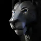
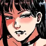
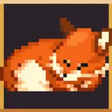
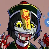
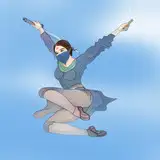
For the illustration this time around I decided to revisit the trio from #99. The three of them were meant to be out doing herbalism field studies. Don't you hate it when you're assigned to a group who just wanna fuck around instead of being productive? Typical, right?😏

Check out the rewards in the attachments! You can also always find them in the rewards collection post, alongside all other past rewards you might have missed!

I've been working on restructuring my painting process this month to allow me to separate image elements to different layers, as opposed to painting everything as if it's merged to one layer. I realized the way I usually paint, without separating things, doesn't lend itself well to being used in bigger projects, like when doing art assets for a game for example. So this is an attempt at starting to fix that problem.

The reason I've usually steered away from this is because separating everything in a picture to different layers necessitates having tons of layers. And tons of layers means a lot of layer management, which causes friction in my workflow and kinda frustrates me. To minimize that friction I've begun to try to create hotkeys for as much of that layer management as possible, so I can spend as much time as possible focusing on just the canvas instead of fiddling with the layer panel. The biggest help, by far, is setting a convenient hotkey for selecting a layer by clicking on its pixels on the canvas instead of clicking the layer in the layer panel. Other useful hotkey actions are jumping down or up one layer in the layer stack, and obviously creating a new layer. Since I wanna preserve transparency around edges when I paint I also heavily rely on the Preserve Alpha toggle hotkey for my brush, as well as toggling eraser mode for the brush. By using those I can do nice painterly edges and preserve that painterly style I like while also having transparency around edges on everything. I was initially worried that would be difficult or inconvenient to do, but it turned out better than I thought it would!

In the time lapse video this time around you'll see I tried to do values and colors separately for a while. But this has a compounding effect on the number of layers I have and I ended up with way too many to manage comfortably. I don't think I'll want to separate values and colors like that going forward. Also, when colors and values are separated it made it more difficult to select the correct layer by clicking the layer's pixels. So keeping values and colors merged seems to just be tidier and more convenient for this particular workflow.

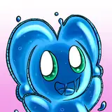
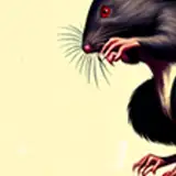
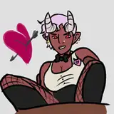
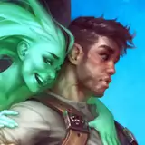
The doodles this time were a few extra things I've been messing around with as a way to get used to the restructured painting process. The more complex layer structure than I'm used to isn't ideal, but I am noticing throughout the main painting and these doodles that it's got some really nice benefits too. Toggling Preserve Alpha makes it a lot easier to do shading on each element in a drawing without needing to carefully shade along the edges of things or paint bespoke masks. So, while the extra layer management steals some time, there are time savings to be made there too! Hopefully a net positive.

Thanks for supporting me through June! I'm eager to start painting something new. πŸ˜€

Illustration #130 + rewards, sketches and doodles Illustration #130 + rewards, sketches and doodles
Illustration #130 + rewards, sketches and doodles Illustration #130 + rewards, sketches and doodles Illustration #130 + rewards, sketches and doodles

Comments

I would like to, for sure! I put two of them in the recent post for illustration #131. :) And I hope to get a couple more done soon, we'll see.

Calm

Would you consider releasing more shorter time lapses of your sketches? Those are very fun to watch.

devorah industries

Thank you, CiarΓ‘n! Happy to hear you're enjoying the characters, both in the illustration and in the doodle. And the environment and composition too! Always fun to know the details and the work I put in are appreciated. πŸ˜„

Calm

Ah, so it's not just our male elf friend that we're seeing again but also the two specific girls that he... spends time with 😈 It's fun to see that bit of continuity and those two elf girls are very lovely, so they're certainly a welcome sight 😻 Before getting to that, I have to briefly say that that lady in the centre in the "Doodles" is 100% my kind of girl! πŸ–€πŸ–€πŸ–€ Love the black hair and make-up, as well as her bright blue eyes. The pose is incredibly sexy and I love seeing how you do all of these squishes. Like her bra squishing her breast and her hand squishing her bum. Her warm skin tones definitely pop against her black and white clothes and I do like how you varied the blacks. Her hair is more neutral but then there's blues mixed into her bra and cape/glove, while her thigh-highs have more red and pink tones mixed in. Really adds some lovely variety and makes the different blacks look unique. Her expression is just great too, with the curled eyebrows, eyes rolling back and that cute way that her tongue rests against her lip. And of course, the actual rendering of her hair, body and clothes all look amazing but that's no surprise at this point! 😸 Suffice to say, I'd certainly not complain if we saw her again, quite the opposite! 😻😻😻 Maybe Luke could stumble across her 😹😈 __________________________________________ But now to the main painting! I'm going to try my best to be more broad in my comment and not immediately get captivated by all of the details, like I often do 😹 The whole scene looks absolutely gorgeous! The environment is so warm and inviting, with those bright god-rays that shine in from the upper right being a particular highlight. And that warmth is nicely balanced out by the cool tones of the waterfall and stream that weaves between the sand. Likewise, the blue-teal sort of haze at the edges of the scene is also a nice contrast to that very vibrant warmth at the centre of the image. Speaking of which, I like how the characters are set up here, kept in the centre, with that warm light shining down on them, while being framed by the green tinted water that runs around and underneath them. Back to the lighting, I do also like that the scene has one really strong light source from one direction, which then creates some great, contrasting shadows. The trees are a particularly great example, warmly lit on their left side, with dark shadows on their right. And of course the other elements in the environment and the characters benefit greatly from this too. The actual details of the environment are amazing, as always. The way you do trees is just so fantastic, with these twisting, overlapping shapes that wrap around each other. Likewise, I enjoy the way the larger rocks have these rippling segments to them and the ways they weave together and connect. And the blue-green tints to the trees and rocks within their shadows is a great detail too and gives that extra contrast against the warm sunlight. The sand also has a really nice texture to it and I enjoy that wavy, rippling effect to it. And like always, the foliage has a tonne of detail and depth to it thanks to the warm light from above and dark shadows beneath. And lastly, the colourful birds are a really nice touch and I do like that there are some mid-flight and others just chilling in the trees. And the specific green-blue colour of the waterfalls is just gorgeous!. I tried being a bit different with how I describe the scene and even tried my hand at talking about the composition, which I don't think I normally do πŸ˜… I don't know if trying to talk about the painting more broadly made the comment any less long than usual but I thought it'd be a nice change of pace 😹 _____________________________________ But now, to the characters! I really like the poses for all of them too. Our boy just looks so... hot and bothered, might be the phrase 😹 I like how he's just collapsed onto the rock and propped up by the tree, with his arm hanging limp beside him as he just about holds onto his book and scroll. The way his pants are just haphazardly resting on the rock beneath his leg, while more scrolls, a satchel and a boot are scattered about are great details that add to the story-telling in the scene. His worn-out expression, red face and the beads of sweat dripping down him are great details that really sell how intensely his friends are taking care of him 😹 And of course, the actual painting of him is brilliant as always. In particular, I like his green shirt with the way the material bunches up, crinkles and creases as it's pushed up his body. The detail of the skin on his thigh being pushed and compressed as his friend holds his leg is really well done. And I like his shift in skin tone, really warm and orange-tinted at his stomach/hips, growing steadily greener down his leg, towards the green water. And of course, the shapes of his anatomy and how all of his muscles are rendered and fit together are brilliantly done. The pink-haired girl just looks so alluring to me. I love the way her hair cascades down her arched back, with her ample breast pushed forward, while still teasing us with the nipple kept out of sight. Her very high-waist panties do a wonderful job accentuating her curves as the straps rise high over her waist. And I really love the soft, squishy shapes of her lower midsection and that crease where it meets the thigh. The lighting on her is particularly lovely, with the blue tinting to the shadows that shroud her hair and arms/shoulders, contrasting strongly with the warm, shiny skin tones below. Her hair really benefits from this, with that bright, warm section at the bottom really standing out against the darker, cooler hair above. And those bright, wet shine spots on her breast, sides, bum and thigh really make those areas pop and along with the shadows, do a great job defining her beautiful, voluptuous shapes and figure. And for the last character, the white-haired lady looks stunning too. I am in love with just how sensual and teasing her pose is. The curves of her waist, hips and thighs as she lays down, with a lovely twist to her body, just look incredible. And I am a serious sucker for when a character is naked/mostly naked but the naughty parts are just hidden from us. Her nipples behind her arm or her special place hidden as her thighs cross over is just indescribably sexy to me. I really like the colours here too, with her warmly lit skin contrasting with the whites and blues of her hair, bra and socks. Also, it has to be said... her naked belly, hips and thighs, while still wearing socks is just really, really, ridiculously hot and I don't know why 😹😻😻😻 The lighting on her looks great too, with the warm highlights running along the top planes of her waist and legs, smoothly blending down into the dark shadows below, perfectly defining her volumes. Likewise, I adore the rendering of her breasts, with a spot of sunlight on one of them, with warm, red tones mixed into the shadows and dark occlusion shadows between them to show their overlap. And like with the other girl, the way her hair flows down over her body looks great and you did a marvellous job with her expression. Like with the fella, I really enjoy the reddish tint to her nose and cheeks, as well as the sweat on her skin. Having her hair cling to her skin is a terrific detail too and the shine spots on her lips and tongue really sell that moist, luscious effect. And lastly, before I end. I've zoomed in at points to get a proper look at things and my goodness, all over again, I'm falling in love with the painterly, textured style that you use. The characters skin in particular just looks amazing to me, but of course, everything looks glorious in this style! Unsurprisingly, I think you've done a brilliant job here, with a beautiful, vibrant and warm scene that just looks so inviting. And goodness, all 3 characters are brilliantly painted and these two ladies are particularly stunning with their sensual curves and tantalising teases! πŸ‘πŸ‘πŸ‘πŸ‘πŸ‘πŸ‘πŸ‘πŸ‘πŸ‘πŸ‘πŸ‘πŸ‘πŸ‘πŸ‘πŸ‘πŸ‘πŸ‘πŸ‘πŸ‘πŸ‘πŸ‘πŸ‘πŸ‘πŸ‘πŸ‘πŸ‘πŸ‘πŸ‘πŸ‘πŸ‘

CiarΓ‘n

The art is crazy good, you don’t miss do you?

Topher


More Creators