XaiJu
calm
calm

patreon


Illustration #123 + rewards, sketches and doodles!

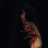
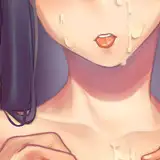
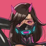
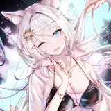
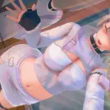
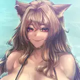
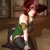
Hey, here a new painting for you guys! I couldn't resist painting another couple of elves. What can I say? ๐Ÿ˜…

And here are the download links for the rewards if you wanna check out the painting process:
WIP images
Short time lapse video
Long time lapse video
PSD files

It was an interesting painting from a workflow perspective. I've typically used Hard Light to add colors to values, like I showed last month. I've tried using the Overlay blending mode as well, but I often felt like it had trouble adding color to very light values, which Hard Light was capable of, so I fell into the habit of using Hard Light instead. I have noticed now, however, that Overlay does work the way I want as long as the values below are accurate, and my problem was really that I wasn't doing a good enough job hitting those intended values before adding the colors. So I feel like that's something I'll be attempting to pay proper attention to going forward.

I'm still feeling pretty good about having switched over to Krita from Paintstorm. I know some of you have been curious about that. Since Krita is a free software I'd recommend giving it a try if you've been on the fence about it. Just keep in mind that it does require a little bit of effort to set up hotkeys and customizing the UI and stuff. If you can get past that initial hurdle I think you'll like it.

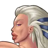
You'll notice the sketches I posted here have different styles to them. I tried some new and some old approaches, which I sometimes do kind of as a sanity check. "Is my new approach actually better? Did I forget something good about the old approach?" And looking at it now I think I much prefer my newer approach, fortunately!

I spent some of my time this month messing around with 3D modeling again. I don't really do it often enough to have anything worthwhile to show you guys unfortunately, but hopefully some day lol. Substance 3D Modeler is a fun software to use though. Especially in VR. You should check it out if you have the opportunity! Or check out Adobe Medium if you want the free alternative. ๐Ÿ‘

Thanks for supporting me in October! I hope you all had a nice spooky month. :)

Illustration #123 + rewards, sketches and doodles! Illustration #123 + rewards, sketches and doodles!
Illustration #123 + rewards, sketches and doodles! Illustration #123 + rewards, sketches and doodles! Illustration #123 + rewards, sketches and doodles! Illustration #123 + rewards, sketches and doodles! Illustration #123 + rewards, sketches and doodles!

Comments

You're welcome as always and you've earned a lot of praise with such lovely paintings! And thank you for answering about the brushes. I just wanted to make sure that I imported them correctly and didn't somehow accidentally miss out on anything. I do want to try them out soon for some sketching. They look like they'll be fun to use

Ciarรกn M

Oh I am. I ran into your stuff a while back, when I was looking for art to spice up a rulebook for a forum RP and decided "shut up and take my money" was the appropriate response to what I saw, lol.

Twelve Seal

I'm glad you're enjoying it!

Calm

I think it's a combination of things, but mostly because I've been trying a slightly different mark making method recently. I think I would ideally like to have results that aren't quite as painterly, but landing on ideal results just sometimes requires some attempts that don't quite get there. It's a learning process. :)

Calm

Thank you, Ciarรกn, you are always too kind with all your praise, I really appreciate all of it. ๐Ÿ˜„ The brushes file is only containing two that I felt confident about. The rest you saw are just experimental or not tested thoroughly enough, so sharing them as "Calm's brushes" feels a bit misleading if that makes sense.

Calm

Yeah, I've had trouble getting the result I want with gradient maps too, so manually painting the color variety has been a better approach for me, even if it takes more time. ๐Ÿ˜… And cool, I'll check out the comic!

Calm

New Calm art is always nice to see.

Twelve Seal

Why your recent pics are so blurry?

Tom

Whoa, now that is one incredibly colourful scene! But before getting directly into that, love Doodle 1. The colours are so vibrant and the textures are gorgeous. The swirling cloud mass in the background adds so much motion and dynamism to the scene and I like the way the rocks have those oranges, blues and greens mixed into them. Doodle 2 has a really interesting look, it's incredibly painterly and many of the shadows and textures have this... almost film-grain look to them. They give the painting this very old-timey, textured look like you might see in a physical painting, it's very cool to see. The colours are also gorgeous and I like how the flames in the background wisp upwards in this zig-zag motion, with the smoke blending into the pink above it. And those pink colours are even being tinted orange below from the fire, which is a lovely interaction. The more angular style for the character is also very interesting... sorry, "interesting" feels like such a vapid word that doesn't really mean anything ๐Ÿ˜…๐Ÿ˜น But it is very different, in a good, fun sort of way and I really like the stark lighting on her, with the warm light bathing the length of her back, butt, arm and legs, with those darker shadows to the sides. I also really like the warm tones mixed into the shadows on her calves. Oh and lastly, the shining, textured, metallic pots/urns/braziers in the background look really nice, especially with the warm oranges blended in and the contrast between light and shadow. Sketch 1 is just... wow! โค๏ธโค๏ธโค๏ธ Red was clearly a big inspiration for this one, with her vibrant hair, the red sheets, the red thigh-highs and all of the red/pink tones mixed into the skin of both characters. The bold reds also pop really nicely against the blue background and I do like how the blues are mixed into the shadows of the characters. The bright, white-ish highlights in her hair and across her skin look so striking and I do like the similar rim-lighting on the man. Her pose is just so sensual and sexy too, the foreshortening looks great, especially with how her hefty breasts spill across her chest. The dark, red shadows give her breasts great volume and I adore her huge areolas and the white rim-lighting on her left nipple โค๏ธ The sort of scratchy/hatchy texturing on her thigh-highs is so good too and I really like how there's a mix of navy and pink tones blended in. I'll stop there but overall, the colours are so vibrant and the background is a great compliment to the vibrant reds of the main action and the textures on everything are just so painterly and beautiful! ๐Ÿฅฐ๐Ÿฅฐ๐Ÿฅฐ Now... that main scene... hooo boy... ๐Ÿ˜ป๐Ÿ˜ป๐Ÿ˜ป Firstly, I absolutely love all of the colours and textures throughout this whole scene and I continue to really enjoy this pearlescent style where different colours are mixed into objects and characters. The stonework in the background has so much detail and texture, with the pink, green and blue tinting making the grey stones look so vibrant. The reflective shine on the glass looks so good too and you captured the perfect level of detail for the exterior. I can tell what the outside scene is meant to be easily and it doesn't distract from the interior scene. But when you do look at the outside areas, you're treated to lovely colours, details and textures ๐Ÿ˜ธ With the interior, I really like the wooden headboard of the bed. It's got such lovely, swirly wood-grain patterns and the overall warm, reddish-brown colour is made so vibrant with the pinks, greens and blues that are mixed in. The bedsheets are great too with an obscene amount of depth and detail, with so many creases and folds, both tight and loose and with the two materials overlapping each other and themselves. And of course, the different colours blended into the green and white just make them look so vibrant. I do also like that cylindrical pillow under the gentleman's head. The striped pattern looks great and conforms to the shapes and folds of the material and I like the end of the pillow, with the little tassle at the end. That tassle looks very nicely rendered, mostly in blue-tinted shadows, with a little highlight area of warm yellow-brown and with shadows giving depth to all of the little material strands. I'd best stop talking about the background and get to the characters now ๐Ÿ˜น The poses are incredibly sexy, with the ponytail elf straddling him, her peachy bum pushed outwards and accentuated by both the foreshortening and the way she arches her back. I love the teasing of her breast, protruding out from behind his arm and being squished against his chest and I like the intimacy too with her arm on his chest as she looks directly at him. The other girl looks terrific too, again, great foreshortening and I do like how her body is tilting/twisting to one side, with her hips and shoulders at opposing angles and her torso having this subtle c-curve to it. She also benefits from that sensual breast teasing as it pushes up against the bed, likewise with the shapes of her bum rising up, looking beautifully voluptuous but with the naughtier parts hidden from view. I like her expression quite a bit too, eyes centred on... you-know-what, with her cheeks/mouth extending and lips and tongue wrapping around it. The execution of everything is as terrific as ever and I continue to really enjoy the more painterly rendering of the characters too. The textures of all of their skin looks fantastic and for this piece in particular, the mix of bright lights and dark shadows does a great job of defining their bodies. The muscles on the man are so well done and looking at his arm and pec in particular, I really like how we have blues, pinks and reds blended into the shadows. His face too is incredibly vibrant with pinks and blues blended in and I do also like the tones of his legs as well. The legs look more sun-lit than the rest of his body, which is very striking against the pink/blue/green tinted shadows that run down the sides of the legs. For the ladies, starting with the one on her knees, the lighting/colour contrasts on her are very striking. I like the dark, blue and green tinted shadows across her marvellous booty and leg, set against the warmer tones of her upper half. And even then, there's still greens and blues mixed into the skin of her torso and breast, while also having reds blended in as well, making those areas look so colourful. The other lady has beautiful colours and lighting as well and I especially love her butt, especially where it connects to her left thigh. I love that overall circular area of light on her cheek, with a bright shine-spot on the upper left, with a warm shadow wrapping around the bottom of her bum. I really like how that shadow then cuts into the thigh, showing how her bum-cheek overlaps the thigh and these strongly contrast lights and shadows just bring so much depth to that part of her body. I also really like the greens and blues added to her shoulder and upper back, adding some contrasting coolness to that area. But what I really love is this magenta/purple tinting to her breast, along with the very dark cast-shadows from her arm. Overall the breast is especially vibrant and given a lot of depth. Okay, I'll finally stop... But damn, there is so, so much going on in this painting, it is absolutely wild! ๐Ÿ˜ป๐Ÿ˜ป๐Ÿ˜ป๐Ÿ˜ป๐Ÿ˜ป Excellent work once again on this one! ๐Ÿ‘๐Ÿ‘๐Ÿ‘๐Ÿ‘๐Ÿ‘๐Ÿ‘๐Ÿ‘๐Ÿ‘๐Ÿ‘๐Ÿ‘๐Ÿ‘๐Ÿ‘๐Ÿ‘๐Ÿ‘๐Ÿ‘๐Ÿ‘๐Ÿ‘๐Ÿ‘๐Ÿ‘๐Ÿ‘๐Ÿ‘๐Ÿ‘๐Ÿ‘๐Ÿ‘๐Ÿ‘๐Ÿ‘๐Ÿ‘๐Ÿ‘๐Ÿ‘๐Ÿ‘๐Ÿ‘ Oh but one question, the new brush bundle file that you've added here. How many brushes is that meant to contain? I noticed in the video that you have quite a few "Calm" brushes and when I load the bundle into Krita, there are two brushes. I just want to see if that's correct or if I've somehow screwed up the import ๐Ÿ˜…

Ciarรกn M

Wow! This one's very different. There so much color variety in the temperature changes. I try to do that with gradient maps from time to time but it doesn't quite work (at least not when I do it.) Glad krita is working out for you. I have been experimenting with Clip Studio lately but not quite there yet. We'll see. Last two things, one, I fucking love that island environment you did, which leads perfectly into my last thing: I DM'd you a copy of my comic. One of the last pages has the exact same color palette and a cloud exploding in the center, just like it lol

Pez


More Creators