![[全体公開]てゅーりんげんのメイキング](https://img5.xaiju.com/storage/5/vr/cf/d38796-019e8e9e-f3fd-7e0b-af31-c6315424f3bd.jpg)
![[全体公開]てゅーりんげんのメイキング](https://img5.xaiju.com/storage/12/fi/gp/d38796-019e8e9e-f401-764f-a217-231ac79f0d2d.jpg)
![[全体公開]てゅーりんげんのメイキング](https://img5.xaiju.com/storage/8/di/ut/d38796-019e8e9e-f40e-7ec3-902e-5238af3f6580.jpg)
![[全体公開]てゅーりんげんのメイキング](https://img5.xaiju.com/storage/1/jg/lg/d38796-019e8e9e-f41d-7879-81a4-c11d8e561dd9.jpg)
![[全体公開]てゅーりんげんのメイキング](https://img5.xaiju.com/storage/2/mf/gr/d38796-019e8e9e-f424-7605-9c8e-20447a001d9d.jpg)
![[全体公開]てゅーりんげんのメイキング](https://img5.xaiju.com/storage/11/yo/ik/d38796-019e8e9e-f427-7bc6-821a-fd2c28e59eb7.jpg)
![[全体公開]てゅーりんげんのメイキング](https://img5.xaiju.com/storage/1/vp/za/d38796-019e8e9e-f42a-7586-85be-0db9e6f3d2e3.jpg)
![[全体公開]てゅーりんげんのメイキング](https://img5.xaiju.com/storage/4/pt/xv/d38796-019e8e9e-f42d-7d09-8603-608a25d25692.jpg)
![[全体公開]てゅーりんげんのメイキング](https://img5.xaiju.com/storage/4/mg/vi/d38796-019e8e9e-f435-7277-af8e-e282dab690e5.jpg)
![[全体公開]てゅーりんげんのメイキング](https://img5.xaiju.com/storage/8/lt/rz/d38796-019e8e9e-f43f-78b7-8be0-7b1c1c44fe5b.jpg)
![[全体公開]てゅーりんげんのメイキング](https://img5.xaiju.com/storage/7/xz/ki/d38796-019e8e9e-f443-7cad-8c1b-8f4f610e4195.jpg)
お世話になっております、永地です。
前回描いたテューリンゲンについての軽いメイキングです。
(Hi!Here is a light making of Thuringia that I painted last time.)
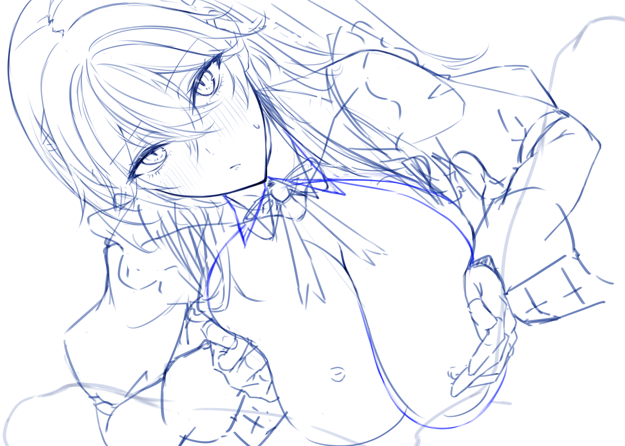
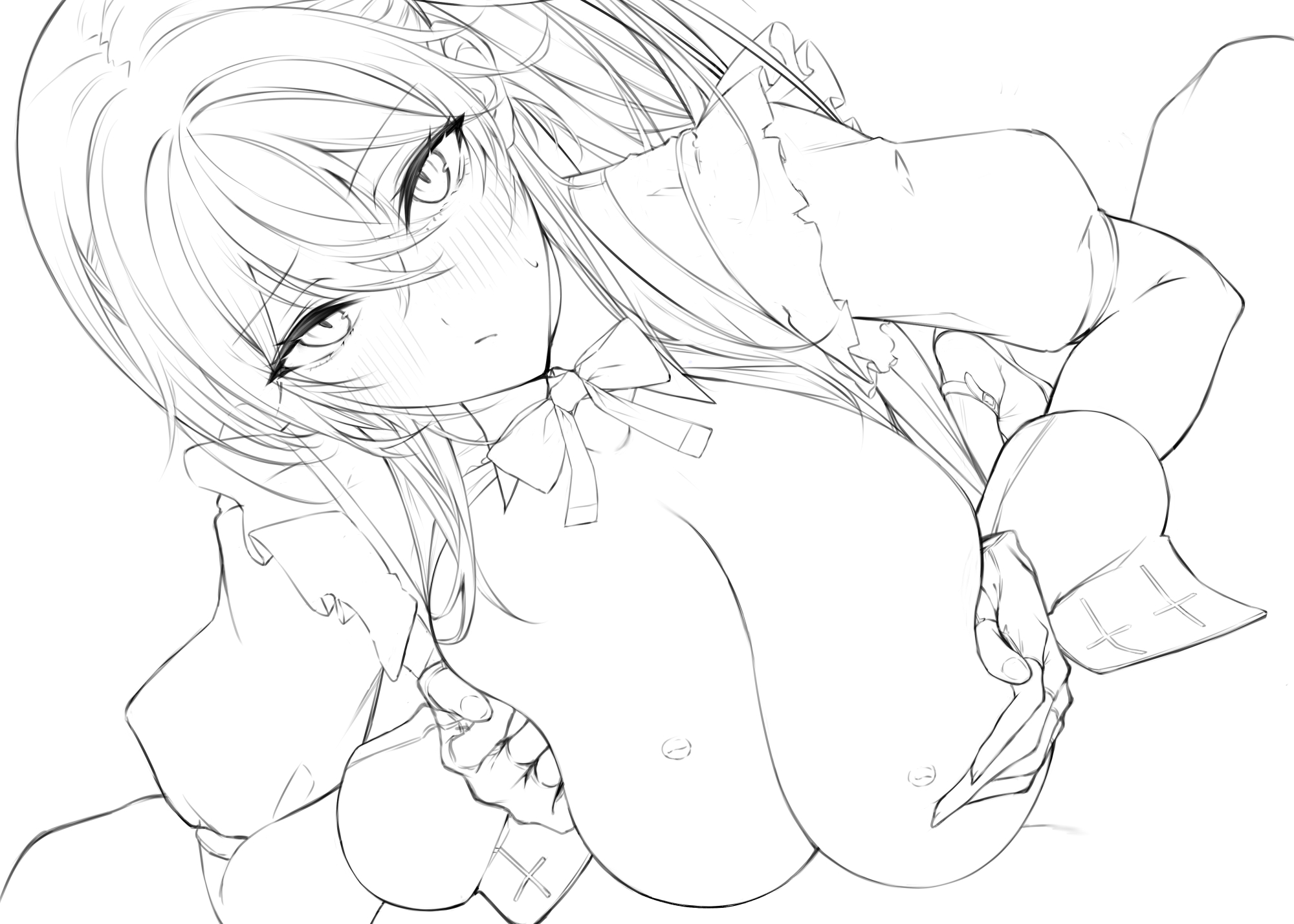
1,ラフ
今回は構図はオーソドックスな感じにしてます。王道は正義。
(This time the composition is orthodox. Standard is justice.)
2,線画
予め顔は描き込んでいたので少しブラッシュアップして流用します。
最近漫画を描いてたおかげで線画が楽になったかも?
(The face was drawn beforehand, so I brushed it up a bit and used it.
I think I might have been able to draw the line drawings easier thanks to my recent cartooning experience.)
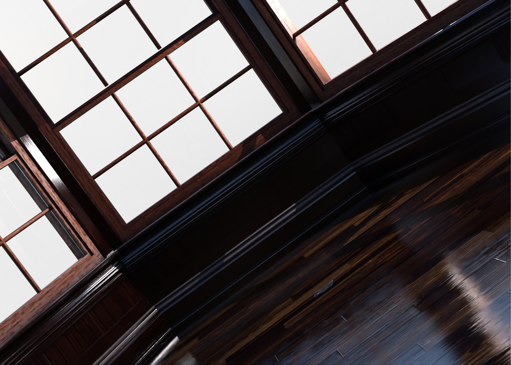
3,色置き&背景の用意
毎度の事DAZで構図を作っているのでその際に背景を設定します。
この時にキャラの陰影もおおまかに決めます。
胸を目立たせたいので斜めから光が入って胸に当たってる風にします。
(Every time I make a composition in DAZ, I set the background at that time.
At this time, the shading of the character is also roughly determined.
I want to make the chest stand out, so I want the light to shine on the chest from an angle.)
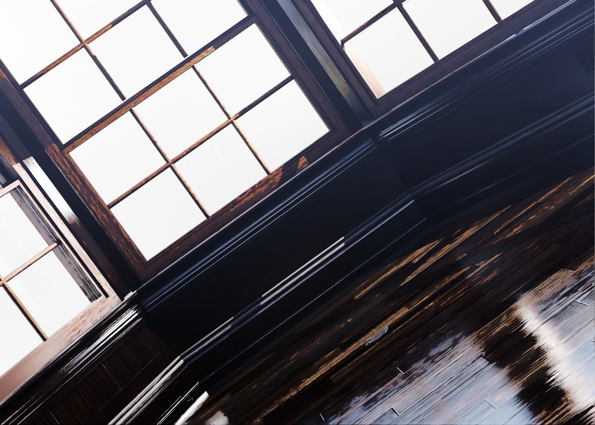
4,背景の処理
とりあえず光源を設定してレンダリング。
クリスタでスマートスムージングを描けるだけで少しイラスト感が出ます。
ここからさらに手を加えていきます。
(For now, set the light source and render.
Just being able to draw smart smoothing in Crystals gives it a little more of an illustration feel.
From here, we will make further modifications.)
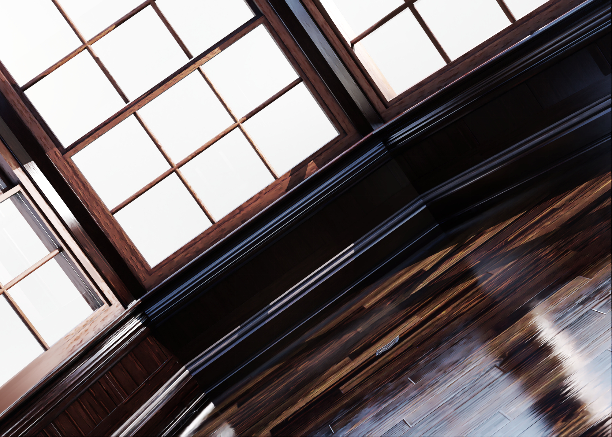
トーンカーブでメリハリをつけます。元が暗めなのでライトはアップしながら暗い部分はあまり変わらないようにしましょう。
また、木目はレタッチしてある程度潰します。テクスチャがそのまま出ているとイラスト感がなくなってしまうので大事。
(Use a tone curve to add fullness. Since the original is dark, the lights should be turned up while the dark areas should not change much.
Also, retouch the grain of the wood to reduce it to some extent. This is important because if the texture is left as it is, it will lose its illustration feel.)
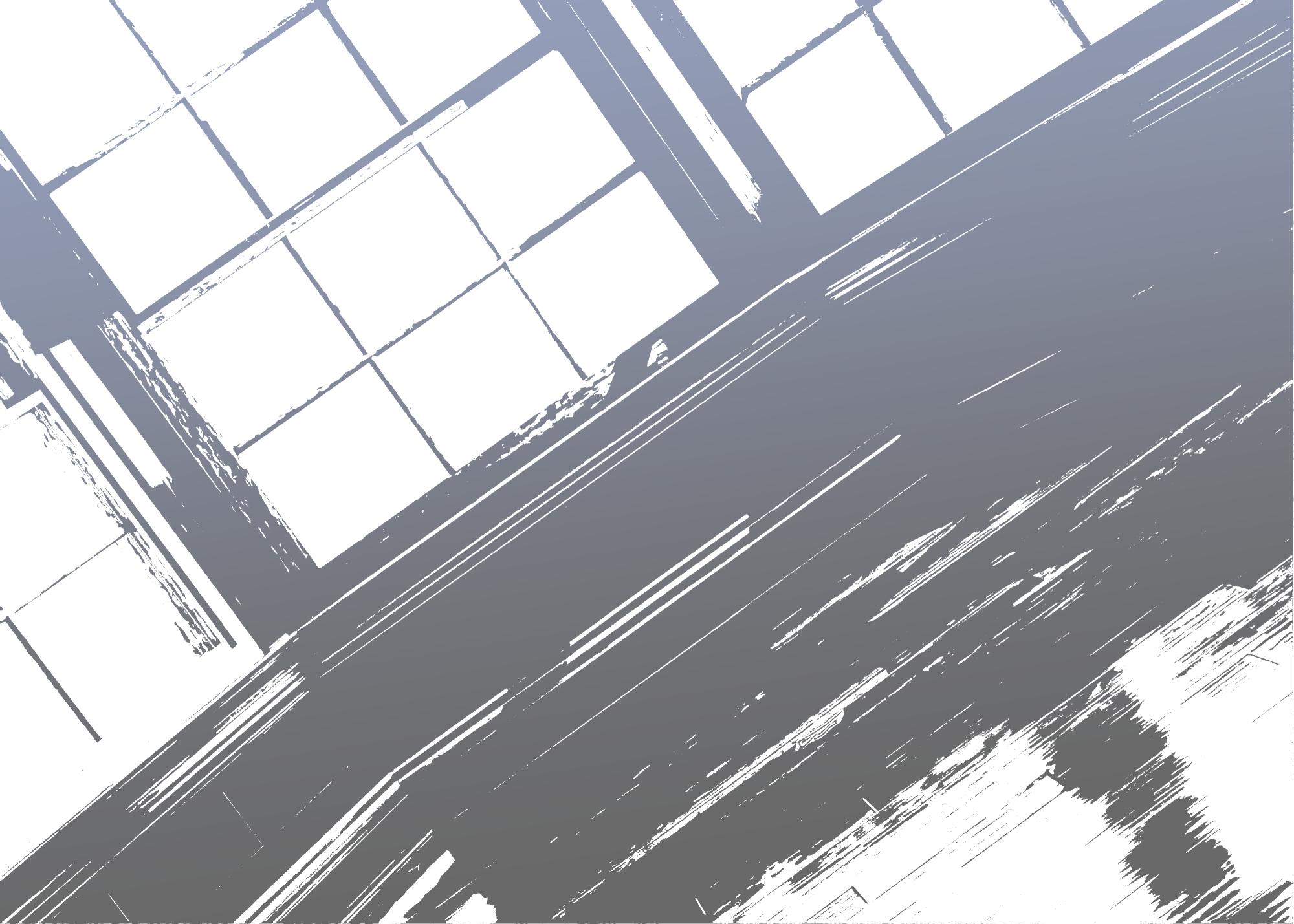
レイヤーをコピーして2値化します。
それをやや青めにグラデーションかけます。今回は透明度60%に設定。
(Copy the layer and binarize it.
Apply a slightly blue gradient to it. In this case, transparency is set to 60%.)
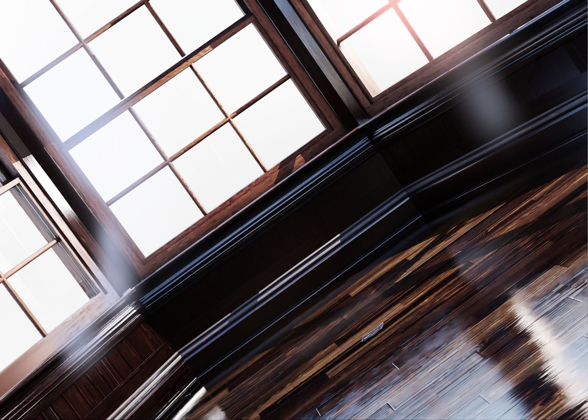
これを先程のものに重ねるとこんな感じ。かなりアニメっぽくなりますね。
尚、今回は絵とあわせたら上手くいかなかったのでこの青みは使ってなかったり。
(If you superimpose this over the previous one, it looks like this. It looks quite cartoonish.
Note that I did not use this shade of blue this time because it did not work well with the picture.)
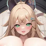
最終的にはこうなります。白モヤはキャラの輪郭にかかっており、キャラが目立つようにしてます。
(The final result looks like this. The white blur is over the outline of the character, making the character stand out.)
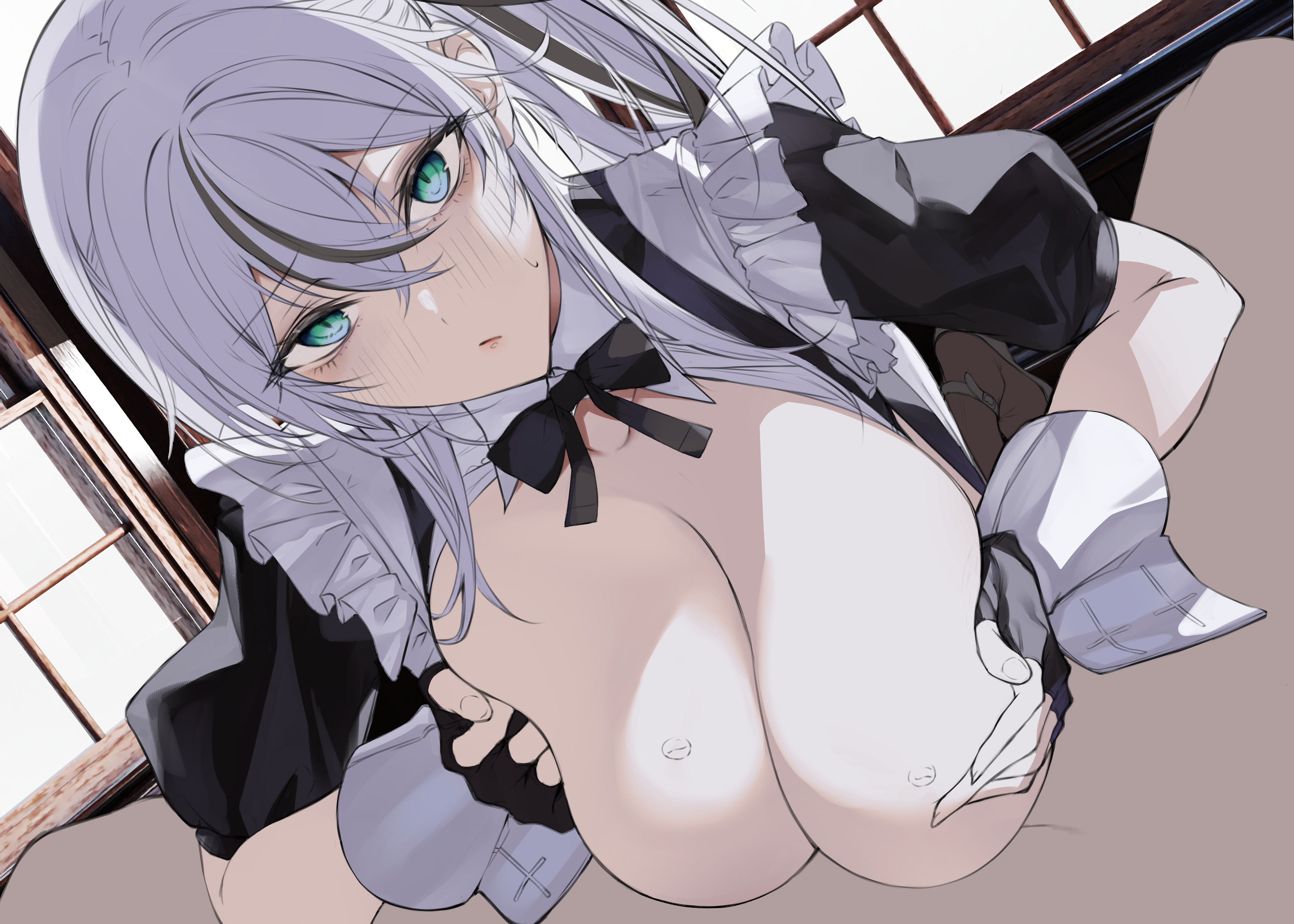
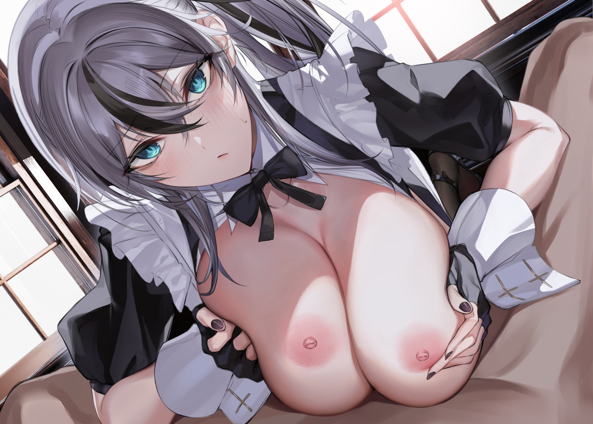
4,ある程度塗り完成
ある程度塗ったキャラと合わせるとこんな感じ。
先程の白モヤが生きますね。
線画をいわゆる色トレスってやつでなじませます。
一部は完全に塗り部分と同じにしてるのがわかります。
塗るときは線画にこだわり過ぎないのも大事なのかも。
(This is what it looks like when combined with a character that has been painted to some extent.
The white blur from earlier comes to life.
The line drawing is blended by what is called "color-tressing".
You can see that some parts are completely the same as the painted part.
When painting, it may be important not to be too particular about the line drawing.)
5,描き込み
髪の毛や光沢、あと細部の模様などを書き足します。
あとは要らない線なんかも塗りつぶしてしまいましょう。
乳のハイライトは今回はテクスチャブラシを使ってみました。
(Add hair, gloss, and other details.
Fill in any lines that are not needed.
For the highlights on the breast, I used a texture brush.)
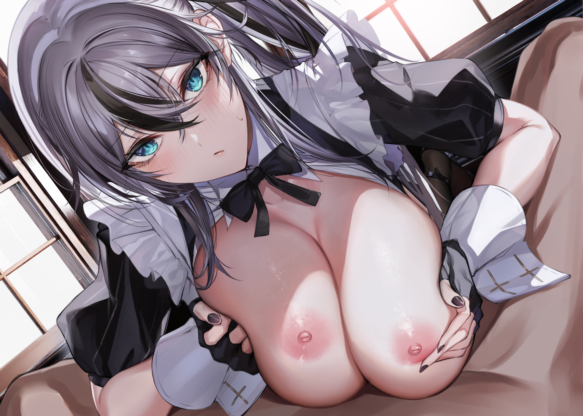
6,一旦完成
汁を書き足せば完成。
(Liquid is painted on and completed.)
今回は個人的には好きな雰囲気で描けたと思います。
あとは再現性が課題なんですけども・・・。
(This time, I think I was able to paint in an atmosphere that I personally like.
Now the challenge is to reproduce it....)
引き続き上達したいところです。
よろしければまた読んで下さい。それでは!
(I would like to continue to improve.
Please read again if you like. See you soon!)


