![[тЁеСйЊтЁгжќІ]УљйТЏИсЂЇсЂ«тиЦуеІ](https://img5.xaiju.com/storage/3/fh/od/d38796-019e8e9e-f8d6-73c7-b8f5-f9de7531996f.jpg)
![[тЁеСйЊтЁгжќІ]УљйТЏИсЂЇсЂ«тиЦуеІ](https://img5.xaiju.com/storage/4/zd/yi/d38796-019e8e9e-f8d6-7f25-ac08-78445fba0294.jpg)
![[тЁеСйЊтЁгжќІ]УљйТЏИсЂЇсЂ«тиЦуеІ](https://img5.xaiju.com/storage/10/nr/of/d38796-019e8e9e-f8dd-71f9-92c4-e2bc1bcdc0bd.jpg)
![[тЁеСйЊтЁгжќІ]УљйТЏИсЂЇсЂ«тиЦуеІ](https://img5.xaiju.com/storage/5/ge/yu/d38796-019e8e9e-f8e3-71a2-bf3b-9d35cceaed20.jpg)
![[тЁеСйЊтЁгжќІ]УљйТЏИсЂЇсЂ«тиЦуеІ](https://img5.xaiju.com/storage/3/cr/xg/d38796-019e8e9e-f8e6-773d-b679-ee67d3147a4d.jpg)
![[тЁеСйЊтЁгжќІ]УљйТЏИсЂЇсЂ«тиЦуеІ](https://img5.xaiju.com/storage/10/qm/hi/d38796-019e8e9e-f8ef-7d59-9e9f-f0c50e1ddba7.jpg)
![[тЁеСйЊтЁгжќІ]УљйТЏИсЂЇсЂ«тиЦуеІ](https://img5.xaiju.com/storage/10/kn/js/d38796-019e8e9e-f8f3-7761-9776-f25b3ff69da5.jpg)
![[тЁеСйЊтЁгжќІ]УљйТЏИсЂЇсЂ«тиЦуеІ](https://img5.xaiju.com/storage/4/qc/og/d38796-019e8e9e-f8f5-7be3-89bd-759ddad3c3c6.jpg)
![[тЁеСйЊтЁгжќІ]УљйТЏИсЂЇсЂ«тиЦуеІ](https://img5.xaiju.com/storage/4/ip/ac/d38796-019e8e9e-f8f9-7191-9f22-e6626836af39.jpg)
![[тЁеСйЊтЁгжќІ]УљйТЏИсЂЇсЂ«тиЦуеІ](https://img5.xaiju.com/storage/11/ar/bk/d38796-019e8e9e-f8fd-76a0-9ebd-75dbfb57f27b.jpg)

С╗ітЏъсЂ»сѓ»сЃГсЃ│сѓисЃЦсѓ┐сЃЃсЃѕсЂ«УБйСйютиЦуеІсѓњсЂІсѓІ№йъсЂЈТЏИсЂёсЂдсЂЙсЂЎсђѓ
УІ▒Уе│сѓѓсЂцсЂЉсЂдсЂЙсЂЎсЂїсђЂТЕЪТб░у┐╗Уе│сЂфсЂ«сЂДУфГсЂ┐сЂЦсѓЅсЂёсЂІсѓѓсЂЌсѓїсЂЙсЂЏсѓЊсђѓ
[In this issue, we write about the production process of Kronstadt in simple terms.
English translation is included, but it may be difficult to read because of machine translation.]
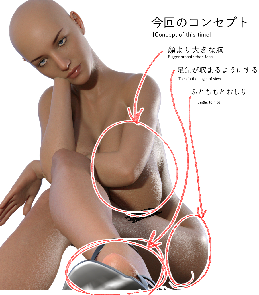
1,тЈѓУђЃсЃбсЃЄсЃФсЂ«ућеТёЈ(blueprint)
сЂЙсЂџсЂ»DAZсЂДтЈѓУђЃтЏ│сѓњСйюсѓісЂЙсЂЎсђѓ
сѓ»сЃГсЃ│сѓисЃЦсѓ┐сЃЃсЃѕсЂ«жГЁтіЏсѓњТ┤╗сЂІсЂЏсѓІсѓѕсЂєсЂфсЃЮсЃ╝сѓ║сѓњУђЃсЂѕсЂЙсЂЎсђѓ
[First, make a reference diagram in DAZ.
We will come up with a pose that makes the most of Kronstadt's charm.]
сЃ╗сѓИсЃБсѓ▒сЃЃсЃѕсЂ«сЃЄсѓХсѓцсЃ│(Jacket design)
сЃ╗УёџуиџуЙјсѓњт╝ЋсЂЇуФІсЂдсѓІсЃЄсѓХсѓцсЃ│(beauty of slender female legs)
сЃ╗жАћсѓѓТўасЂЌсЂЪсЂё(I want to draw a face.)
сЃ╗УЃИсЂїсЂДсЂІсЂё(breasts!)
ТюгТЮЦсЂфсѓЅСйЋсЃЉсѓ┐сЃ╝сЃ│сЂІУђЃсЂѕсЂЙсЂЎсЂїС╗ітЏъсЂ»у┤аТЌЕсЂЈС╗ЋСИісЂњсЂЪсЂёсЂ«сЂД1сЃЉсѓ┐сЃ╝сЃ│сђѓ
тЁЅТ║љсЂфсЂЕсѓѓжЂЕтйЊсЂФТИѕсЂЙсЂЏсЂЙсЂЎсђѓ
[Normally, I would consider several patterns, but this time I wanted to finish quickly, so I used one pattern.
The light source and other elements are also used appropriately.]
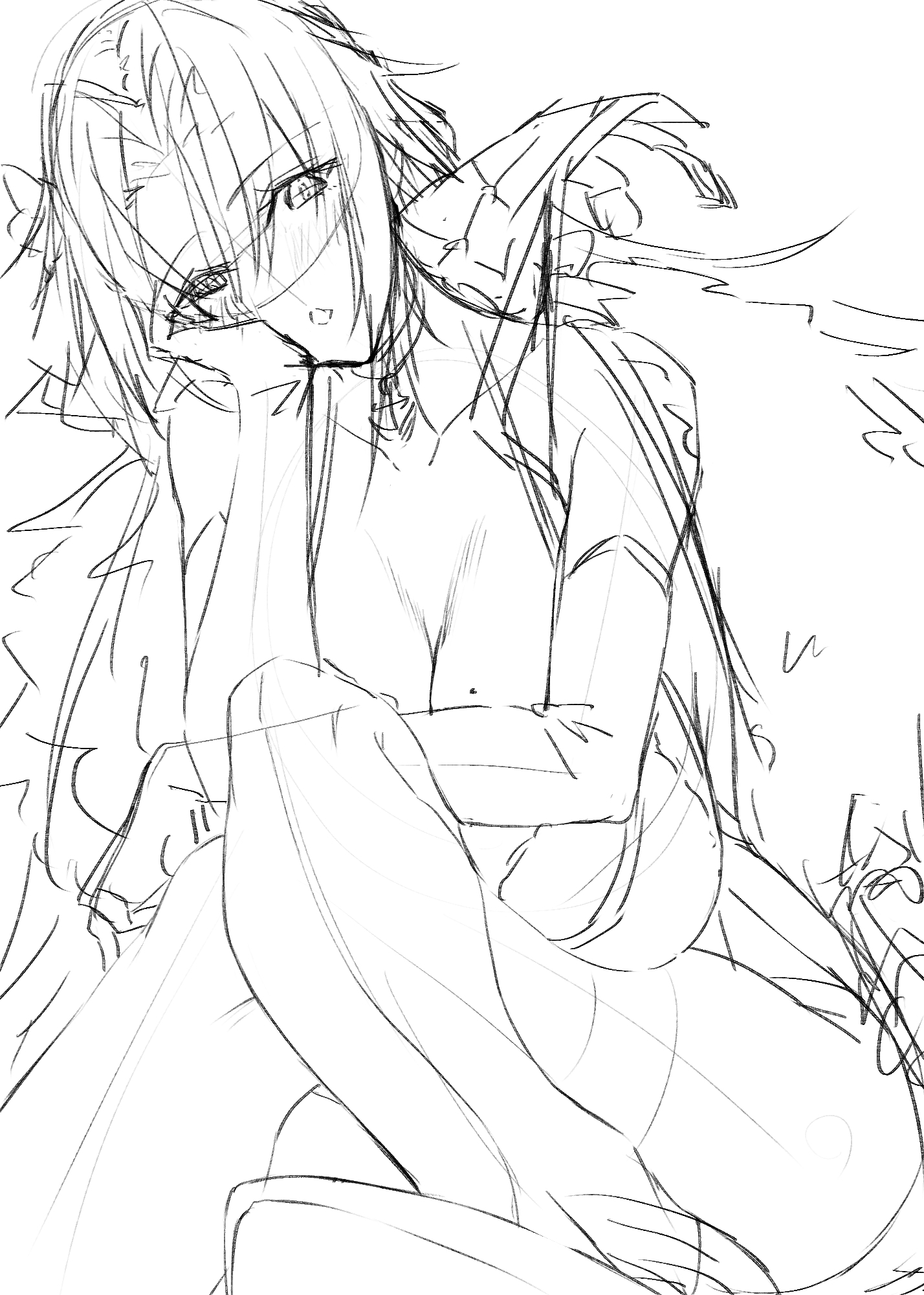
2,сЃЕсЃЋућ╗сѓњТЈЈсЂЈ(rough)
С╗ітЏъсЂ»УЅ▓сЃЕсЃЋсЂ»СйюсѓісЂЙсЂЏсѓЊсЂДсЂЌсЂЪсђѓт┐ўсѓїсЂдсЂЪсђѓ
жЄЇсЂфсЂБсЂдтѕєсЂІсѓісЂЦсѓЅсЂёсЂесЂЊсѓЇсѓёУЄфтѕєсЂ«УІдТЅІсЂфу«ЄТЅђсЂ»жфеТа╝сѓњТЈЈсЂЇсЂЙсЂЌсѓЄсЂєсђѓ
[I did not make a color rough this time. I forgot.
Draw a skeleton for areas that overlap and are difficult to understand or where you have difficulty.]
3,уиџућ╗(line drawing)
сЂесЂФсЂІсЂЈТЎѓжќЊсЂїТЃюсЂЌсЂІсЂБсЂЪсЂ«сЂДТђЦсЂёсЂДуиџућ╗сѓњТЈЈсЂЇсЂЙсЂЎсђѓ
ТЅІтЅЇсЂФТЮЦсѓІУдЂу┤асѓёУ╝фжЃГсЂ»сѓёсѓётцфсѓЂсЂ«уиџсЂФсЂЌсЂЙсЂЌсЂЪсђѓ
[In any case, I rushed to draw the line drawing because I didn't have much time to spare.
The elements and outlines in the foreground are slightly thicker.]
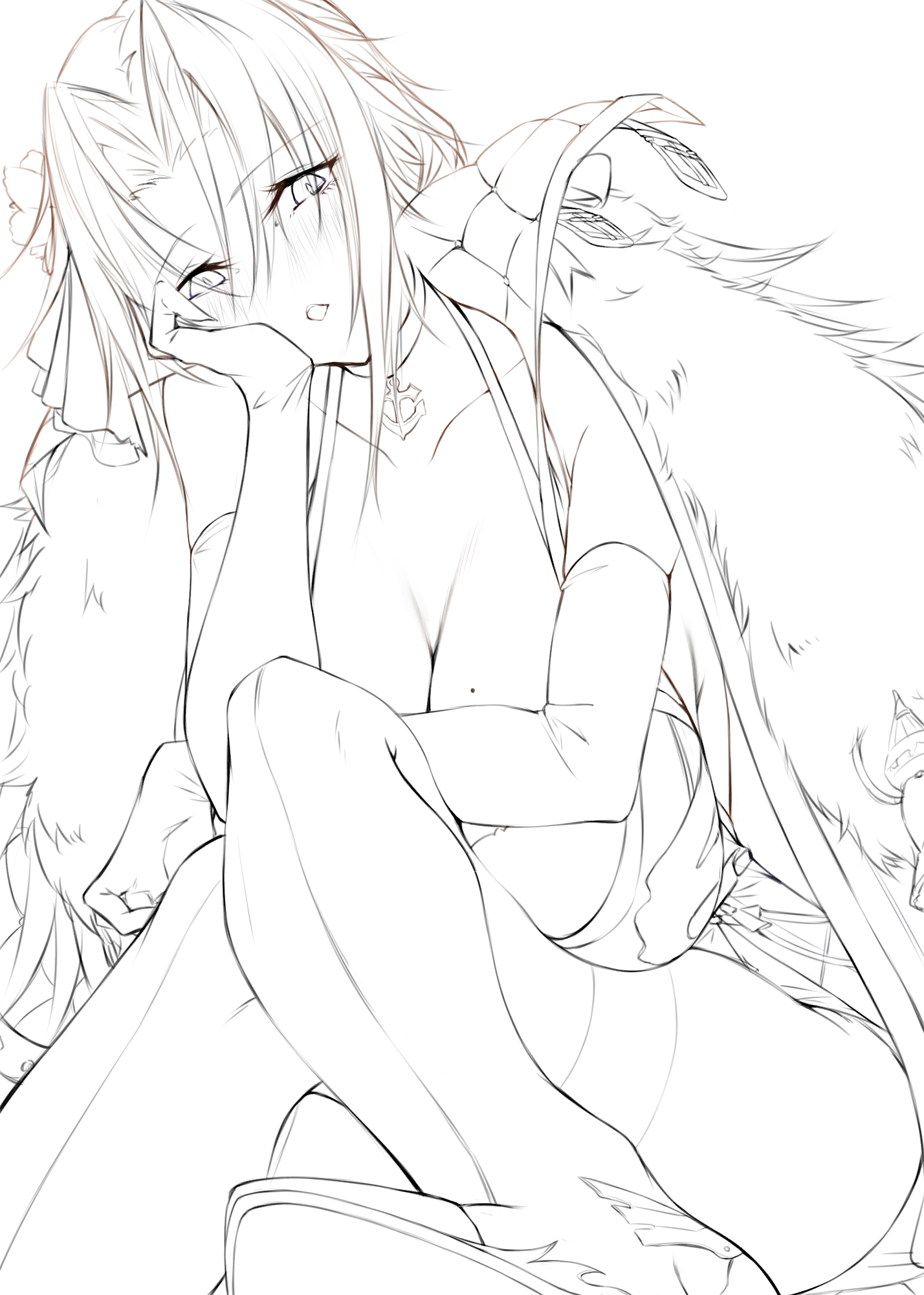
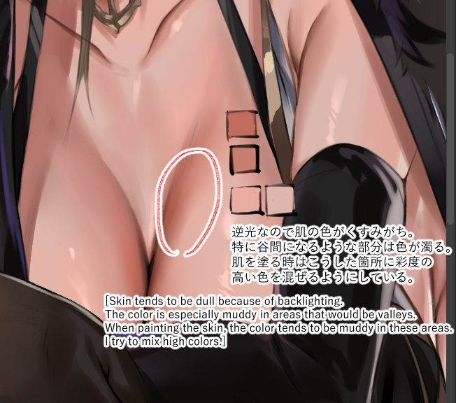
4,тАЌсѓісЂ«сЃЋсѓДсЃ╝сѓ║1(Coloring phase 1)
С╗ітЏъсЂ»тЁеСйЊуџёсЂФт╝исѓЂсЂ«сѓесЃЃсѓИсЃЕсѓцсЃѕсѓњСй┐сЂєС║ІсЂФсЂЌсЂЙсЂЌсЂЪсђѓ
сЂДсѓѓТЌЕсЂЈС╗ЋСИісЂїсѓІсЂ«сЂ»сЂёсЂёсЂЉсЂЕсђЂсѓесЃГсѓ╣сЂ»т╝▒сЂЙсѓІсЂІсѓѓРђдРђдсђѓ
[This time we decided to use a stronger edge light overall.
But it's nice to get it done quickly, but it may weaken the eroticism. ......]
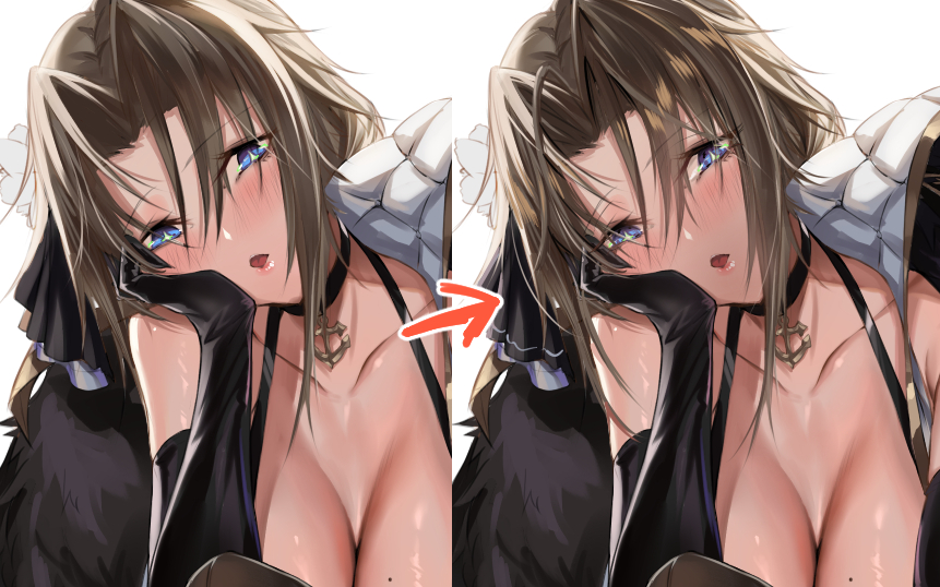
5,тАЌсѓісЂ«сЃЋсѓДсЃ╝сѓ║2(Coloring phase 2)
уиџућ╗сЂ«СИісЂІсѓЅТЈЈсЂЇУХ│сЂЌсЂЙсЂЎсђѓ
уЏ«уФІсЂцуиџсѓёТ░ЌсЂФжБЪсѓЈсЂфсЂёжЃетѕєсЂ»сЂЕсѓЊсЂЕсѓЊжЄЇсЂГсЂдТЈЈсЂёсЂдсЂЌсЂЙсЂёсЂЙсЂЎсђѓ
[Add on top of the line drawing.
The lines that stand out and the parts you don't like are drawn on top of each other.]
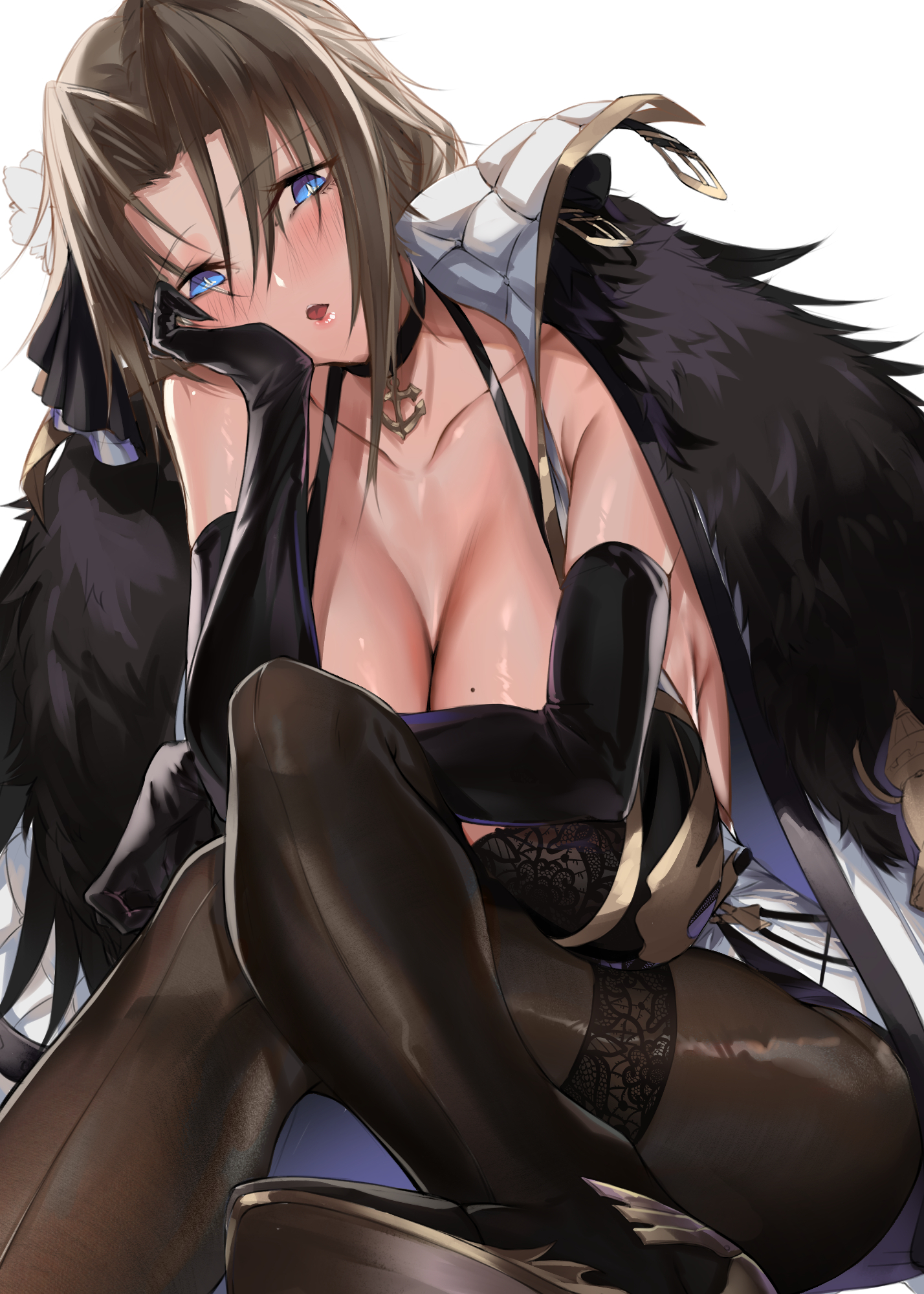
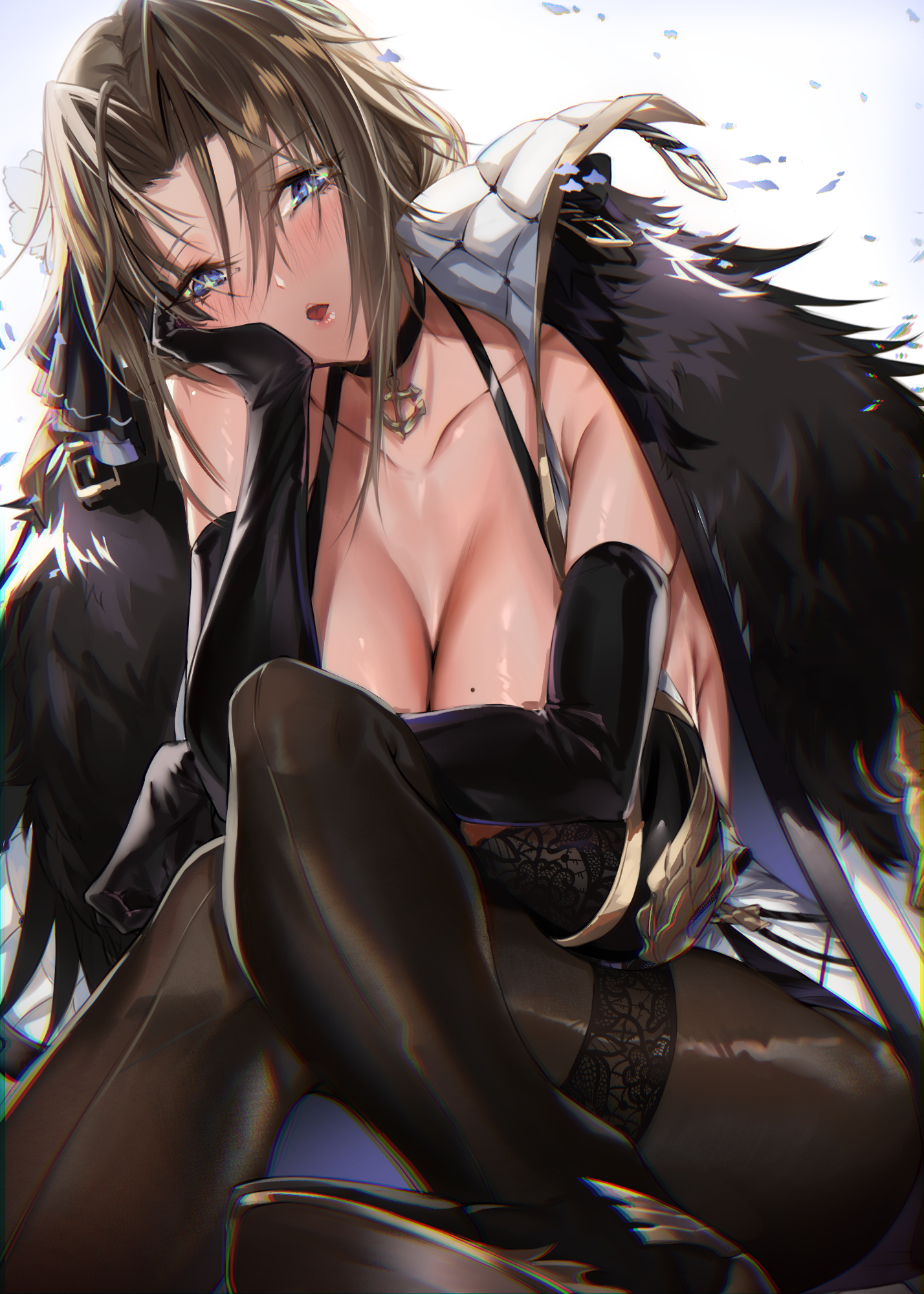
6,сѓесЃЋсѓДсѓ»сЃѕсѓњсЂцсЂЉсЂдт«їТѕљ№╝Ђ(Finished with effects!)
сѓесЃЋсѓДсѓ»сЃѕсѓњсЂІсЂЉсЂдт«їТѕљ№╝Ђ
УХ│тЁѕсЂфсЂЕсЂ»ућ╗жЮбсЂ«сЂІсЂфсѓіТЅІтЅЇсЂФТЮЦсѓІУдЂу┤асЂфсЂ«сЂДт╝исѓЂсЂФсѓесЃЋсѓДсѓ»сЃѕсѓњсЂцсЂЉсЂЙсЂЌсЂЪсђѓ
сЂ╝сЂІсЂЌсЂДжЂаУ┐ЉТёЪсѓњтЄ║сЂЎсѓѕсЂєсЂфсѓцсЃАсЃ╝сѓИсЂДсЂЎсђѓ
[Finished with effects!
I applied the effect strongly to the toes and other parts of the image because they are elements that come very close to the front of the screen.
Chromatic aberration is used instead of blurring to create perspective.]
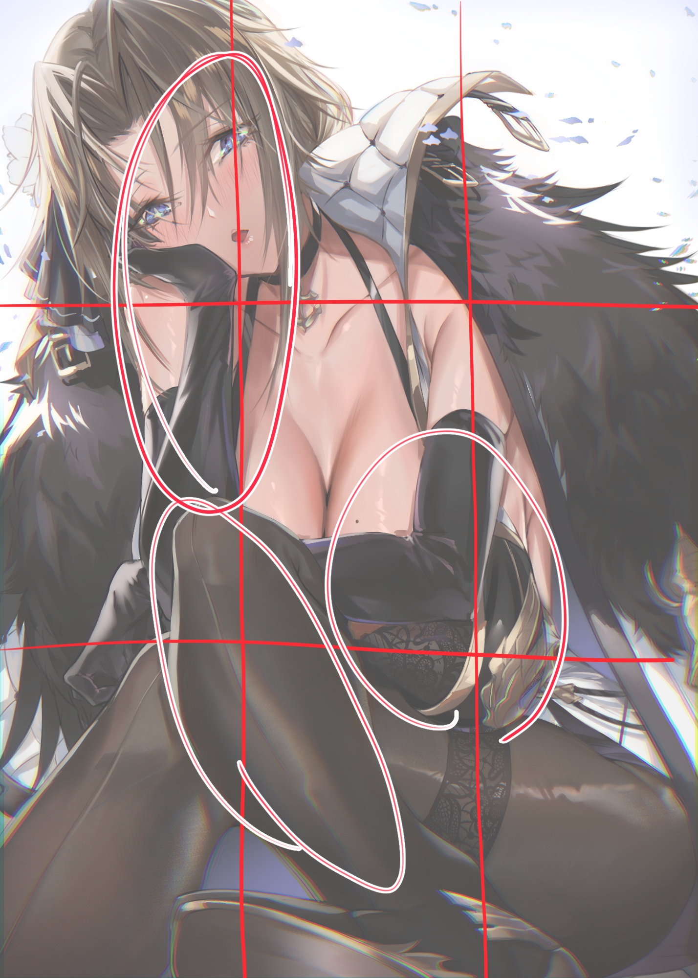
сЂісЂЙсЂЉсђЂТДІтЏ│сЂФсЂцсЂёсЂд(Extra: Composition)
жЂЕтйЊсЂДсЂЎсЂї3тѕєтЅ▓Т│ЋсЂДуЏ«сЂФсЂцсЂЇсѓёсЂЎсЂЈсЂфсѓІсѓѕсЂєсЂфжЁЇуй«сѓњТёЈУГўсЂЌсЂдсЂЙсЂЎсђѓ
[It is appropriate, but I am aware of the placement of the three partition method to make it more visible.]
сЂЙсЂЪсђЂС╗ітЏъсЂ»тидСИісЂІсѓЅтЈ│СИІсЂИТёЈУГўсЂїТхЂсѓїсѓІсѓѕсЂєсЂфсЃЕсѓцсЃ│сЂФсѓѓсЂфсЂБсЂдсЂёсЂЙсЂЎсђѓ
УдќуиџсЂ«ТхЂсѓїсЂїСИісЂІсѓЅСИІсЂИтљЉсЂІсЂєсѓѕсЂєсђЂсѓцсЃЕсѓ╣сЃѕсЂ«СИітЂ┤сЂ»Т»ћУ╝ЃуџёТўјсѓІсЂЈСИІсЂИУАїсЂЈсЂ╗сЂЕтй▒сЂїсЂІсЂІсЂБсЂдсЂёсЂЙсЂЎсђѓ
СИЅУДњТДІтЏ│сѓёт»ЙУДњТДІтЏ│сЂфсЂЕУцЄТЋ░сЂ«ТДІтЏ│сѓњТёЈУГўсЂЌсЂдсЂёсЂЙсЂЎсђѓ
[In this case, the line is also such that consciousness flows from the upper left to the lower right.
The upper part of the illustration is relatively light and the lower part is in shadow, so that the flow of the viewer's gaze is from the top to the bottom.
We are aware of multiple compositions, including triangular and diagonal compositions.]
сЂѓсЂЙсѓіТЎѓжќЊсѓњсЂІсЂЉсЂЪСйютЊЂсЂДсЂ»сЂфсЂёсЂДсЂЎсЂїсђЂУЅ▓сђЁсЂетиЦтцФсЂ»сЂЌсЂдсЂёсѓІсЂ«сЂДТЦйсЂЌсѓЊсЂДсЂёсЂЪсЂасЂЉсЂЪсѓЅт╣ИсЂёсЂДсЂЎсђѓ
сЂЮсѓїсЂДсЂ»сЂЙсЂЪТгАсЂ«УеўС║ІсЂДсЂіС╝џсЂёсЂЌсЂЙсЂЌсѓЄсЂє№╝Ђ
It is not a work that I spent much time on, but I hope you enjoy it, as I have tried to do a lot of things with it.
Stay tuned for my next post!
Thank you!!


