SUPER FATTY ART STYLE GUIDE
Added 2024-09-23 22:00:02 +0000 UTCI wanted to share more Game Dev logic and a lot of people seem to like my artstyle so I wanted to share some of the specifics of it's direction from the style guide we use in our game projects.
===
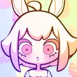
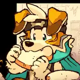
Monster designs should be uniquely identifiable to each other at a glance. Remember players are constantly on the move and need to make snappy decisions. So, color and silhouette are a big focus for this particular style.
===
COLOR:
===
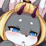
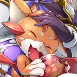
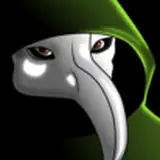
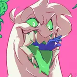
Each monster should have a unique color pallet of no more than 2-3 colors with one color being a clear majority. For instance, this imp is MOSTLY red and only has a secondary red for shading and a yellow for the shirt. This is an ideal number and usage of color.

Color pallets that need a large number of colors to achieve their design should make their colors either very close to each other or very sparse. See in this zombie with FIVE colors. There’s three greens that are very similar but only a splash of pink and yellow.

Sprites should use big, solid black shapes.


The use of the solid black is to emphasize silhouette over detail. Parts of the body that are not focal points (like the legs or the further arm) can generally be solid black. For bigger more complex silhouettes, use more black than color. If you can't identify a limb/clothing/feature by its silhouette, you should be asking if that can be fixed or, if you even need it at all. For instance, (I hope) the witch's hand and spoon is identifiable even with no lines or color.
However, you will notice I added lines within the black in key areas. This was for the RPG where the player didn't need to be running around as much as the SWEET games. What level of detail you can get away with will depend on your gameplay.
Additionally, the solid black is useful for when limbs overlap the body. See how the front arms in these designs are still clearly identifiable because they’re overlapping solid black. Generally, if limbs overlap the main bodymass it should be color over black or black over color.
===
SHADING:
===
This style severely limits shading. Generally, all coloring should be accomplished with the fill bucket in big, blocky shapes. But occasionally, there is a need for “shading”.
Usually, shading should only happen to the “main” color and on larger, less detailed parts of the design. You’ll see here there’s no shading on the imp’s yellow shirt because it’s small and busy with lines. For the head and arms though, it’s useful to shade the neck and far limbs for depth. Similar logic was applied to the zombie.
Generally, drawing proper “shadow” will only happen if any particular block of color is exceptionally large. Like here on the belly.

Here’s an example of over-detailing shading. Instead of trying to add the ‘highlight’ here in addition to the line, the line should have simply been colored the lighter shade, like on the right. Overall, if your shading detail would only be a few pixels in size, reconsider it.


===
HIGHLIGHTS:
===
Generally, do not add highlights. I would prefer to avoid them altogether.
===
LINE COLORS:
===
The outer lines should ALWAYS be black (with few exceptions). Where two colors meet should USUALLY be black but lines within single colors or lines just for detail/design should almost always be colored. See the shirts again for an example of the latter.
Additionally, look at the hair on the imp. The whole shape is outlined in black to emphasize its separate “form” from the head. Black lines can be used to indicate depth in this way. But the single line within the hair is a detail so it's colored.
It’s also good practice to use the “main” color as the line color for other colors (see how the red of the imp is the lines on the shirt) and whatever color you used for shading as the line color for whatever crosses over the main color (see the line in the hair)
FYI: coloring lines can make the whole “mass” of something feel softer. Generally, where fat rolls over itself or smooshes against other fat should be colored. Like cleavage.
===
SILHOUETTE:
===
Look for big, identifiable features in your design that set it apart. Find unique limb posing and try to exaggerate. If the sprites were painted solid black they should be still uniquely identifiable. In our imp example they have those two big curly horns, that’s a great focal point for the design.
Additionally, try to avoid overlap in limbs/bodymass where possible. See how the wings and tail are completely separate from the body. Something like below (with the wing) is a big no-no.

It’s touching the other body too much when it doesn’t have to. It leaves that weird little gap that’s not super visible. Generally, if there’s a gap in your silhouette that’s only a few pixels try to fill it in or open it wider. (this will also save you headaches when fill-bucket-ing)
===
STYLE EXAMPLES
===

A lot of detail lines are colored in the suit, but the line between the mane and collar is left black to separate parts. Even though both parts are the same color.

This silhouette is very busy. So a lot of the figure is left solid black instead of trying to add color and making it even busier. The limbs are also drawn as separate as possible.

There’s a large “blob” of the figure in the back. So it’s solid black so you can focus on the foreground and the foreground/background wont get mixed.
===
Well that's about it! If ya'll have any particular questions or need more examples lemme know! Additionally, I'd love to do more breakdowns like this. If there's any aspect of design from the fatty games ya'll want me to elaborate on just lemme know!
Comments
Thank you WeirdMidnight! <3
Prism7
2024-09-24 15:57:21 +0000 UTC