XaiJu
guweiz
guweiz

patreon


Rooftop (Full-res + Process steps)

Update: Process steps are now up, apologies for the delay!

Instagram also has saw it fit to delete this piece from my account, so in the future I will probably have to "censor?" stuff going up there. 

---

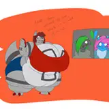
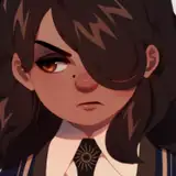
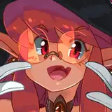
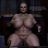
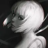
This was a really interesting piece to do for a couple of reasons - I wanted to kind of refresh myself on character design for this months video (coming soon!) and finally start to solidify the characters in the Bad guys series I've been doing.

There will be a couple more pieces coming up in line with this idea in the near future, so please do look forward to them!

Thanks as always for your support!

Rooftop (Full-res + Process steps) Rooftop (Full-res + Process steps)

Comments

Amazing Art!

They said it violated guidelines for "Adult solicitation", I'm assuming because her top is somehow too much for them.

GUWEIZ

Hm, I wondered where it went on Instagram. I don't really see why they would remove it, did they gave a reason?

Miiiguu

Sorry for the delay, it's now up :)

GUWEIZ

Thank you! Sorry for the delay, it's now up.

GUWEIZ

Where is the process step XD

Cristina

look great like always !! can you put the process please, want to learn from it haha! (idk if u forgot :p)

Glaiyn

Thank you! To answer your questions: 1. Usually I try not to take ambient light for granted, usually for bounced light to be strong to the point where it visibly brightens an area, the source light has to be even stronger. Something I try is to imagine that my eyes are positioned in a given spot in the scene, and then draw the spot/area's lighting depending on what I "see". Given that it's a dusk setting, where the sun is pretty much gone and only diffuse lighting is being reflected down through the atmosphere, bounce light originating from the sky will be really weak. In addition to that, I visualized that there's some kind of structure/billboard right behind the camera, so there's also some extra ambient occlusion going on. 2. Paintovers will really take a lot of effort if I do them properly, which isn't something I can take on right now unfortunately due to time constraints. Hopefully in the future!

GUWEIZ

Thanks!

GUWEIZ

I just love how she looks in this piece ! Looks pretty ! (especially her face and hair). Questions ! 1.When I make i own piece I tend to avoid really dark almost pitch black areas (in this case her right side of the body which surprisingly makes a good balance between dark and light ! ). Is this some kind of atmospheric perspective or something else? It's night time (I assume) and if I were you (in my level of understanding) I wouldn't give her right side really dark values (there's still light bouncing in this open space outside, right?). Sorry if I'm being too much here :'). Do you have any tips for that? 2.Will you do paintovers or something close to that topic? I really love your style and works, I make my own piece based on the knowledge I gain from you (and other artists of course). I'm a 70% self taught artist (I do have a mentor that teaches me fundamentals but not to the level of detail like you have). I would be a happy person If someone I really admires reviews my works :)

Lndo Gusto

awesome as always. i dig this character.

nathan callaway

Thank you!

GUWEIZ

Thank you as always for your immense feedback! It's great that you pointed out some parts that stood out as a bit weird to you - things were indeed a bit off. Her pants are a bit high (the belly buttons should be at the middle of the belt buckle), but her chest was also a bit larger than intended. I've worked in some fixes and hopefully it should give a more accurate-to-intended first impression. The head cutoff was intentional though, I feel it gives a closeness to the frame that zooming out to capture the full top of the head can't give. (And yes to the smoke as well, thanks to your frequent reminders :))

GUWEIZ

This illustration perfectly fulfills its purpose of introducing your heroine. Besides, does she have a name? Her profile view does not prevent her from being expressive, we perceive her femininity a bit provocative (by the sight of the bra) as well as her cigarette, revealing here again a state of mind. Moreover, the background confirms us in the universe that you have created, dark, very urban, perhaps even overcrowded. In terms of details, her chest is perhaps a little big, right? Or too low compared to his navel. I can't really tell if it's because of her posture or because her pants are a bit high. This is really to give you my complete feeling, because otherwise the illustration is really beautiful ! Ah, and last detail: at the level of the cut, it's a bit of a pity not to see the top of her head. It breaks the whole portrait a bit. But don't take these remarks as defects, they are just my feelings. The main thing to remember is that once again, you do wonders ! (and you remembered to put smoke on the cigarette this time haha !)

Mickaël Gil

Awesome job!

Charles Hartford


More Creators