XaiJu
lazygeckos
lazygeckos

patreon


Ok, we're getting closer!

Here's the latest version of number 5, please let us know what you think! 

We're planning on purchasing number 1 for the front of shirts, hats and stuff like that. This will be our main logo though. 

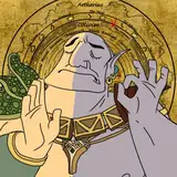
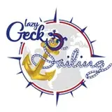
We tried to incorporate the Gecko, sailing and some from the Marine Corps. The Gecko has a blood stripe which NCO's and Officers have in the Marines. The globe and anchor from the Eagle, Globe and Anchor plus the colors...So this is our Gecko, Globe and Anchor LOL

We'd love to hear your thoughts! Thank you!! 

Ok, we're getting closer!

Comments

Good morning Laramie! Haha!! Good point ;)

Lazy Gecko Sailing

I Love Love Love it, it’s perfect. So what if The compass rose is a little off, Some of us Lazy Gecko’s are a little off ourselves it’s wonderful.

I like your idea too! We are thinking of doing a more simple version in the future in short-form of "LGS" and maybe we can incorporate your idea into it somehow :) <3<3<3, Brittany

Lazy Gecko Sailing

Will do :)

Lazy Gecko Sailing

Thank you so much for taking the time to write such a thoughtful comment <3 I think we have it almost perfect to what we'd like along with taking some of our Patrons input into consideration. We appreciate all the feedback :) Love you guys!!

Lazy Gecko Sailing

We thought about that but not sure if we want the boat to define our logo :) For this design we decided to try to define the logo with thangs the describe who we are like the military colors and etc.

Lazy Gecko Sailing

We asked her to double check on the compass rose :) Thank you!

Lazy Gecko Sailing

Yay!!

Lazy Gecko Sailing

Trying to figure that one out with the designer :)

Lazy Gecko Sailing

Looks great. Very busy but I like it. Personally I would just have something like #3 but with the gecko on his back on the anchor drinking a beer. No words needed self explanatory.

I really love the design. Like Beppo said...if you guys love it, run with it. Semper Fi Gunny and Brittany!

I do like this one a little better than the last iteration you posted just cause the compass is less busy than the rope. I didn't comment in the last post, but it was what I liked about #4 was it's simplicity (and it's use of only 3 solid colors so it's cheaper to print.) The compass and red circle relief above the k seems a bit excessive. Though to be honest, all this is just personal taste stuff kindo like redhead vs blonde etc. Ask 3 different people and you'll get 5 different answers, so I'd say it's just what your personal preference is since it's going to be YOUR brand's logo. Whatever you guys go with I'm sure I'll still enjoy the video series just the same. :D

Beppo

I like it ceptin instead of the anchor it should be a pencil silhouette of the new boat.

IMHO 1. I'd lose the grey world map it makes it waaaaay to busy and probably hard to produce. 2. Your Compass Rose is about 3-5 degrees off of vertical. It would drive me nuts. But I do like this one. BL

Yeah, better I think....

If you raise the gecko up just a smidge and align it with the word it might look better :-)

Scott Holley


More Creators