XaiJu
YummyTiger
YummyTiger

patreon


Feedback Requested

Hey everyone,

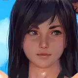
As I mentioned in my last Dev Journal, I've been tinkering once again with Aylia's facial expressions. Facial expressions are probably the single area I've spent the most time working on as I've spent time drawing this past year. Anyways, I'm trying to lock down once and for all the characteristics I want Aylia to have (eyes, nose, mouth, etc.). I'd really like to hear everyone's thoughts. In this version, I accentuated the black around Aylia's eyes (especially above) quite a bit more. I lessened the curling of her eyelashes and went for a more straight variant. Used a lot less blurring in the eyes themselves, and actually added a black pupil (hard to see at lower resolutions). Her eye shape is less circular and has a bit of a point now, and they are about 15% smaller. I've also shifted the nose to be more direct (although I just realized I forgot to add in shine, that'll get added). And I redid her mouth, since her prior mouth was kind of... derpy.

If I stick with this style, I'd tweak Aylia's eyes in a number of other portraits/CGs, but I probably would just do a little as I go. All of the CGs/portraits would not be revamped for the chapter 1 release, which I don't think would be a huge deal, but all new CGs I'm working on now, would have the newer features. So, as far as delaying chapter 1's release, it should not have a huge impact.

Anyways, what do you guys think? Do you like the new face better? Is it not enough of a difference to warrant the revamp? I'm leaning towards the new face, but also, part of my has gotten used to Aylia's older features, and now I'm not sure if this is actually an improvement.

I really look forward to hearing what you all think!

YT

 EDIT: I've got a better comparison shot to upload. I've modified it a bit more based on feedback so far. Mainly, lightened up the eyes. Still can't change the post picture due to Patreon not being able to load it up when editing my post. Here is the link: http://i.imgur.com/3v2vj6K.png 

Feedback Requested

Comments

Hehe, good point!

YummyTiger Gaming

The one on the left is trying to sway the vote in her favor, but I'm resisting and voting right

bsnick

Right is right.

Rebis

Hah! Was wondering if someone would comment on that :-)

YummyTiger Gaming

After seeing the new comparison picture I've gotta say definitely the one on the left, better view of the boobs :v

Furanky

Great! That is what I'm aiming for.

YummyTiger Gaming

You ever decide what you did not like about the mouth? Did you check the new version, where I made it more red? I really did not like the old mouth, but I don't mind the new one. Don't love it, mind you, but don't mind it.

YummyTiger Gaming

You know, fixing eye brows has been one thing I've had to do in a number of pictures. There was a HUGE variation in the black line width, which was due to me resizing them between pictures. Normalizing that width has improved a lot of the pictures in my opinion, and only took about an hours to do. Eye brows are pretty easy to draw :-)

YummyTiger Gaming

Me too!

YummyTiger Gaming

Thanks for the feedback! As I've been updating a few pictures, I'm liking the right version more and more. The initial eyes gave Aylia kind of a doe-like appearance (if that makes sense), which I guess is good for "innocence." But, I want her to be a bit harder in general, while still innocent in a sexual sense, I don't want her to necessarily be a deer-in-the-headlights type of character. She is an Eliandre, and believes herself to be tough. She can hold her own in battle. I believe the newer eyes represent that better. Course, I might just be rambling.

YummyTiger Gaming

Pic on the right...the face is softer, overall, but the eyes are harder. Nose has shrunk a bit. Not sure about the mouth. Pic on the left...seems to be a bit more open and worried/surprised, and eyes are softer, where the left is a mix of worried and annoyed. Can't decide between the two.

Sync

I like the pic on the right better

Rasu89

Dem eyebrows. I like the one on the right more.

Vesle Triumphant

I like everything but the mouth. I can't really put a finger on it, but the mouth still doesn't look right to me. Anyways, overall I'm pretty impressed by your artwork, so keep it up! :)

I didn't see this until the edit to add the update, so my comment is based on the updated version. I vote for the new one - it looks a little better overall, and conveys more of a confident vibe than an innocent vibe.

I hope so. That is why I'm trying to work on consistency now. I fairly satisfied with my progression in art style.

YummyTiger Gaming

Good point, my aim is for Aylia to be more in the "strong and proud" camp. In that vein, I think the right version suits her better. Also, mouth positioning drives me nuts. I line the eyes up with the tops of the ears, and the nose approximately with the ear bottoms, but damned if I can figure out where I like the mouth to fall. I'll try moving it up a bit.

YummyTiger Gaming

I know about losing the details, but damn it, I can't help myself. I'd be a terrible businessman, too focused on nitpicky stuff. Although, releasing higher resolution pictures to you guys is definitely doable if it is something people would be interested in.

YummyTiger Gaming

There are bits I like about both of them. I can't decide haha

Slarry

Good job, you've certainly improved. The left one is kind of like a blank expression where as the right one feels like a true representation of an expression. I would say it has quite a difference. The eyes look nicer too. Also, don't spend too much time on the fine detail as the resolution in RPG maker isn't that great without major tweaking. Unless you will release the CGs later as a bonus download or something.

InsaneBrain

Definitely the right one.

I like the right one more, methinks. Looks more embarrassed and nervous of the situation.

Mizu

Changing the size of her eyes changes how old she looks (bigger eyes means younger, that’s why often make-up is used to widen them). It will probably be easier to make her look naïve and playful with bigger eyes and strong and proud with smaller ones, so it may depends on which characteristics you want to emphasize. See how people think the left one looks more innocent and the right one looks more mature. For the mouth, maybe it’s a little too low, usually there is more space between the chin and the mouth than between the mouth and the nose. I prefer the right one.

Darian

I like the right one much better yeah. It really convey her emotion, the old one looks more confused then flushed. Also I think she looks more attractive, even if it's a small change.

Querzis

Well, which do you like better? That is most important :)

YummyTiger Gaming

Well, I do have her blush vary between emotions. "Embarrassed" expression are generally the only time I use blush across the entire face, usually it is just a tinge of blush on the cheeks. I also avoid taking a straight line and go around the nose with it narrowing significantly in that area. Blush is something I've also tried a number of methods to see how I liked it.

YummyTiger Gaming

I'm inclined to agree that as it appears, I think I've shaded the eyes more than I'd intended. The whites in the left seem to give a more positive vibe, even though she is embarrassed here.

YummyTiger Gaming

Yes, the left is the earlier version.

YummyTiger Gaming

I'd concur that I've always felt her expression in that picture was a little off. That is one thing I like about doing the eyes this way, is I think they just fit her facial frame much better. The mouth though was another big aspect I wanted to address in this picture.

YummyTiger Gaming

Not sure they are different expressions, but the features are what is important here. They both looked embarrassed to me. What else do you see? As for the use of time, I'd disagree. I've heard time and again how important consistency in artwork is to people playing these games. That is one of the knocks against Roundscape, etc. Aylia's Story artwork up to this point has been me learning and improving. At some point though, I NEED to settle once and for all on how I want these features to be drawn. Currently, her portraits are somewhat similar, but vary significantly in the eyes especially. If I settle on this style, I'd make sure that all Aylia's portraits going forward use the same style. I believe that is a very important aspect to spend the time on. Beyond that, it seems like facial expressions can make or break a picture for a lot of people. For this reason, I've dedicated a good amount of time to evaluating what other artists do and honing my abilities. Prior to Aylia's Story, my drawing has been incredibly sporadic, and I've never had any real training. This is just one reason why I preferred the pledge by content approach, because I knew I would need time to figure a lot of this stuff out.

YummyTiger Gaming

This is a big reason why I succumbed to tweaking facial features in the first place. I'm content with where my art is now that I'm settling down on exactly how I want her features to be. I'm aiming to make all the CGs/Portraits consistent, instead of the mishmash of learning that I've been doing.

YummyTiger Gaming

Definitely the one on the right. It looks like your art style is maturing (along with Alyia)

Dongs.exe

Overall I like the right one better. However, I never had a problem with the left, and without knowing /remembering what the other portraits look like, the biggest consideration is to make sure the hcanges to make for her don't cause her to look differently than how the other faces will be.

Eunoshin

They look like different expressions to me. Not necessarily better or worse. This also seems like a poor choice for how to spend your time.

Pengy99

Like both, but the mouth is better on the right one. Thats the main thing for me

The one on the right looks a lot better, definitely. Honestly, something always seemed off with the left expression for me, but I never said anything because I couldn't put it into words.

Solar Pants

Think I will cast my lot in with the second. Looks more...mature? I think. It's not a huge difference but I like the air given off in the second picture more.

FaderPotater

I feel like the right hand image conveys more emotion.

thswherizat

I think that the style on the left is a bit better of a fit for the character.

Pretty sure left is before because now that you mention it, the mouth DOES look a bit derpy... I think the change is good, assuming these are supposed to be the same kind of expression. Fits in the character at least. They're both unsettled to a degree, but left to me makes her look a little waif-like. Right looks more like embarrassment and 'oh god why'. Good job.

Not Telling

I can't really see any significant difference.

Heartfeltcurse

Is that supose to be the same expresion ? Left looks like a suprised expresion, right like she is slightly grossed out. All in all I dont think thats work thats need your imidiete atention. New once are beter maybe, but the diffrence is minimal rly, not sure if it is worth retracing your progress. IMHO no.

Angmir

I like the style of the right one but i think the color is a bit too dark for my taste... it makes me feel a bit awkward.

I like the shape and size of the new ones better but it's a little bit too dark and shadowed now, in that aspect I like the old one better. Going too much towards a more realistic approach without changing your whole art style would give a disjointed effect I think, so when I doubt I wouldn't change too much yet.

Hurr

Maybe it's just me, but I always hate how blushes are just that one line of red that looks like a military chevron on the face, rather than that general area of the face as a whole simply appearing slightly flushed, (or extremely flushed in extreme embarrassment) like real faces. I've seen times where the line thing works, but it is rare for me. I think because it is so "strong" that is looks like a line, rather than flushing. Great other than that though. And that one thing could just be chalked up to personal preference so...

Secular Reason

i like the 2nd but i like the shinier eyes of the first one makes her look more innocent

habibo

New one rocks!

Shirafune

i don't know which is the old one, and which is the new one, so it's hard to say. XD

Even

The change might be small, but I think it's an improvement.

I like the new one more :3

Lilith Iden

I like the eyes of the left one the most though :)

waffel

I think that you're on the right track with the change, Yummy. The new version does look definitely better to me.

I think both of them look good, but the new one looks better, if you need to remake some things in order to add it in i can live with it, i'm a patient man however since you wrote that it problably wouldn't take much longer i would definetly say to go with the new one.

I think both look great, but I agree that the smaller one look a bit better. However I don't think it's worth any efford such as recreating previous pictures.

DwDuck

Vote 2. they look more haughty than 1 which is something that Aylia would be in spite of her new position as the last of her kind and the things she may encounter. At least until her pride takes a big dip.

Zaiaku

I really like the smaller eyes, but then I don't really have any Japanese / anime influences so pretty much any little shift toward natural proportions appeals to me (I realise I'm pretty unusual in that regard though). The one thing I'd suggest is raising and lowering the intensity of the blush depending on the expression... The image on the right really captures embarrassment, whereas the one on the left I see more like surprise (in which case I think the blush on the left image could be toned down a little, which I think would add to the impact of the one on the left).

TheOldDruid


More Creators